CS3 Wacom Bamboo Tablet
Just basic masking
Thanks to kconnors (Canyon) and mzacha (motorway) (5 years and 3750 days ago)
(5 years and 3750 days ago)
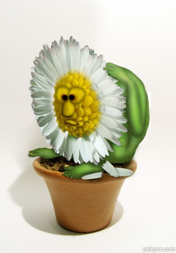
Edge of the back could be more smooth, but nice job, and a plus for humor. 

i saw the edge of the back after i submitted it, i was fixing it while you were writing the comment, lol!
thx CMYK. 
and i love this work XD fav
just brilliant.. the finger is fantastic!!!
Poor guy... he's self-scourging! 
Nicely done, author! 
I like the flower monster alot
Great idea 
Great entry, I wish I could think of things like that. The facial expression, hands and feet and extremely well done. 
the expression is mindblowing..
Great work...very well done
Great idea and nicely executed. Love the expression. 
Nicely done. Perhaps you'd like to add some more highlights here and there so that at least the hand & arm will be more visible from the body. Good luck!
thanks wazowski, i hope it's better now. 
good idea  You might want to make the pedals a bit curly to make it more realistic
Extra marks for your drawing skills...... fantastic work .....
pmaheen, please remove author name from your comment .
EDIT: pmaheen comment has been removed 
Lovely work, author. Really imaginative  Good job.
omg what is he doing?!?! hehe nice work...like it a lot!
haaha this pictures is so funny great job
 this is great! loving every bit of this guy, including his bewildered look. great job! definately my fav!
wonderful entry ! great job ! 

Very cute critter. I love what you have done with this source image, definitely a fav. GL
congrats! to you too.... funny chop
Congrats!!!!! (and now questionable hands LOLOLOL)
congrats 

Congrats, it's soooo cute 
Congrats! 
Congrats Oana, well deserved win. 
congrats xoxoxoxoxox 
Congrats!!
congrats 

Congratulations O!
Howdie stranger!
If you want to rate this picture or participate in this contest, just:
LOGIN HERE or REGISTER FOR FREE
Spec Thanks to Thorinsise for use of this picture found on Flickr Photo Sharing and on thornisise photo stream.
(5 years and 3751 days ago)
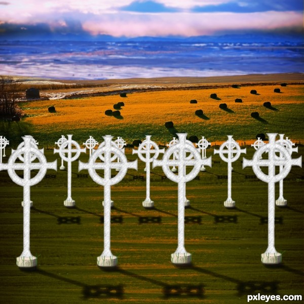
place shadows under each cross, and try adjusting the brightness, the original source was a bit too bright.
Yes I agree too bright and a little shadow at the bottom of the crosses will help greatly. Also you could push the shorter grass onto the crosses just a bit to make it not float. Very easy fix for higher votes Good luck Author
Hay Thanks guys Thanks. How's this any better?
I think you should dim or fade the bluish background, maybe even som slight blur also.
better 
Hey Thanks I darkened the blue a little more and added some blur to the blue what do you think?..if you look in sbs. the original flickr picture their day & night
This is a difficult background to work with. The view is looking down towards the lower far field with the foreground sloping away. However, you treated the foreground as flat [my eyes interpret the crosses as equal-sized and vertically true], but that's inconsistent with being able to see the tops of the hay bales in the far field. The light is from the upper left corner, so we should be looking at the shadowed side of the crosses and they should have long, strong shadows going south-southeast (like those of the hay bales). If the crosses are marking graves, they seem too close together. And then they don't seem to be organized in a cemetary-like grid (after adjusting for perspective, of course).
Crosses need some shadows... 
lightings and shadows doesn't feel right. sky is too blue and dark and w/o any evidence where the light is coming from to cast such a strong shadow on the stones. like the others were saying, celtic crosses needed dark shadows too to match the stones'.
Ok Thanks I Here's a remake any better?
Better. The shadows need to be darker for more consistency with those in the background, need to be thicker (same width as the cross elements casting the shadow), and need to be skewed so the cross-piece's shadow is parallel to the cross piece. I still think having the top of each row noticeably lower than the top of the row in front of it would capture the falling away of the foreground for better linkage with the background.
Thanks for comments I have made some adjustments and added to sbs.
Much better, but you still need some work with the shadows. Blur them a bit with gaussian blur (not to much though) and then also maybe 80% opacity on them. I´d also think you should change the perspective, so that the shadows "leans" on the ground, I´m not sure how to explain that better, but if you look at a cemeteryphoto you might see how I mean. GL
I like the image, but the cross bars on the shadows need to run parallel ot the horizon just like the striations on the ground to make visual sense.
There you go! 
fine work
Howdie stranger!
If you want to rate this picture or participate in this contest, just:
LOGIN HERE or REGISTER FOR FREE
Thanks and credits to 'garwee' and 'nlolv'. (5 years and 3752 days ago)
WOW WOW WOW this is a piece of art...well done author and good luck
This is for you Mario... Happpy that you like this.... Thank you...
Yes mario, this is a great piece of art. I jealous, how lucky you are.... think you will not forget this birth day ever ...................
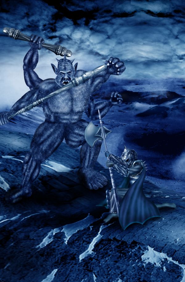
the warrior is extra ordinary
thank you!!! .. and your work is too hard!!!
great job author...good luck
aWeSoMe
great idea
Good work.
Congrats! 
Howdie stranger!
If you want to rate this picture or participate in this contest, just:
LOGIN HERE or REGISTER FOR FREE
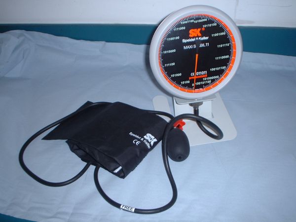
clone stampstool
text tool
rectangle marquee
pen and paper for conversion to binary (5 years and 3753 days ago)
aaannddd.. what's that?
alright.. got it.. so r u done with the rework?
i am new to pyxleyes.. how do i send in my rework
Welcome to site.
You can edit your entry by clicking on "MY Stuff", then "my contest", where your current entries are listed. Click EDIT button to edit entry and upload corrected version using browse button 
thanks nasirkhan. And bye the waty u r one super artist. am a fan of yours. Just took this oppurtunity to let u know.
Thanks author for your nice comment. Wish you success here and enjoy chopping. Good Luck.
good luck author.. and welcome aboard..  hope to see cool entries from you..
Welcome to PXLeyes...your work is very nice...good clean crop...good luck
Welcome, new member of Pxleyes! And if you didn't say the flaw, nobody would notice it... it's binary! 

Howdie stranger!
If you want to rate this picture or participate in this contest, just:
LOGIN HERE or REGISTER FOR FREE
WOOOOOOOOOOOOOO HOOOOOOOOOOOOOOOOO
HELP ME.. I think I'm falling.... in love again.. (my bad Joni Mitchel impression.. hehehe) great job author!!!!!
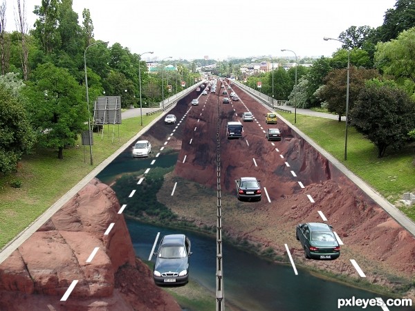
I really like how you included lots of traffic to show that the pavement art is fake. However, I think the pavement art misses the point. As Mr. Mueller states in the FAQ at the linked Website, "every anamorphic street painting only makes sense from one specific spot." And I would think that here that spot would be the driver's seat of the up-bound car just below the center of the image. Since we're flying well above that, we should see a distorted image. In any event, your canyon source image is not what one would see prior to driving off a cliff for that Thelma-and-Louise moment; it's the view of someone standing at the edge and looking down into the canyon.
I think i could fall here np. Good job Author
good idea.....
Nice!
something doesn't seem quite real enough about it for me to be scared driving on it....maybe the center crack needs to be darker? not sure
nice idea
Nice work and good luck!
Howdie stranger!
If you want to rate this picture or participate in this contest, just:
LOGIN HERE or REGISTER FOR FREE