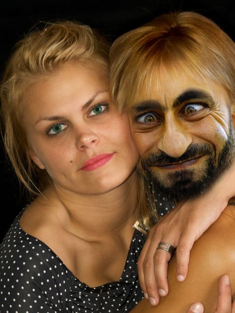
we have seen a lot of this guy in the contest. but take my girl away from me. that I cant take it.
thanks to
biqevil600 for his image fuuy man
thanks to willsun for the untitled image. (5 years and 3738 days ago)
(5 years and 3742 days ago)
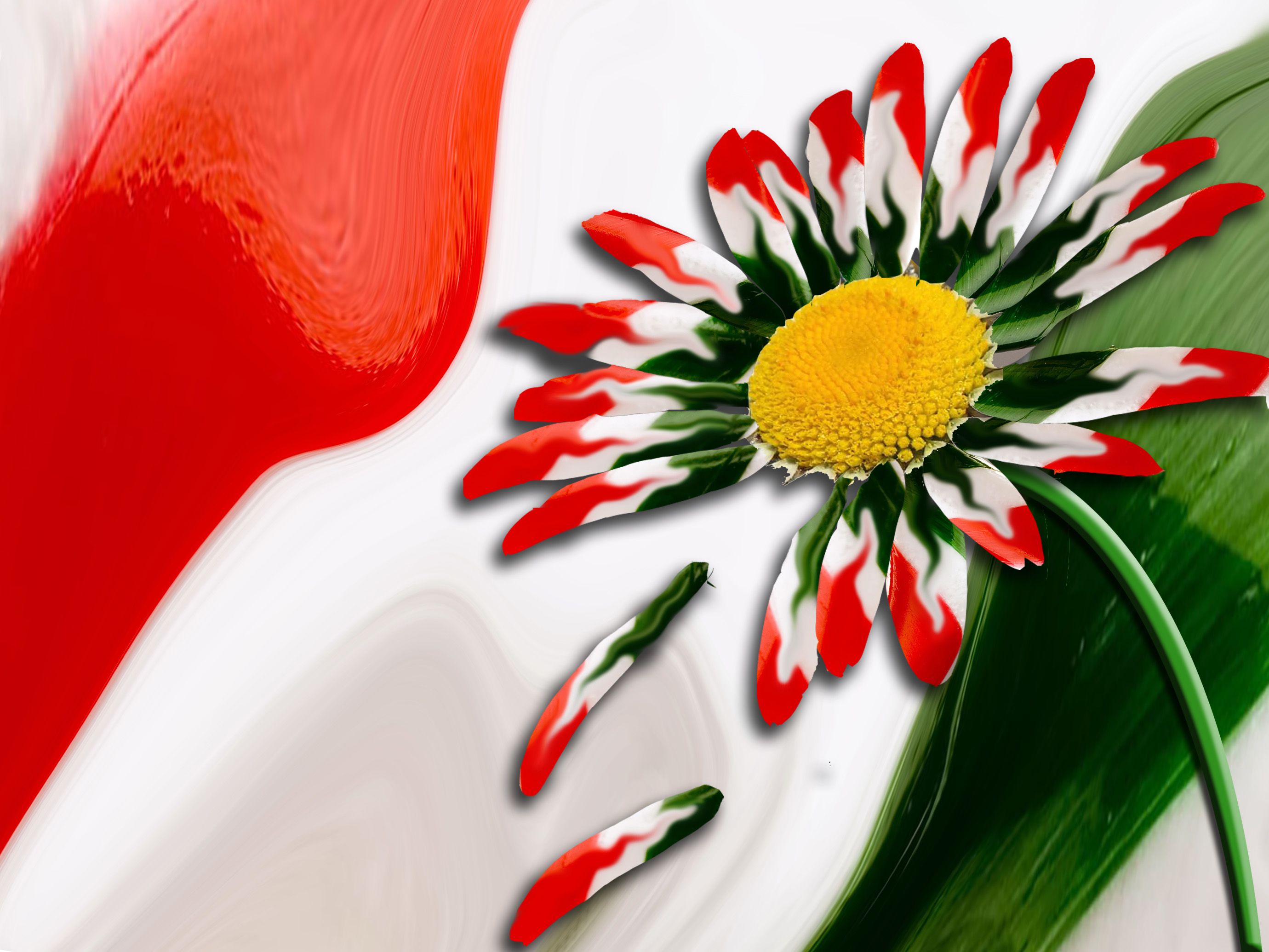
it'ws a really unique chop, I am just wondering why you did not change the color of the center from yellow to say white instead? Not a suggestion, just curious. Don't get me wrong I'm impressed with your use of the surce and how you have put it together so well so good luck to you! 
This image is beautiful. The yellow in the middle is perfect. It makes the image more interesting than if the hole thingwas red, white and green.
Thank you both for your nice comments  . jawshoewhah, I actually thought of doing it white and tried it but it didn't look as good as yellow, that is why I just left it yellow.
nice chop, very unique use of the source
lol....funny entrie.....i like
beautiful.
Howdie stranger!
If you want to rate this picture or participate in this contest, just:
LOGIN HERE or REGISTER FOR FREE
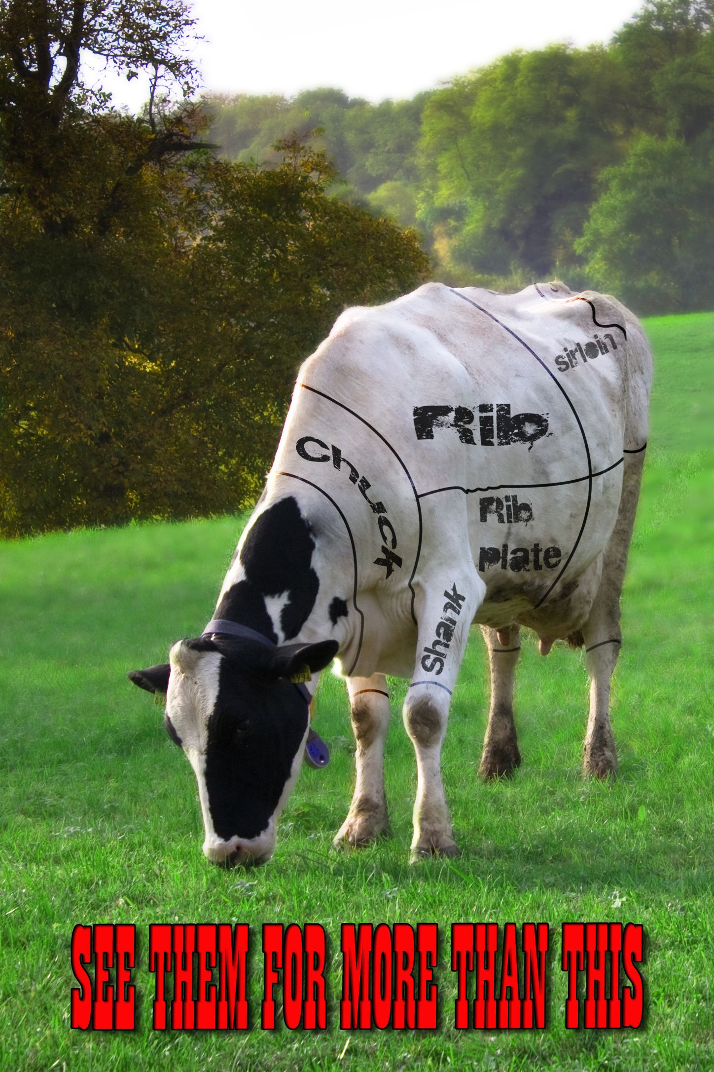
I am firm believer in animal rights. I actually made this last year. but have never used it for anything, so I thought this would be good use of it. I hope everyone on this site could respect my view and beliefs and rate this based on talent and artistic ability. Not how it goes against your views, I am not looking for debate.
Thank you
For the image I use the clone tool to remove the black spots from the cow, used the pen tool to draw the lines on the cow. I use some blurs to add depth to the picture and and some color corrections. Really simple techniques, mask are great. hope this desription is good enough. (5 years and 3744 days ago)
Pretty good image, and I appreciate the sentiment. I have not had red meat in 42 years. However, the term "animal rights" is confusing to me. It suggests that my cat should have the right to vote because she is considerably more intelligent than some humans who have that right. 
nicely done! - strong visual message; well done I think you executed your idea very simply!
This is a Holstein cow. We don't eat Holsteins. We milk them. But for stereotypical purposes, it's probably a better fit. Chick-Fil-A does the same in their advertising. I think the font is a bit much and IMO, just remove it or tone it down a little.
Well we can tell who the cowboys are. Thank you for sharing something you feel strong about. I do agree with the text on the bottum and maybe tone it down just a little. It distracts from the photo. gl
Thank you everyone for the comments, I too have had thoughts about the text treatment. But in the end I felt it was useful, but have had thoughts to change it. jawshoewhah,Nator where do you think the big majority of veal comes from Holstein calfs and dairy cows are used as well I know this because I grew up on a dariy farm. They are however a not a true beef cow, that is correct.
I don't buy red meat to cook at home. But occasionally I will have a fast food burger. When I was in highschool, I was a future farmer of america and wanted to go to Tuskeegee to major in Ag business and raise Holsteins. I love cows. Beautiful animals. But I think that God put animals here to be subject to us. Doesn't mean that we should abuse them. Anyone of an Abrahamic faith could check your Books and see that there are rules.
Anyway, I like the image. Big fan of Cows in any context. Good job.
Lovely submission. Im a veggie enough said :P
change the type. the font, at least
Yum roast beef
.I do respect your beliefs but don't forget just one thing. For maaaanyy years, humans eat animals to survive.Animals eat animals..to survive. So, how about the animals who's eaten by another animals? They have "rights" as well! Oh, and plants are alive as well, and like the animals, they can't talk , they can't protect themselves ... It's a nature thing...But love the message and the image is great. Good luck!
Nothing like a good piece of meat every now and then.
very good
I love a good steak!!! You made me hungry! On a more serious note I do see them as more than meat though, I love milk and they can also be a source of amusement when tipped over
Nice work!
Congratulations for 3rd
Congrats for your third place, TTstinger!
Congratulations!
thanks everyone
Howdie stranger!
If you want to rate this picture or participate in this contest, just:
LOGIN HERE or REGISTER FOR FREE
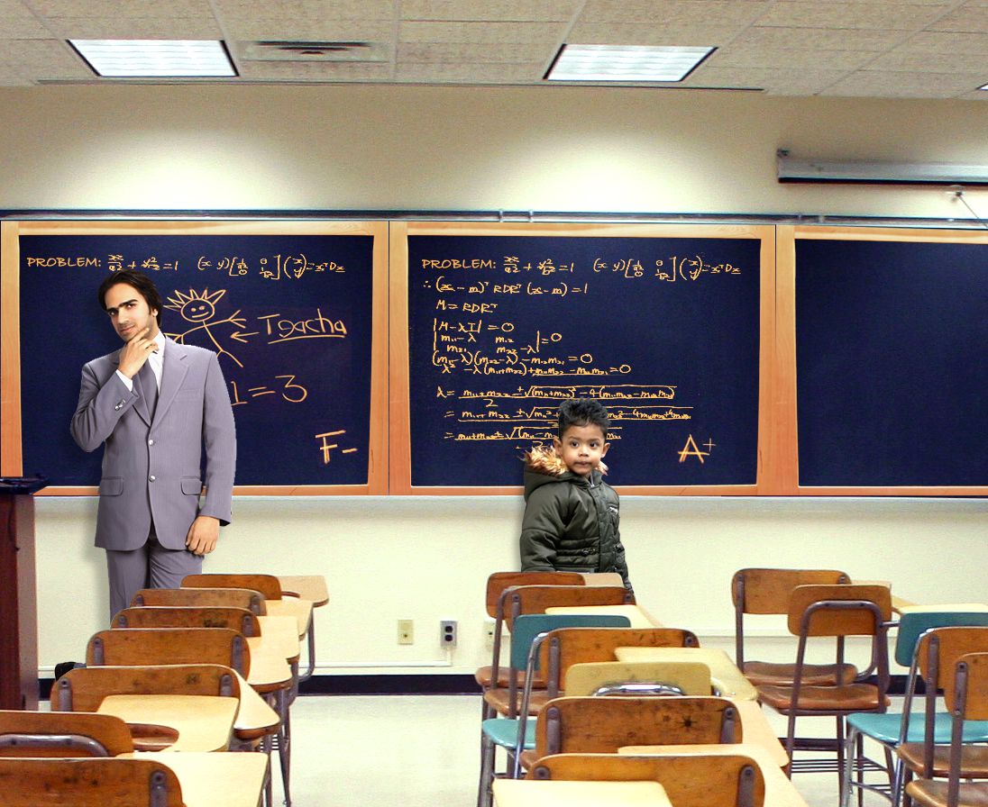
Not everyone that gets older gets smarter (5 years and 3748 days ago)
Unique idea but try to blend the color of the source chalk board with the green chalkboard you used. You should probably just used magic eraser for the outside or maybe even magic wand and drag chalk outline to the found classroom source. Also, more than one light source should leave multiple shadows but probably not so hard.
You need to fix your source 2 link as it gives an error. Source 3 is from Photobucket which is not usable.
Sorry..new to this..thanks for the comments and suggestions, and letting me know about the source problems..i'll fix them asap
this guy kinda reminds me of the one from that show numbers.. nice one
Very funny idea and good execution! Also good choice of sources. I really like the man's expression. As if he thinks: "Hm... maybe I'm not THAT smart." I hope, for you, that you'll be as successful as the little boy with your entry Good luck!
nice mixing of images
Good work, author! Glad you got your images sorted out...
very nice work...great blend...good luck author
nice work...gl
Congrats for your second place, Fatz!
Congrats
Howdie stranger!
If you want to rate this picture or participate in this contest, just:
LOGIN HERE or REGISTER FOR FREE
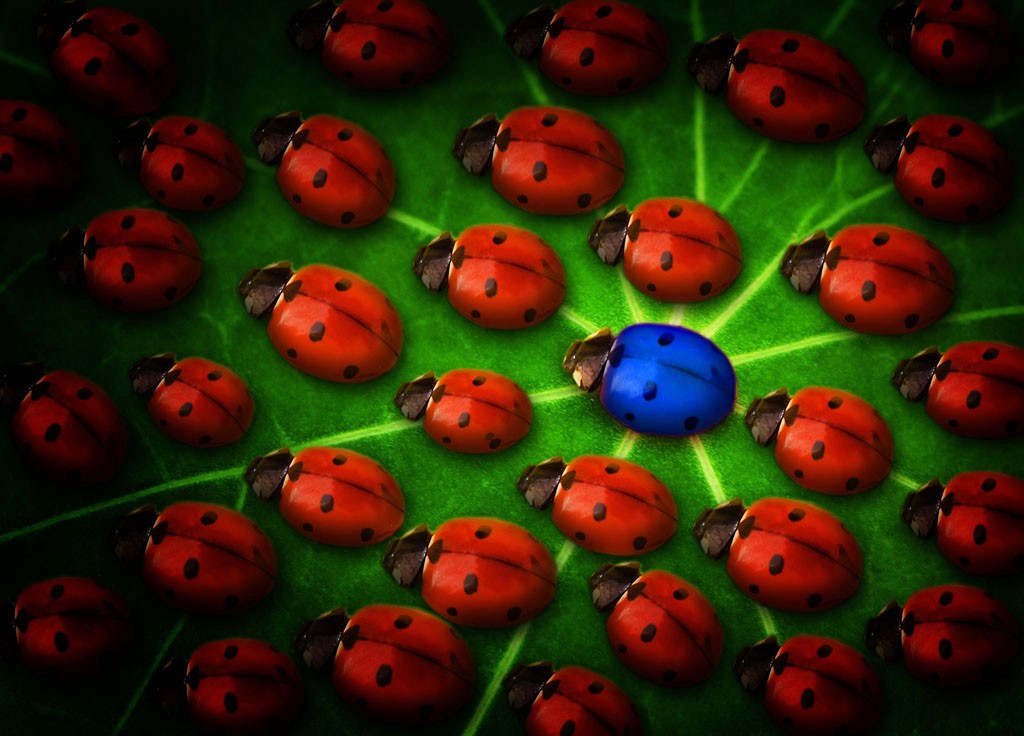
Originally I changed the spots on ladybugs, but eventually decided to leave them like they are.
Hope you like. =) (5 years and 3774 days ago)
Very nice idea, i like the difference in size and orientation. Great job!
Thanks! =)
Maybe give it more light, the vignette makes it very dark...
Nah, when I brighten it it looks to contrasted, and when I remove the vignette, it looks bad... I'll brighten it just a liiiiittle bit cause you're right about it being to dark =)
EDIT: Done. did +20 to the brightness, and it looks OK to me now. =)
Nice work! But a suggestion: instead of using a new layer filled with pure black, try to use, on this new layer, a very large soft black brush with 10% opacity, applying half of its diameter, or less, around the image border until you get satisfied with the result. You can always use the eraser tool with the same settings. It'll give you more control on your work and it'll look more natural Good luck!
Thanks Divair! I'll make sure to try it out with this image and update it if needed. =)
Nice
Great message and nicely done. I like that you took the time to make them different sizes etc. 
Thanks. =) I also changed the spots on each one at first, but then I decided to leave them all the same, since it kinda fits the title even better. =) Tho, maybe I should've changed the spots on the blue one....? Nah, nevermind =)
Very nice idea,lighting is very good,maybe to make upper right corner a bit lighter because is closer to the central bug then lower left,and u have the same lighting on both sides...Beside that very nice final result...good luck author
Nah, I actually like the kinda 'asymetry' of the lighting compared to the blue bug.... The bug is already in the centre of attention.
The vignette was done well and I think it puts more focus on the blue one. Well done and good luck.
Thanks. =)
Howdie stranger!
If you want to rate this picture or participate in this contest, just:
LOGIN HERE or REGISTER FOR FREE
Photography and photoshop contests
We are a community of people with
a passion for photography, graphics and art in general.
Every day new photoshop
and photography contests are posted to compete in. We also have one weekly drawing contest
and one weekly 3D contest!
Participation is 100% free!
Just
register and get
started!
Good luck!
© 2015 Pxleyes.com. All rights reserved.


very good super creative,congrats and good luck
thank you mario
Nice, i'd add some hair to the arm and change the hair colour (or at least give him some dark roots) to make it more realistic though.
OK RayTedwell. thanks for your advice, darkened the hair a little bit, not to much, because the idea is that he looks ugly. thanks again.
great job
Hehe.. well blended!
Howdie stranger!
If you want to rate this picture or participate in this contest, just:
LOGIN HERE or REGISTER FOR FREE