Photographer: ~MysteriaViolentStock
(SBS shows wall texture not used in the final) (5 years and 2777 days ago)

SOURCE
with My Picture (5 years and 3374 days ago)
Nice one. Like the idea. Shadows are cool. GL 
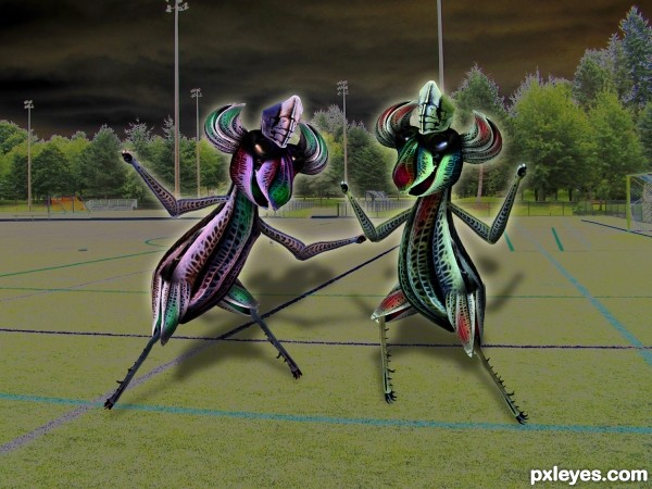
great construction author and fantastic title imagination...i would just a bit lower the opacity of the shadows...now they are a bit to strong and create small distraction from the Farina and her sister...
much better.. thanks Erathion 
My pleasure...just tell me author...which one is Farina? If i could guess i would tell that Farina is Red one...
Farina is more red and green (on the right ...our right.. never could tell the difference) .. for she represents the Christmas Colors and the silliness of making clashing colors a concern... her heart has endured too much so she has decided to unite with her evil twin and take control over the world at hand...
Or I was just really confused as to what to do with a Macro of a fricking Grasshopper and just decided to go nuts (great macro is it not? MnMCarta is a master).. can't shake the guilt of manipulating it.. hehehe.. but I'm going to do it anyway hehehe
(can you tell I've relinked with my college roommate who was a brilliant writer... she gets my creativity going LOL)
Great stuff
Howdie stranger!
If you want to rate this picture or participate in this contest, just:
LOGIN HERE or REGISTER FOR FREE

Only source used
(5 years and 3888 days ago)
cute
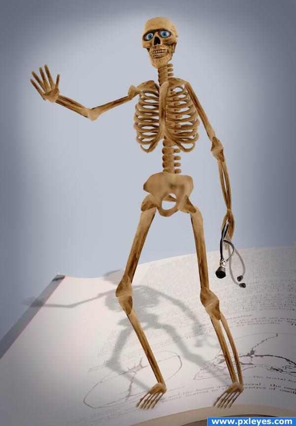
I don't know why.. but he needs music ... hehehe (well done!)
LOL what does the skeleton need now
Great job!
great image. good shadow. well done.
Howdie stranger!
If you want to rate this picture or participate in this contest, just:
LOGIN HERE or REGISTER FOR FREE
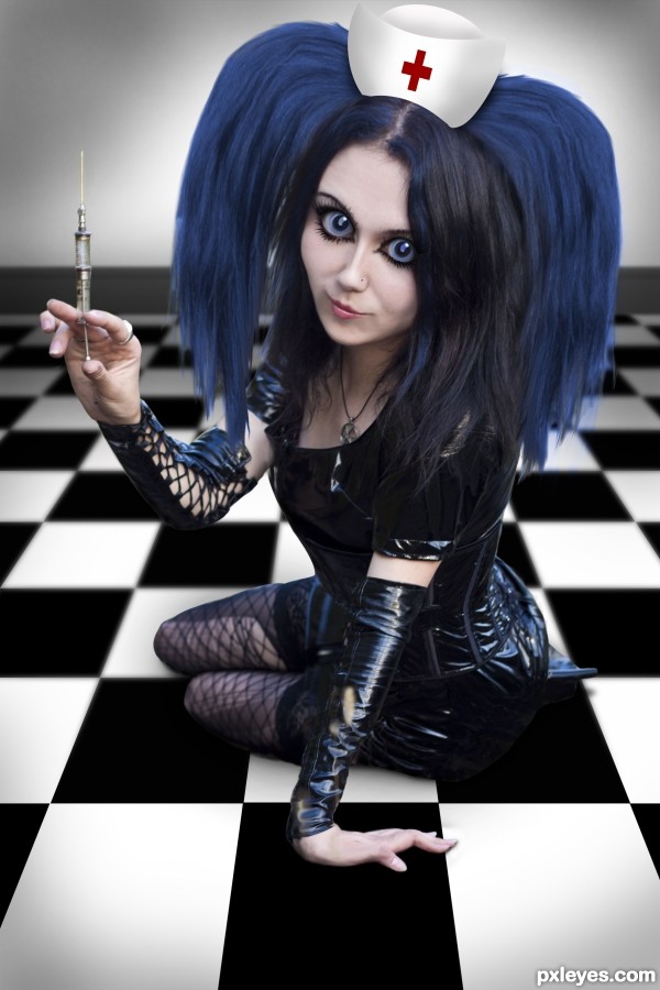
ohh i love her eyes, well done
Great job on the eyes!
you did a very good job with this photo
Thank you, all.
I like all of it except the hair, a bit to obviously photo shopped, but the face is very good
Good job! Nice compromise between reality and manga. The problem, in my opinion, is the hat because it's too flat and the lights on it are wrong .As you can clearly see on the hand or observing the reflections on the dress the main source of light comes is on the right, even if it's clearly a diffused light probably because the sky in the source image seems cloudy. I suggest you to use another source image for the hat, or, if you prefer to mantain that, change the lights on it and apply a material texture. Good luck
Congrats!
Congrats!! So nice to see you again!
Congrats !
Howdie stranger!
If you want to rate this picture or participate in this contest, just:
LOGIN HERE or REGISTER FOR FREE