The Earth and Nature goddess. (5 years and 985 days ago)

(5 years and 2783 days ago)
Work of art, and I don't say that lightly.
Howdie stranger!
If you want to rate this picture or participate in this contest, just:
LOGIN HERE or REGISTER FOR FREE

Spec Thanks to AL Hikes AZ
for use of his picture found on Flickr photo sharing.com
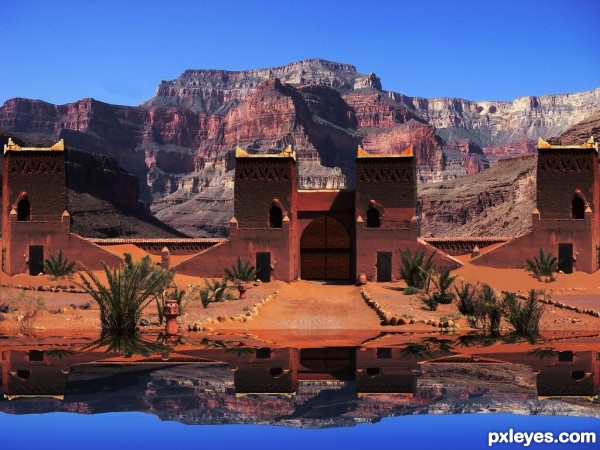
Water reflection done with vm natural called lakeside reflection.
Thanks to Tapiona for suggesting source picture for contest. (5 years and 3634 days ago)
gud job...nice idea...!!!
gud job...nice idea...!!!
cool idea the reflection is too distorted though
Ok Thanks guys I took the blur out I thought their was supposed to be a slight blur on reflections. I also took the bend of buildings in reflection because water is dead still no movement
the sky colour looks wrong
What do mean sky color looks wrong? It's almost same as original on source.
very good work......
@leebaoren, the sky isn't wrong it's your lcd monitor and the angle your looking at it. Move your head up and down to see that your screens color changes as you do so. I would suggest a displacement on the reflection though. Here is a good tutorial. http://photoshopcontest.com/tutorials/26/displacement-water.html
The buildings & mountains are far enough away that they wouldn't be reflected in the water, just the sky.
Howdie stranger!
If you want to rate this picture or participate in this contest, just:
LOGIN HERE or REGISTER FOR FREE

Thanks to "gerard79" for source 1
Thanks to "garwee" for source 2
Thanks to "straymuse" for source 3
Thanks to "gtrfrkbob" for source 4
Thanks to "asifthebes" for source 5
Thanks to "bradimarte" for source 6
Thanks to "jaqx-textures" for source 7
(5 years and 3817 days ago)
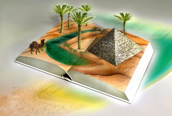
How would your book perform it's 'pop up' - there are no tabs to pull or push...
Take it easy Mr. JamesD.. not all are, experts like you .... I forgot to put quotes from experts....by the way, no one is perfect!!!...Not even you!!!.....Don't look if you don't like!!!!...and....see your last job (SON GOKU TOU!) ... and you know what I mean....!!!! thx for comm....!!!
nice job come on author dont be too harsh he was js asking.
 for the insult... there's no need for that... I haven't insulted anyones work!?!...
I was just asking you a question. Merely asking you to explain how it would work...
And as you mentioned my last entry Son Goku Tou atleast it was obviously a country and not a planet... i read the goals and the aims... and fulfilled them...
JamesD !!! i don't insulted you,,,,, you got it right ... you've asked you ... I've answered me .... and where is my insult? ...btw...I would be curious to know!!! however, you comm. all entries from this contest...in the future PLEASE don't bother me...ok?
i think what james is trying to say author... as he did on my entry ( i took no offence) .. how will the peices fold over into the book. The palm trees are all posing the same way yet the two at the back should bend forward into the book when closing.. He is simply asking how would you achieve this? Maybe put tabs there to show the book will pull them forward as he told me 
exactly... I was merely asking a technical question... as for the not communicating you part... I don't see why I should be bullied into not asking a very honest logical question... in future, if you don't want to hear peoples opinions or answer peoples questions then don't put your piece up for public comments...
jeez guys.. the entry's fine. that's what private messagas are for.
Doesn't really saeem like a pop up book jsut a surreal image.
good work .if you put some tabs on it, it will look more good.
Howdie stranger!
If you want to rate this picture or participate in this contest, just:
LOGIN HERE or REGISTER FOR FREE
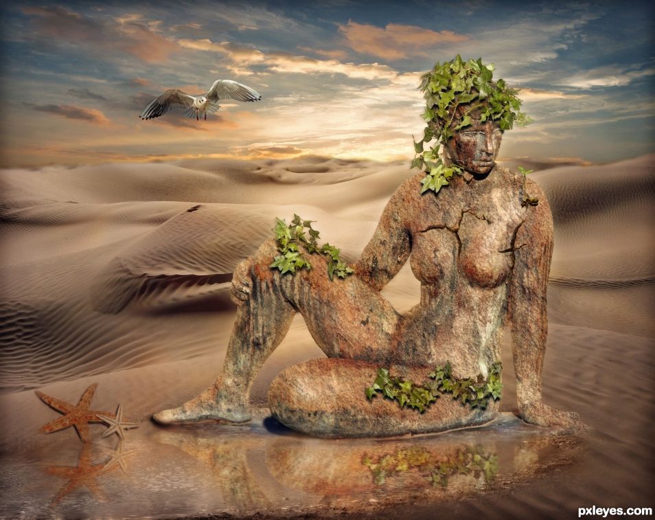
Figure needs a reflection, shadows are wrong. Look at the shadow under the chin for original light source.
There are already reflections in the water. Can't you see them? It has the statue reflection and the starfish reflection and also the cloud reflection in the water. As for the shadows, they are following the same angle as the shadow on the knee and chin. See that knee shadow? It is heading slightly to the left. The chin shadow seems to be going straight down so I figured I needed to use both source shadows to make my own shadows. I made the ivy leaf and starfish shadows aim down and slightly left. The dark area you see above the leaves on the knee are cracks in the statue. Those areas are holes. The ivy is growing through those cracks.
Now if you still think the shadows are wrong, which way do you think they ought to go if not slightly down and to the left?
The light source is almost overhead. I'd make the shadows lower and more to the right. I'd also make the reflection more visible.
I moved the shadows 6 pixels more to the right and 3 pixels further down and made the reflection more visible for you.
Thanks for your help CMYK.
Congratulations...
Thanks George
Congrats
Thanks Sylvie.
Howdie stranger!
If you want to rate this picture or participate in this contest, just:
LOGIN HERE or REGISTER FOR FREE