(5 years and 3339 days ago)

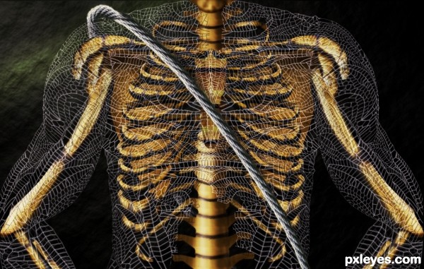
This is one of my entries before the Big Bang. On my PC, I only had the 3rd psd I was working in ( I used to work in different psd, then merge and work on image cause my PC was getting slow),so i had to find the source(thx mqtrf) and redo the SBS. (5 years and 3423 days ago)
Very nice, great work author! 
Amazing use of Dragonfly wings. Fascinating image!
Superb Work!
Thanks folks. This entry was created for PST and i wanted it to get back on this site, where it belongs & in my portfolio. I'm really glad mqrtf found the source and I'm very grateful to him 
Always keep a psd of your works containing the source, in case anything happens, that's what i learned.
Author I recommend getting an external hard drive, worth the money in the long run....saved me A LOT of stuff when my other computer finally crapped out.
Now back to your entry  AMAZING WORK!!! I love how you have created depth...it's FANTASTIC......Best of Luck
Well done, I did noticed that u used dragon fly wings, but maybe because I've taken macros of them. And I really like what you did here = )
cool work author...gl
I love this and I am a wee bit surprised it was not in the top 3 ... so close though! Just had to tell you again how much I loved it ... I kept coming back to look at it.
Howdie stranger!
If you want to rate this picture or participate in this contest, just:
LOGIN HERE or REGISTER FOR FREE

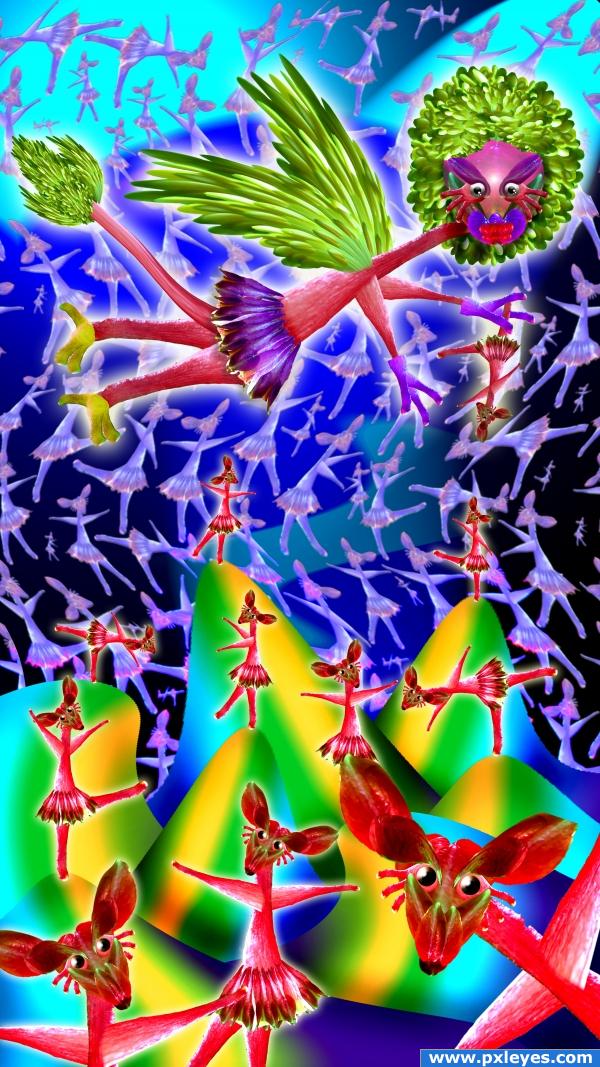
The celebration of Death
(Happy Halloween.. and all our sacrifices) (5 years and 3830 days ago)
lol very cool are the red ones rats??
Dancing Flower Deers LOL
BAMBI ON LOTS OF CAFFINE!!! LOL..........very cute! Good luck. 
nice
Hahahahahahahahahahahahahahahaha! 
Intersting and vivid colors.
CMYK.... RED Flagged and reported for Guideline Violation (DON'T make negative comments without suggestions for improvement. (eg. "THIS SUCKS", "WHAT A MESS", "LOW VOTE FROM ME", ...) The author will be discouraged by these comments and can do absolutely nothing with them. There's nothing wrong with critique. But, it should come with a suggestion.)
Also, Author requests that you refrain from sending SWEAR word filled PM's. (I will post them into the comment area with proper censoring). Now you have a nice day.
Nice
Absolutely insane! Reminds me smething in Dutch school of painting, but I can't remember what now.
@divair... it's actually a very simplified influence of Hieronymus Bosch... one of my favorite artists
I like Bosch too. Actually I consider him as surrealist as Dali, maybe more considering his epoch 
Nice job - fairly insane, in a good way - but very nice job - good luck!
nice job 
The red mice are stunning! 
just wonderful. there are two points in this work that i like the most. the faces and the choice of colours. the background dreamlike boardering on surreal. lovely artistic creation author
Ooooh, oooh! I typed "SWEAR WORDS"? Holy shit, that's really horrible! Maybe you should improve your lame work instead of whining about the comments you get.
chuckle.. this piece was featured on several websites.. thanks for reminding me.. gotta enter in some more contest .. woo hoo (oh.. and you've been red flagged again)
Howdie stranger!
If you want to rate this picture or participate in this contest, just:
LOGIN HERE or REGISTER FOR FREE

Many thanks to Juliaf & Ventileit for there fantastic images!!
Not anything Special just an “idea” Lots & lots of blending & a ridiculous amount of time
(5 years and 3920 days ago)
very awesome collection of sources.. they fit together beautifully.. very nice feel and the message is great .. even the text in the image is so subtle it doesn't distract (and that usually makes it look like an advertisement.. and I don't see that here at all) good LUCK!!!!
Great idea and blend, except for 3 or 4 different light sources...still, the image rocks. Good luck.
really cool, saving to favorites! well done 
you know, i really have to wonder about people when they make images like this hehehehe well done, very weird 
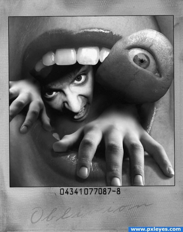
nice work on the eye in the thumb
wow cool
Nice concept.....Well done.....G/L Author.
got to say this is good author. Where do these thoughts emerge?
  (h)
(h)
could be a horror movie poster
Nice!
very nice 
This tongueeye scares me! Pretty strange, creepy and funny picture. Good luck 
very nice!
Great, Good Luck, nice finishing with the eyes., 
Many thanks for all your great comments 

Nice idea!!!
Congratulations for 2nd
Congrats for your second place! This tongue still scares me 
congrats!!
congrats! eyecatching image
Congrats!
Howdie stranger!
If you want to rate this picture or participate in this contest, just:
LOGIN HERE or REGISTER FOR FREE
love this cool
thank you!!!
Beautiful, so peacefully!
Really pretty image, but agree with nishagandhi...don't see much of the source.

EDIT: Author...please don't be offended. You've done nice work here and I DO see where you've used the source. I think the clouds and reflection distract from the source is all. I like what you've done!
nice choose of colors, good luck!
nice that u added another step author..nice work...
like it very much
I'm sorry but i really think that you just covered the image (almost) completely and we don't see the source anymore. Anybody could do this and i really believe that we are here to see and vote some creativity. i don't say that it is not creative, but i don't think that that image you've done is belong in this contest. i wanted to vote ( a low score) but i won't -this time-
I'm not agree with this at all
Very nice work with amazing final product...best of luck author
well, this is your right to vote or not to vote. tastes differ and opinions either. but i want to thank those people who liked my entry! thank you all!!!
But i like your entry!!! It's just the fact that you covered too much the image and i don't see the source anymore. i don't want to upset you, i just said what i have in my mind. Sorry
Howdie stranger!
If you want to rate this picture or participate in this contest, just:
LOGIN HERE or REGISTER FOR FREE