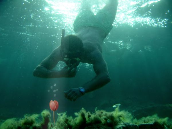
Can you find this on the bottom of the ocean? I don't think so :)
credit to source 1 by "manolo" (5 years and 3650 days ago)
(5 years and 3665 days ago)
Nice! 
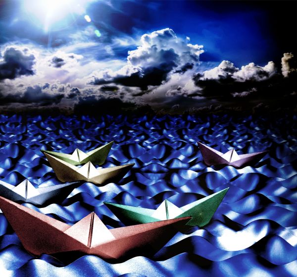
I like this, but given the paper boat and water, imo the sky salightly doesn't fit... maybe if it was a little stylised? well done though
Agree with PixelWhisperer, the boat and the sea need to be realistic or the sky should be turned to the painting-like one.
Thanks for the suggestion. I have changed the sky a bit. Hope it looks better now.
very pretty!!!
Very nice! GL!
nice idea
Howdie stranger!
If you want to rate this picture or participate in this contest, just:
LOGIN HERE or REGISTER FOR FREE
Thanks to Jvr, Clshearin, Cyanocorax, Night_fate, Jakewill, Straymuse & Doc (5 years and 3703 days ago)
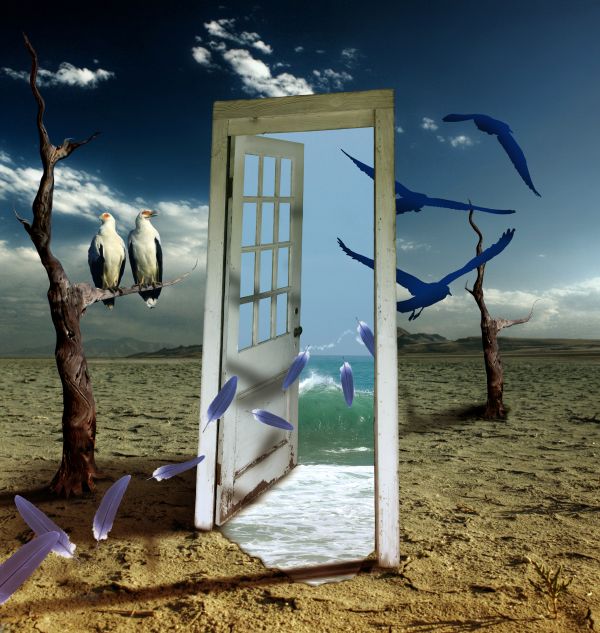
If there's a different place beyond the door, why does it have the same sky & mountain in background?
I am going to sleep over it  Maybe i will change it. It's surreal, so there are no rules...
Big improvement, author...good luck! 

Really love how the shadow is cast from the door frame onto the sand and the feathers are a wonderful touch! Love the birds too! Great! 
Nice, I like this image also, but why are the birds sheading so many feathers ?
It's the feathers blown throw the door that become the birds :-b Don't think to much about the logic, there isn't any 
cool 
Dreamy and surreal! 
XD nice one
Great idea...feathers are to bright and sharp and because of that they look copy/paste
very good work!, looks like a Dali! 
Good image.
congrats 
Congrats clinge on 1st place!! 
Congrats for your first place, Clinge!
Congrats!
Thanks on congrats 
Congratulations on the first place!!! 
hi dude keep it up........nice work ...
Howdie stranger!
If you want to rate this picture or participate in this contest, just:
LOGIN HERE or REGISTER FOR FREE
(5 years and 3769 days ago)
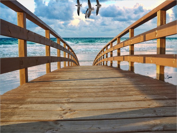
Although the concept is good your masking is a little rough. looks like you used the eraser tool with a soft brush.plus you have left some of the background image (sky) on the bridge. maybe try useing the pentool to mask off areas..good luck 

I tried it and I think the easiest way to mask it is the alpha channel (copy of blue channel), and for the areas where alpha channels don't work, use the pen tool.
i am so new at this i not sure even how to use pen ool to mask so i used background eraser
Click on the bridge layer, then on the mask. With the pen tool click the 4 corners of the square you want to cut out. Right click on your path, make a selection and then fill it with black.
Author, if you don't want to use the pen tool, the polygonal lasso tool works just fine, but play around with both and you'll get the hang of it.
Polygonal lasso is easier probalby, especially if you are just learning. You can do better edgework with it.
leaving aside things that have already been highlighted , this is a lovely image. I look forward to further works from you author especially when you develop more skills.
Howdie stranger!
If you want to rate this picture or participate in this contest, just:
LOGIN HERE or REGISTER FOR FREE
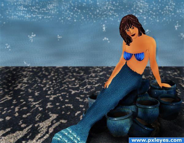
Only used a bubble brush and the given contest photo.
Not real good at drawing yet but did it for fun and practice ;) (5 years and 3836 days ago)
Great image. My only suggestions would be to soften the transition of the shadows under her and a little more under her arm.
Howdie stranger!
If you want to rate this picture or participate in this contest, just:
LOGIN HERE or REGISTER FOR FREE
Very interesting idea... Don't you think source image a bit sharp comparing to the background?
Yup, erikuri has a good point, the flower & bubbles can do with some blur. You also may wanna experiment with a blue-ish photofilter for the flower, so that the colors match better with the background. Good luck!
yes the points above r to think about.. now it looks as if you pasted it.. needs to blend with the rest of the image..
Very very nice work author...
good rework.. its looks better now..
the blend is better now
Howdie stranger!
If you want to rate this picture or participate in this contest, just:
LOGIN HERE or REGISTER FOR FREE