only source image used here and the rest done by hand (5 years and 4027 days ago)

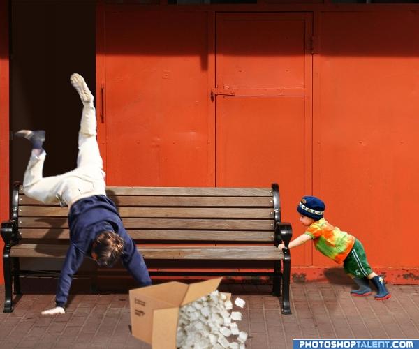
Kids! :-x :-D
Thanks to Mattox on stock.xchng for the picture of the man falling. I notified him.
The other sources are mentioned.
I did a lot of patching up through copy/paste and warping, masking and adjusting layer blending options.
I think the little boy looks a bit flat. Any suggestions on how to fix that?
I hope you like it. I had fun making it... (5 years and 4034 days ago)
very cute and you should have added a humor bar.. the boy is so strong that his little feet look like they are going into the cement.. I'm going to let the techs have at to help you with shading/realism.. I don't want to mess you up because my methods are a bit radical, but you arranged the humor quite well.. good luck author
Haha  (although it's dangerous of course
  ). Good pick of sources and well constructed. I'd give the edges of the box a slight blur and do womething different with the shadows from the man and kid (light comes from up, so you'd see shadow down). Good luck!
Good Idea and funny-- falling man seems a bit blurry compared to the source and the boy and the shadows need to be corrected
Thank you so much for the advice. I did some adjustments. I hope the shadows look better now. As for the blurry man falling. I thought I'd add some motion blur to make it look like he's falling? That's ok right or not? Thanks again! 
@GolemAura I thought I added a humor bar. I can't tell, since I can't vote for my own image and I can't add any bars when I go to edit the entry? Please let me know how to do that or whether you just missed the bar? Thanks 
Shadow for the man is way way better! Shadow for the kiddie is already better in that way that right now it looks more clean, it's just that the sun is in mid front but then a tiny bit to the left, while right now the kiddie's shadow looks like the sun came from front right. But looks already way better! Btw I already saw the humor bar the first time I saw this image, is all ok!  Good luck!
@wazowski I'm confused...  I wish someone could direct me to a tutorial on shadows. Or you know what I'll just have a look around. I really want to learn how to do it right and of course with as little effort as possible...Thanks for the great advice though.
  Like I said I'm gonna do my best to improve the image...
Ok, I really hope the shadows are ok now... thanks for commenting and voting...
NOW THATS FUNNY.. brings back a flash back. lol
thats funnnny lmao, i would love to have seen it happen hehehehehe
LOL...Cute Idea and Good Luck
Author, I have to admit that in the original source, the shadow is not easy to locate, but I do think that the way it is now for the boy is a real good improvement!  Good luck!
Thanks for the comments everyone... @OliviaArts I wish I could have warned him... And thanks wazowski I learned quite a bit about shadows doing this...thanks for your help!
good work
lol good job authur
I would lose the box and the dude. The child is effective on his own.I would trim the dark line from around the front of his face too.
That is hilarious. good work. the image could be cleaned up alot.
haha, how so cute, nice entry, good luck
Good idea
Howdie stranger!
If you want to rate this picture or participate in this contest, just:
LOGIN HERE or REGISTER FOR FREE
nice!
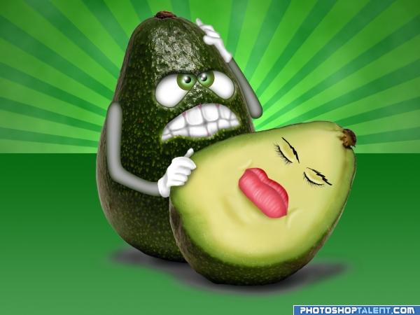
HEY!!! whats with the avacodos in trouble... LOL..we got a fetus, a broken egg, a murder victim..and now a dead guy???.. hehehee.. we got get them all together and write a story book..hehehe.. (Great Add on Author.. very very cute..the expressive face is AWESOME)
lool , , it is a tragic contest .... thank you for comments
Fun image! Why is the one avocado a 3D figure and the other just a few sketch lines?
nice and funny one .. GOOD LUCK
Fun stuff nice work on the 3D...would keep one style or the other thay don't really work together.....
great!! agree with cmyk would be nice if the other was also 3d
hahaha. very funy
funny image
thank to all commenter , and as CMYK suggested , , i re edit the other peice too ,,,
funny. nice work
awwww noooo

 love it
Nice, his teeth and mouth could use some depth.
Nice work
very nice
Howdie stranger!
If you want to rate this picture or participate in this contest, just:
LOGIN HERE or REGISTER FOR FREE