(5 years and 3156 days ago)

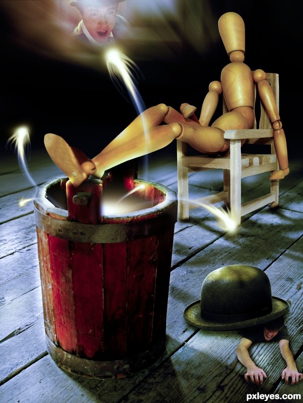
Used Illustrator and Photoshop
As guidelines used also these 2 tuts:
1. http://www.gomediazine.com/tutorials/photoshop/retro-modernist-poster-design-3d-typography/
2. http://designinstruct.com/graphic-design/make-a-retro-space-typography-poster-with-colorful-lights/
(5 years and 3166 days ago)
That looks fantastic author!
The cloud render is a bit too high contrast, it detracts from the cool "paper textures," but a nice effort!
nice work gl author..!!
great work author
Very fun image, love the ai and ps combination of effects.
Many thanks to all for the comments and favs 
Congrats 
congrats...
Howdie stranger!
If you want to rate this picture or participate in this contest, just:
LOGIN HERE or REGISTER FOR FREE
(5 years and 3168 days ago)
Howdie stranger!
If you want to rate this picture or participate in this contest, just:
LOGIN HERE or REGISTER FOR FREE
(5 years and 3182 days ago)
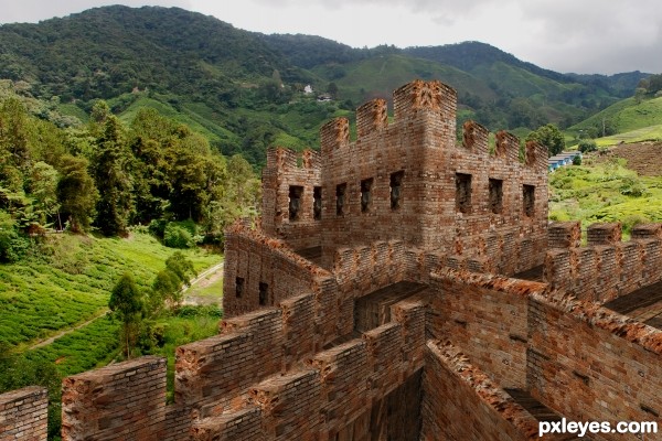
Good effort, but looks kinda like Legos.
Nice but IMHO you need to blend all the elements each other, looks a little forced now, GL!
Howdie stranger!
If you want to rate this picture or participate in this contest, just:
LOGIN HERE or REGISTER FOR FREE
thanks to the following for STOCK PHOTOS:
EquineStockimages D'art
for birds.
Falln: D'art for stock and brushes.
Goblin Stock D'art
Kuoma Stock D'art (5 years and 3188 days ago)
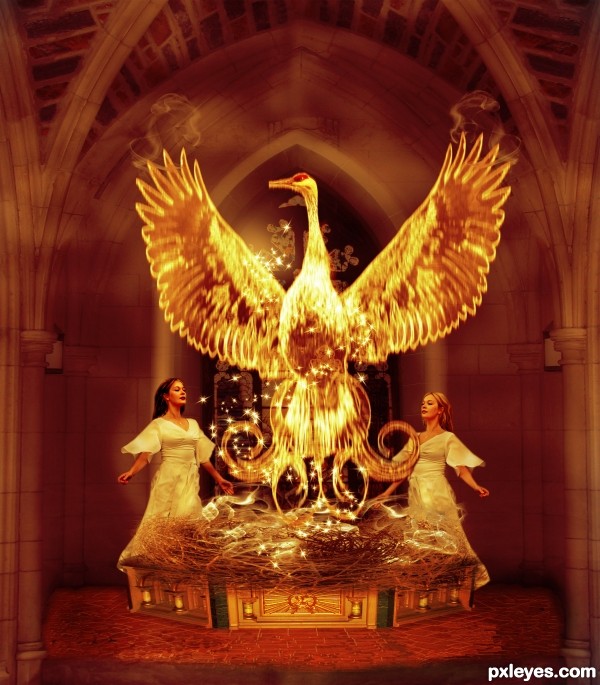
You have made a very complex image here and I see what you are trying to achieve.
IMO there are a few things that need to be corrected if you have the time.
The masking/cutout of the lady on the left could use some refining (if you can try using layer mask they can help refine the cut). The floor is a little too Cloned looking, you could try to use the cut and paste-over in small section, then position the bricks so they line up (which takes a fair bit of time) or try to get a full brick floor. The base could use a bit of perspective fixing ... the sides are slopping out a bit too much, I would say the upper-far corners could be moved in toward the center of the image a bit (using the Transform tool and hold down the Ctrl key to Free Transform individual corners). You can also see through the left hand side of the base at the back just in front of the lady (a quick way to fix this is just to duplicate the layer until it becomes solid and then merge the layers together). I know this is a lot but your idea is very nice and I believe you are headed in the right direction. If you have any questions just PM me 
THanks VERY VERY MUCH !!! it is through this type of feed back one can grow . I wont have time to fix.  but i will take on board your tips for next time...
Howdie stranger!
If you want to rate this picture or participate in this contest, just:
LOGIN HERE or REGISTER FOR FREE
nice work but it looks new one frnd
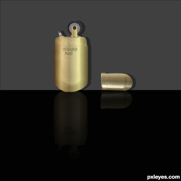
The cap is too angular, and looks more like a lipstick case than the top of the lighter. Other than that, you've done a very good job of colorization and artifact removal, the brass looks good.
Thanks all I changed title and fixed cap.
The cap would not be standing on edge.
Thanks CMYK46 Your right its laying against the wall

Note...CMYK46 tHE SHADOWS WERE BLURED
Blur the shadows and you'll be OK.
Nice try author! Best of luck!
Howdie stranger!
If you want to rate this picture or participate in this contest, just:
LOGIN HERE or REGISTER FOR FREE