(5 years and 3274 days ago)
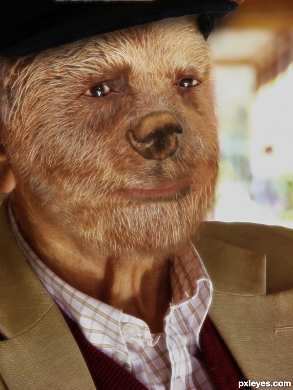
Thanks a lot to:
bear:
http://www.sxc.hu/profile/salsoul
old man:
http://www.sxc.hu/profile/pepo
(5 years and 3285 days ago)
Espetacular! Parabens.
cool work...gl
Howdie stranger!
If you want to rate this picture or participate in this contest, just:
LOGIN HERE or REGISTER FOR FREE
(5 years and 3307 days ago)
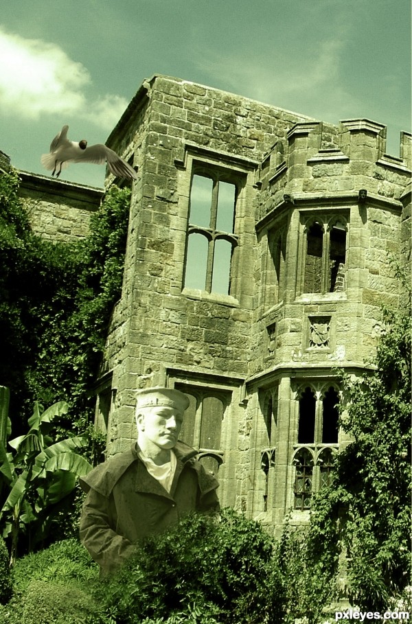
author this is nice image but demand a bit more work...Try to blend elements a bit better...watching your image u could achieve that using some color layers....First, on top of all layers create dark brown layer, blend mode set to color with opacity in between 20-40%. Then create golden layer with similar settings and on top of that dark green layer with blend mode set to soft light around 15-30%...Just an idea...GL
Nice job of choosing the right sources for the coat and direction of the light. I noticed that you added eyes to the statue. Thats fine but the hat on the guy doesn't pass as anything other than a statue. You can probly get away with the skin, but I would suggest putting a real hat on him.
Howdie stranger!
If you want to rate this picture or participate in this contest, just:
LOGIN HERE or REGISTER FOR FREE
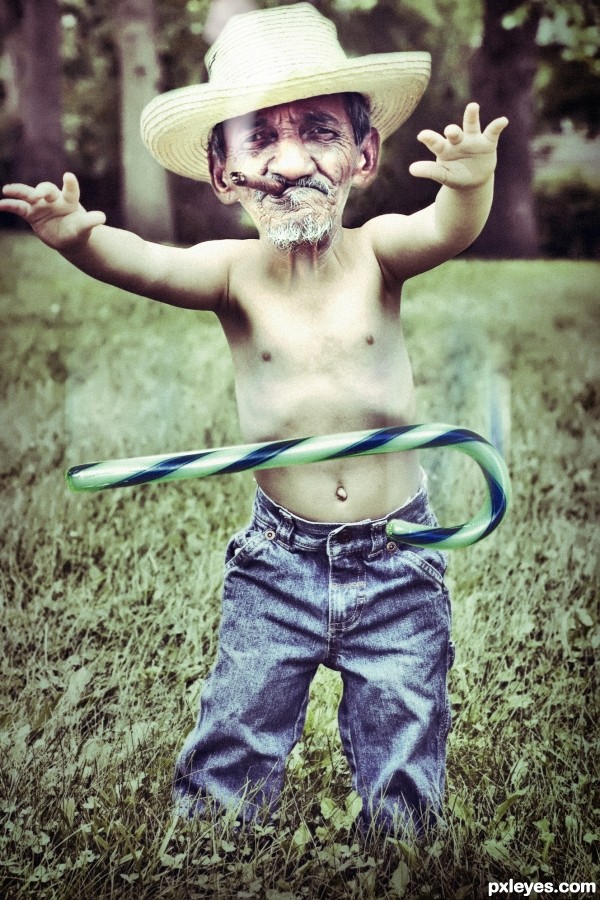
"I think he no longer needs"
(5 years and 3323 days ago)
this entry is fantastic...blend is perfect,here is a touch of humor,very important in this contest...well done author
Howdie stranger!
If you want to rate this picture or participate in this contest, just:
LOGIN HERE or REGISTER FOR FREE

(5 years and 3324 days ago)
Nice work, author. There is a strange edge in the hair by the way  Also try to match the color of the face and the body and it will be a top work! Holding vote for now
you have a little "DEBRIS" near the pink bow that needs fixing.. other then that, it's an adorable (But in all honesty.. there is something disturbing about everyone of these entries.. LOL.. but not a negative.. just so weird LOL)
Good Hard work by the way.. LOL
The lighting on the face, which is full on, does not match the lighting on the baby, which is from the right...
cool
very very cool work...gl author
thanks
the color of the face doesn't match the babies body other wise nice entry
Howdie stranger!
If you want to rate this picture or participate in this contest, just:
LOGIN HERE or REGISTER FOR FREE
Really nice idea!
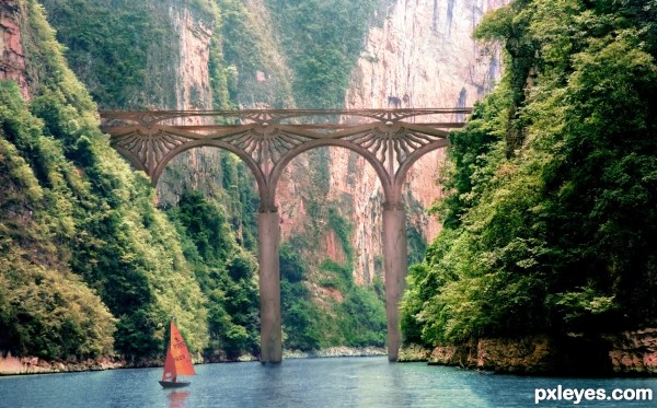
Beautiful concept, but the support beam on the left doesn't look like it goes all the way down to the bottom, much less down into it...
Also, the shoreline on the left has a very dark line of demarcation where it meets the water. Needs a bit of tweaking, but it's still some good work!
i disagree with you MossyB

1. the support column is in the perspective to where the bridge goes
2.the shoreline is not manipulated in any tweaking manner (check the source) the dark line is original
edit: ok darker reflections , lowered the column a bit , not changing the photo
Very good idea, but Mossy is right, and the reflections could be a bit darker. Still, good work.
Nice construction. You could overlay a bit of or red & gold for a better blend, and to make bridge stand out, by contrast.
Another thing that would really help is human scale, either people walking on the bridge or a small boat in the foreground. That would make the viewer better perceive the dimensions of the bridge.
very beautiful!
Very nice, GL!
Very cool work author...best of luck
Howdie stranger!
If you want to rate this picture or participate in this contest, just:
LOGIN HERE or REGISTER FOR FREE