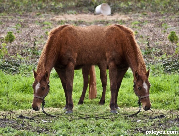
Spec Thanks to mqtrf for use of horse picture found in member stock on pxleyes.com mqtrf is a member of pxleyes (5 years and 3615 days ago)
- 1: source1
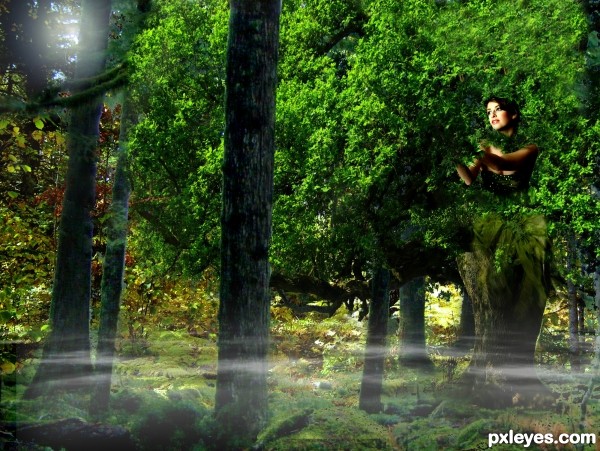
One with Nature and everything around you. (5 years and 3620 days ago)
NIce
Interesting concept 
cool idea
Howdie stranger!
If you want to rate this picture or participate in this contest, just:
LOGIN HERE or REGISTER FOR FREE
Plot:
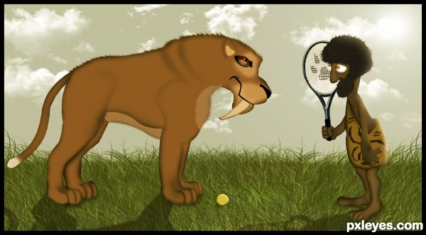
Caveman Wounded Hamster was very happy in the new world. He did not know how it got there… One day he was walking in the woods looking for wild Mahaku cattle, when he noticed an unusual light in one part of the forest. He was looking at the great and beautiful light, and he decided to step into it. Immediately he’s began to spin in all directions until the moment he felt solid ground beneath.
At first he thought that the evil forces led him to this horrible place, filled with the worst of wonders ,loud noises , big towers, and birds made of steel, but every day he is more liked this new world. One day he discovered the game in which he learned that call it tennis, enjoy every day playing this magical game, his backhand and forehand was better as time passing, and drop shot was perfect, but his instinct of a hunter was weaker and weaker. Everything was fine until the moment when he’s realized that he is not only passed through the illuminated portal ....
Mila Vasileva-http://milavasileva.deviantart.com/
For making this entry i used only custom brushes for clouds, everything else is made with pure Photoshop...Please watch high resolution before voting...Thanks
(5 years and 3626 days ago)
Very nice job on the drawing here! The only reason I deduct points here is because it's pretty much ONLY drawing...a mix of both photo just seems to fit the theme of a photoshop contest over, say, a drawing contest. But the image is still great...good luck!
You could write and illustrate a book! It's so amazing, I'm waiting for the end of the story!... 
While I think this is very cute and probably on theme, I agree with gamemastertips that a mix incorporating a photo would be nice — but clearly not required by the contest description. Additionally, I think the description is overdone (and largely inexplicable relative to the image). Just like you shouldn't have to explain a joke, you shouldn't have to explain an image beyond its title.
Nice attempt and almost good result..., I suggest you to paint with spatter or charcol brush to make it more impressive (think it will help you in the future). and also have time for adding lights too.., good luck
I think it's quite cute and very well done 
Thanks for the comments guys...
@Erica and Ernest,thanks my friends for the kind words...
@Gamemastertips and Dan,i agree guys about drawing, i am with u 100%,i had post on forum about digital drawing in photoshop contests,and everybody Mods and lots and lots of users sad that is allowed so i made my decision to try,to learn some new technique's...
@Anoop thanks for the tip my friend about the brushes but "almost good result" is not very nice thing to say...
Nice drawing  . Keep going.

Dear friend please don't take my early comment as offencive, I found the Figure extremely well done.., but don't you think that details for the characters are missing?, 'Almost Good' Is because of that.., sorry if i hurt you.. 
very nice
Very nicely drawn, my fav so far! well done author!
extreemely awesome1
Very cute and funny, good drawing also.. thou I do agree about the picture part. I can't make myself to give very high vote as this isn't a digital drawing contest, sorry for that. (I like the pawn figure on the racket a lot btw..)
great, funny, original (tennis racket, hahhahah)...i can only agree with Tuckinator - extremely awesome!  I'm giving it a very high vote! Well done! You absolutely nailed the topic!
Love the big cat 
Neb, congrats! And the end of the story? 
Congratulations...funny work!!!
Congrats!
Congrats! for 3rd. Your drawing skills are getting better and better  . Keep up good work
congrats
congrats, erathion! one of my favourite entries ever! 
Congrats!!
Howdie stranger!
If you want to rate this picture or participate in this contest, just:
LOGIN HERE or REGISTER FOR FREE
(5 years and 3633 days ago)
Whoa, the baby has a bat nose! 
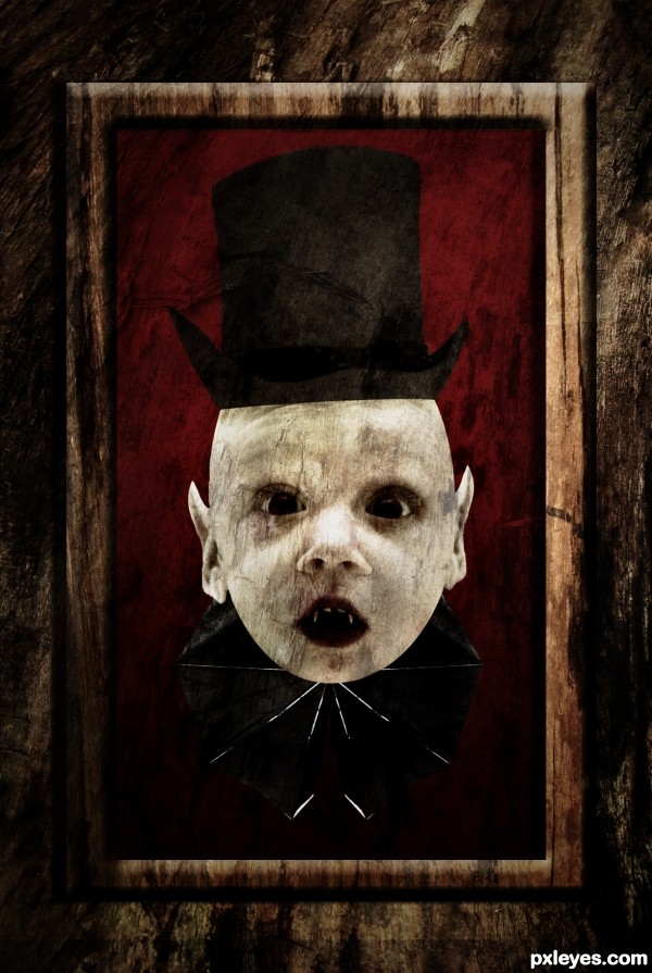
It needs a slight shading between hat and head.
Background is too dark. At first glance the kid is missing the top of his head, and the wings don't stand out. IMO real wings would work better.
Oupss.. 
I forgot to shade it I'll shade it now.
to CMYK: 1-Yes the background looks darker when I uploaded it.
On P.S it wasn't dark. (I'll fix it)
2- I can't understand the part of the missing head 
3- IMO I like these wings 
Ohhh about the wings I don't want it to be wings I want it to look like if he's wearing it (Type of cloth)
Yes I know, I just called them wings because that's what they are in your source pic. Don't you think the hat is a bit too small and too dark compared to the source? The background is better now. 
Yes you are right. 
I've adjusted the size of the hat in Photoshop, used burn dodge tool and then used the liquify tool
I forgot to mention it in the SBS. 
Very disturbing, but appropriately so.  The head is outstanding, but I'm guessing the little notch on the left side is an extraction error and not a deformity. Quibbles: I appreciate that the hat and collar are just kitschy add-ons, but I think the bottom edge of the hat should either be a totally straight line or else curved at both sides (not curved on one side and straight on the other). [BTW choosing two curved sides would also suggest some curve in the middle would be appropriate to convey a further hint of realism.] Finally, a Victorian picture frame around it all accompanied by a title such as "Our Little Darling" would convey a more complete and compelling story IMO.
nice idea...good job on the ears but the vampire needs a body
Wowwwww Thanks a lot for the suggestions I really appreciate it 
I'm working now on the image and I'll update it soon.
Any other suggestions are welcome.
Updated hope it is better now.
Waiting for other suggestions 
I like this surreal kid vampire...good luck author...
wow, very different now cool
Thanks everyone 
great!
Awesome! The assymetric hat (top edge and brim) really adds character. (More contrast between the two frame levels might be warranted, however.)
Done 
I think you were probably taking on a more artistic approach so I can understand the distortion and so I don't think it really matters in this case so GL.
Howdie stranger!
If you want to rate this picture or participate in this contest, just:
LOGIN HERE or REGISTER FOR FREE
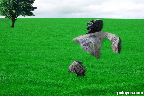
Stone Elemental-The Fallen One (5 years and 3634 days ago)
Very good idea, but the execution needs a lot of work. Without the title I wouldn't know what is going on. You need to make the profile more clear.. maybe try to find some human source with a nice position like this and then use it as a guide or skin it with different blend modes with the rock layer. Seeing a raised hand or some fingers or something would help ppl to identify this as a human form. (I'm assuming it's a human form golem/elemental) .. (As an epic level AD&D player I should be able to recognize one, after all  )
)
Yes i know ...but i want to be like this even if i will be on the last place ..I want-it like this >nothing is perfect .And u don't need to know what is going on because its just an work for -10 LVL .
If you don't care, why did you even enter? Honestly I think that's a little insulting to other member's entries who are trying and DO care.
Howdie stranger!
If you want to rate this picture or participate in this contest, just:
LOGIN HERE or REGISTER FOR FREE
A bit too obvious of mirroring the image...

You should adjust more things with the clone tool, or add more object too the scene..
Gl author
Thanks Nickk It's one of those thing's your like ????
Siamese horses! You could have made it only with the head, as said in title.
Sorry?
I think you meant "two", not "to"
Hey Thanks I looked at what you were talking about and I'm like how did I miss that. It don't pay to rush....
Howdie stranger!
If you want to rate this picture or participate in this contest, just:
LOGIN HERE or REGISTER FOR FREE