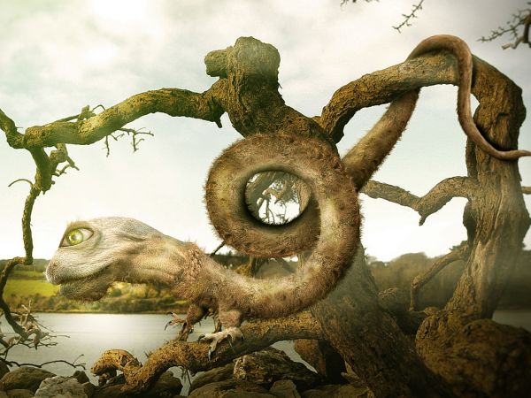
(5 years and 3725 days ago)
- 1: Thanks to vinnyio
- 2: Claws
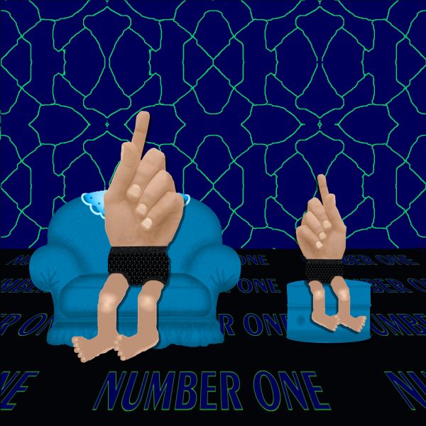
no outside sources used (5 years and 3734 days ago)
It's seems a little 2-dimentional
Why the silly floor and wall?
I agree with both comment, but nice attempt.
Howdie stranger!
If you want to rate this picture or participate in this contest, just:
LOGIN HERE or REGISTER FOR FREE
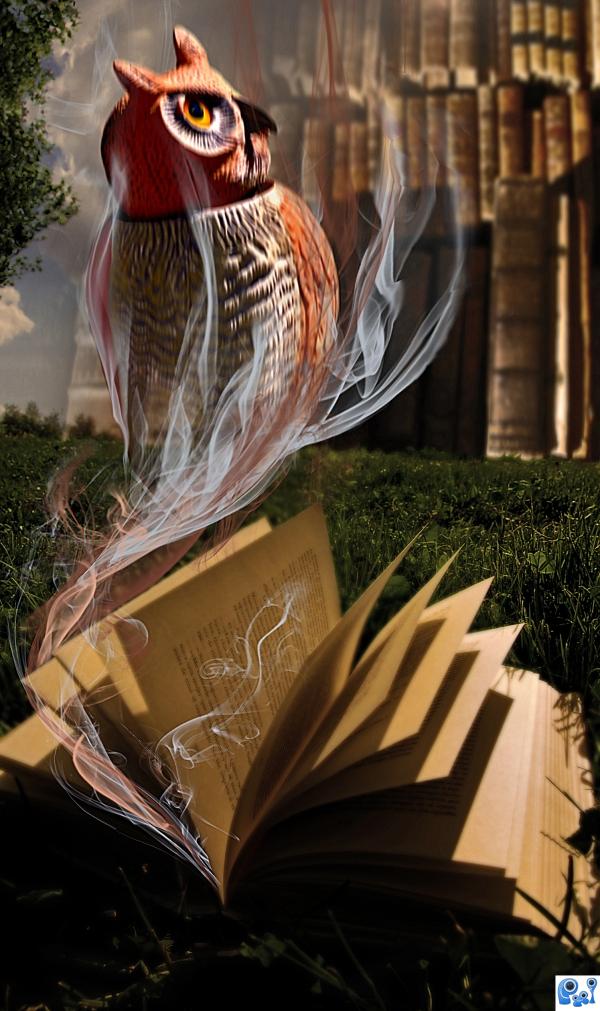
(5 years and 3780 days ago)
Very nice idea, the image is a bit blurry, other than that - great job!!
thanks ponti, I sharpened it a bit!
Very interesting idea!
Great work! 
Light on book is from upper left. Light on owl is opposite...owl is still blurry.
Play with sharp filter and tool a bit...I love idea..gl author...
The idea was that since the owl is 'smoking' out of the book, it can not be sharp, so I applied the motion blur to it!
Very cool.
The URL for smoke brushes is: http://nowdownloadall.com/servers.asp?pb=4&PID=ad188885-f0de-4cf1-a513-22bebf2bce5b&q=Smoke_Brushes_Set_1_by_Falln_Stock.abr
Howdie stranger!
If you want to rate this picture or participate in this contest, just:
LOGIN HERE or REGISTER FOR FREE
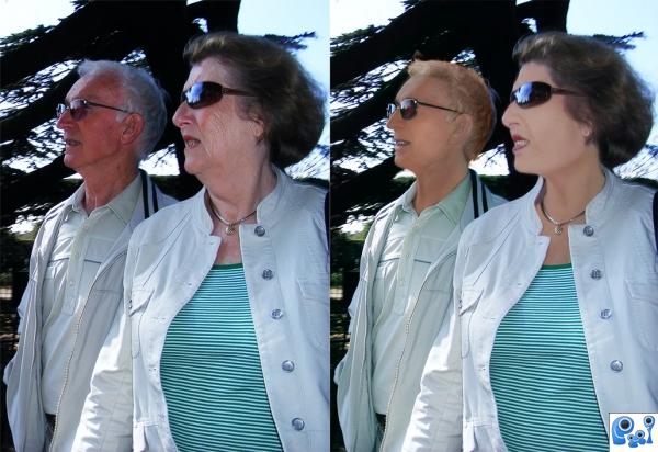
source of baby skin is my own picture (5 years and 3795 days ago)
Not bad, try to darken the skin up some so they don't look quite so pale.
Thank you Anjii, I fixed, darkened faces, indeed it is better now. 
It still looks a little too painted on, especially the woman.
their faces look like they're really well painted. which is not necessarily a good thing 
they look so California
too much.......make up on the lady
a challenging task author. GL
nice 
Howdie stranger!
If you want to rate this picture or participate in this contest, just:
LOGIN HERE or REGISTER FOR FREE
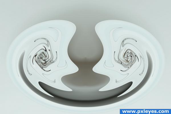
Polar Coordinates only (5 years and 3800 days ago)
It doesn't look like you did much more than polarize it a few times in a row. I know it makes a neat effect but it's just a little simple in my own opinion.
Thank you for your comment jawshoewhah. However, I wasn't aware that for an entry to be considered worthwhile had to be something complex that takes many steps and a lot of time to complete. No matter how simple an entry might be, I would hope the final image would be judged not by how many or few step were involved in creating it, but how well the final product looks. If my final image isn't interesting enough in its' own right, I can understand that, but not because of how simple it was to create. Thanks again for your critique.
Visually, this is an artistic creation. the swirls and curves are fun. Maybe to make the source more visual you could have used it as the background where the cracks were more visible. However, note that is only a personal opinion. GL
Thank you scratzilla1 for your comment. Being somewhat new to photoshop manipulation, I'm still learning alot. Good suggestion on using the source as the background. Cheers!
nice 
Howdie stranger!
If you want to rate this picture or participate in this contest, just:
LOGIN HERE or REGISTER FOR FREE
nice work!
Fantastic mood, and a very surreal creation. Great job.
This is very nice work...where is the source link for the eye...?
very nice
Very Nice work.....Good Luck Author.
Congratulations for 2nd
congrats on 2nd fantastic!
Congrats for your second place, Jaskier!
Gongrats on your second place jaskier
congrats!!!!!!!!!
Thanks for Your comments and votes.
Howdie stranger!
If you want to rate this picture or participate in this contest, just:
LOGIN HERE or REGISTER FOR FREE