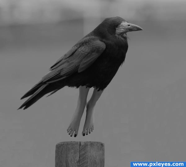
tried to keep this one simple
did alot of squinting...( hence the picture)....lol (5 years and 3803 days ago)
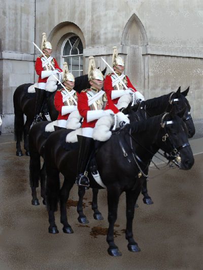
There are sources for this project (5 years and 3836 days ago)
It would of been nice to see a high resolution.
try to get rid of those repetative patterns
Howdie stranger!
If you want to rate this picture or participate in this contest, just:
LOGIN HERE or REGISTER FOR FREE
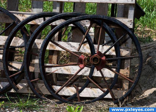
all from the source image, I extract the wheel from the pic. Duplicate it into couple of layers, making "spiral wheel" by masking each wheel layer. Finished with applying find edges filter+blending mode color burn+brightness and contrast adjusment.. (have problem to clean up the background and placing the "spiral wheel" shadow) (5 years and 3845 days ago)
Nice idea... might want to consider just having the one broken wheel... the others are distracting and hard to look at. g/l
Pretty cool  . And I think it's meant to be a bit hard to look at, woodztockr. Good luck!
this image really plays tricks with your eyes
Howdie stranger!
If you want to rate this picture or participate in this contest, just:
LOGIN HERE or REGISTER FOR FREE

Oh yes this is a Tourist Ship as well but they collect unique souvenirs, the bi-pedal hominid kind...and of course the occasional cow. (5 years and 3847 days ago)
rock on! This is an awesome image.bravo!
nicely done
Great spaceship!
very nice
Nice job...maybe the ship should have some lights...?
cool!
Thanks for the comments! I felt adding lights would be too cliche' CMYK46, There are lights on the ground and in the sky, more would just get too busy. Besides we never...I mean THEY never run with lights when collecting specimens.
Ahhh...of course! 
nice work!
love your entry author. the balance of colours and the use of source is great.
That is diferent concept!! now the ship can fly!! good idea author!! GL
nice job! the lights on the ground seem a bit big but it looks great overall
And also congrats for your third place!
Congratulations for 3rd too
Nice show this week congrats!
Congrats!!!
Congrats!, creative
congrats
Thank you all! Much appreciated!
congrats
Howdie stranger!
If you want to rate this picture or participate in this contest, just:
LOGIN HERE or REGISTER FOR FREE
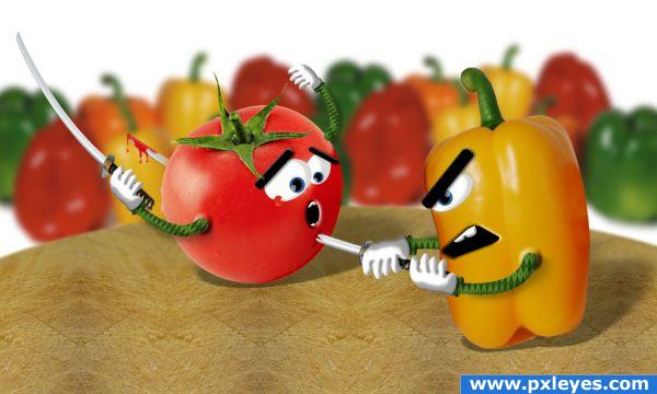
From a culinary standpoint tomatoes and bell peppers are vegetables. It also approve in the US supreme court. hehehe.
sbs comming soon.
hope you like it.
(5 years and 3851 days ago)
Great drawing author! Poor tomatoo he's ready for a salad now
cool
First of all....High Marks cos you've made this without complaining about the contest, also the image is Kick Ass......... Well Done.....Mate 
@akassa its okay... it's just stage play hehe @rich ty i research it before i use it.
Poor tomato  but nice entry
absolutely awesome *clap*
great!
Nicely executed... lol.. great image and drawing of facial expression! 
Wonderful! These veggies would make a great animated cartoon.
Nice!!
very fuuny idea.and good work.gl
Oh no  What a poor tomato... I can just ditto the others: You did a very good job with their face expressions. I think I'll adopt a tomato now. I want to save at least one
  Good luck!
I like this one!
good job
Nicely done.......Good Luck Author.
Congrats for your second place, don!
Congratulations for 2nd
Congrats!
Congrats!!
sorry too busy did not make it to create sbs. and we are flooded too. anyways i will make one next time. thanks for your great comments
Howdie stranger!
If you want to rate this picture or participate in this contest, just:
LOGIN HERE or REGISTER FOR FREE
LOL...crow's feet...good one!
Loves the feet!
Perfection
Legs are not blend very wll.Try to blur them a bit and warp them.Then u gonna have right perspective...
Nice idea...like the greyscale too.
Congrats
this is so cool
Howdie stranger!
If you want to rate this picture or participate in this contest, just:
LOGIN HERE or REGISTER FOR FREE