
Source only. Made some additions. Tattoo translation..."Sexy". Please see high resolution. Thanks. (5 years and 3955 days ago)
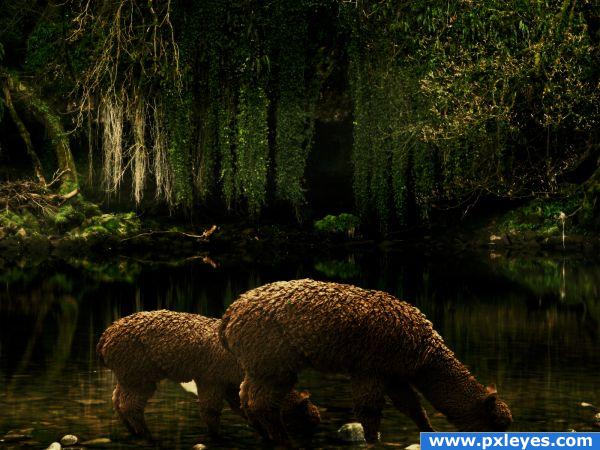
Just a simple manipulation, thats why I did'nt make any SBS.
(5 years and 3957 days ago)
so calm and peaceful!nice use of source
Great use of source, a very calm image. Good luck 
Nice image, indeed...but I think you might have missed some masking where the leg and body meet on the small alpaca. 
Missed masking, hmmmm... I compared the contest source, the outer source and the entry... I think that is not missed masking rather the reflection of the rock of the outer source... I matched the position and shape of the reflection with the supposedly missed masking and it matches... So no missed masking... But author should clarify...
(Guess I had nothing better to do lol)... 
great
Yeah, Addie is right...its not miss masking. Its a reflection of a rock. Chk...out the background source...pixelkid
very nice, calm and peaceful, like it very much.
Very nice! Regardless of whether or not that is a reflection, it's very distracting and would only take a few seconds to clone out. It would definitely help prevent confusion in what is otherwise a well-done manipulation.
Congrats for your second place!
Howdie stranger!
If you want to rate this picture or participate in this contest, just:
LOGIN HERE or REGISTER FOR FREE
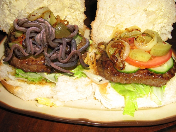
the source came from: http://www.sxc.hu/photo/330137 Uploaded by
dkcandle (5 years and 3961 days ago)
Yum... I just love worms on my burger! The lighting on the worms doesn't match the burger though.
nice support. fixed!
urp...  (great blending of two TOTALLY different feels.. though I would have reversed them so it would go from Yum to Hurl.. instead of HURL to "oh I just don't have an appetite anymore LOL)
omg ewww gross!!! I just knew someone was gonna do that to my burgers lmao XD burgers anyone?
Warm up the color of the worms and this will fit better. Nice blending. 
The one on the left has more protein!
Great job making this look real...high vote on the concept & the chop.
Tasty! great pic!
I think I just threw up in my mouth a little! YUCK!
Definitely the right one  Good blending! Looks in a disgusting way very convincing
  Good luck!
Congrats for your first place!
Congratulations for 1st
Congrats, yuk, this is so gross, well done 
Congrats, HavingFun!
ewww congrats
Congrats!
Congrats for 1st 
Congrats!
Howdie stranger!
If you want to rate this picture or participate in this contest, just:
LOGIN HERE or REGISTER FOR FREE
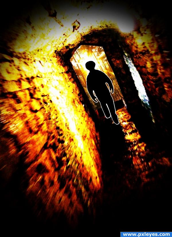
i hope to soon escape this dark tunnel and escape to my paradise, the light at the end of my tunnel. i used all my own pictures. (5 years and 3972 days ago)
Great idea, maybe your dark tunnel could be a bit more gloomy, in contrast to your paradise.
Great ideea... i like the firey colors but you messed up a little with the highlights
I like it!
There's no depth...foreground & background color are the same...and the outline on the figure makes it look too cartoony.
The tunnel is a little bright, but I like the movement on the walls. I don't really like the border around the figure, either.
thanks for all the advice. can i just add that this is my first post. ill bear all of these things in mind for my next attempt on one of these contests.
Howdie stranger!
If you want to rate this picture or participate in this contest, just:
LOGIN HERE or REGISTER FOR FREE
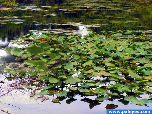
my pictures merged with source (5 years and 3996 days ago)
good perspective change, but the main captivating point of your image is almost impossible to notice. Good luck though! The slug looks great on high res, just a bit small to see on here.
I think the title change helps, you are right ponti55, thanks
Addition looks out of scale...
hehe i like this is clever picture! if you care, then in this moment i see source frame in the middle of your picture, and maybe i would try to give for source flora same sharp like you did it with your own picture, and that lonly animal is great! still, if you care!  cheers!
hehehe thanks fille.. let me see..
guess what fille.. I SUCK at working with green, I did a little to it (darken the outer leaves, but My eyes can't focus on green.. I'm going to have to get checked for color blindness again, crud, but thanks for the comments
lol... that blue slug sure looks damn lonely lol...
author, here is nothing green, this is totally red! 
hehehe all red.. you are a goof ball LOL
cool image author the lillies are cool too im just not completely sure about it though
never mind the colour.... i will get the glasses out to see the bug... damm old age... nice entry author GL
Howdie stranger!
If you want to rate this picture or participate in this contest, just:
LOGIN HERE or REGISTER FOR FREE
Oh fantastic lol! so funny! well done!
bhahahahahahah
Clever, very clever... you should have put the humor bar in! I love it!
Way too funny...great idea! Vignette's a bit dark but still works...
So so funny!
Awesome! Still laughing.... keep up the good work!
very cute
Superb..nice humor
very pretty............
im still cracking up over the expression of the lady in the red/pink
OMG ,this ones so funny.the face expressions are mindblowing.
Thanks for all comments. CMYK: Took your advice...lightened vignette...looks better.
nice!
oh man thats brilliant... i love all the eyes looking at her.... hahahaha
Ohh man this is amazing. excellent Idea.
*lol* Great! The expressions and the whole idea are amazing
  Good luck!
cuz i havent said this twice already... this is STILL cracking me up.
Love it!!
that's hillarious, can't believe what I see. This is sooooo great, good luck!
very great work.. love it
Fantastic.
ahahahahahahahahaaaaaaaaaaaaaa!!!!!!!!!!!!!!
I knew it, I knew it, I knew it! *sing a little* Congrats!
Congrats Space, this is so funny
congrats
Hehe...Congrats!
Great Job! Congrats.
Great entry, congrats!
Congratulations

congratulations, a true winner!
Howdie stranger!
If you want to rate this picture or participate in this contest, just:
LOGIN HERE or REGISTER FOR FREE