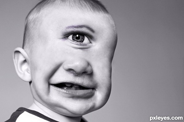
Cyclops child...Check. (5 years and 3100 days ago)
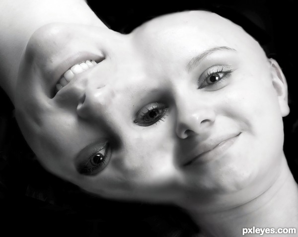
Just made it within 20 min , Hope you guys like it. (5 years and 3110 days ago)
Good idea...execution seems a bit rushed, but the concept is good. 
Ya, i was in little rush while making this thanks 
Neat, though. 
good idea, good luck
Thanks 
Howdie stranger!
If you want to rate this picture or participate in this contest, just:
LOGIN HERE or REGISTER FOR FREE
(5 years and 3118 days ago)
I don't see any comments but I see 305 votes and over 1000 views.....I guess something go wrong !
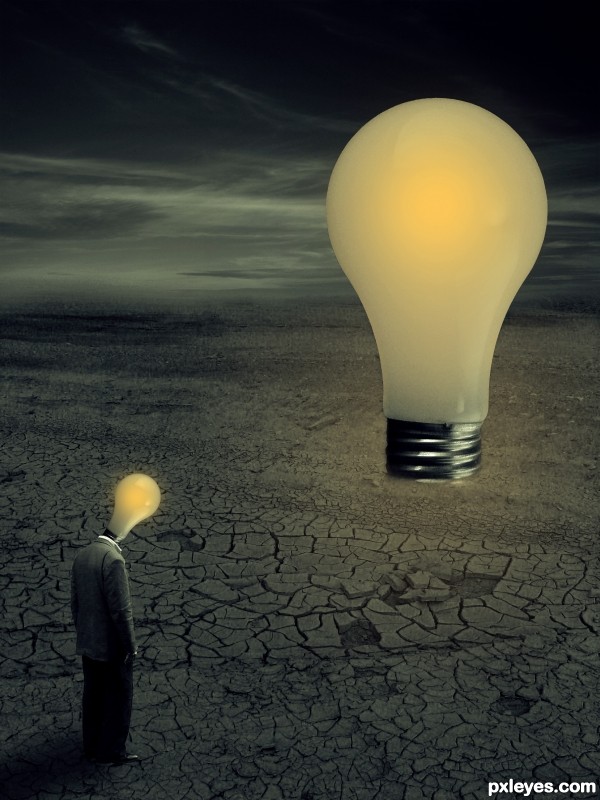
Very nice concept ... I would blend the left side base of the larger bulb a bit more it just looks very cut and 1 dimensional ... and maybe adjust the perspective of the smaller head bulb it just looks a bit off needs to tilt inward to the left a bit more ... the blend from desert to sky is very nice ...
the lamp on the guys neck is kinda out of perspective other then that i like the entry
I like the angle of the lamp on the guy's neck. Don't change that. Try to make the big bulb look like it's really anchored in the ground. In my experience, if you don't get comments that are either positive or negative, your entry doesn't suck, and that's probably a good thing. 
I might have suggested making a glow around the big bulb, but that's up to you.
Thank you for your comments...much appreciated ! I will try to make changes today...hopr to have time  )
)
Howdie stranger!
If you want to rate this picture or participate in this contest, just:
LOGIN HERE or REGISTER FOR FREE
(5 years and 3127 days ago)
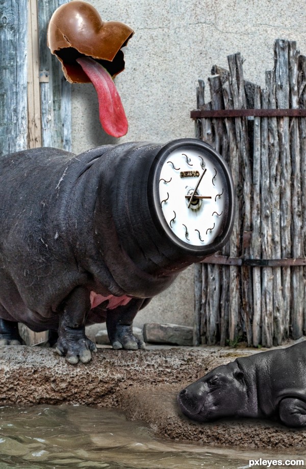
Nice surreal image. The blending of the little hippo could be a little better. I think the lower edge should be softened.
thanks dusty! got it
Howdie stranger!
If you want to rate this picture or participate in this contest, just:
LOGIN HERE or REGISTER FOR FREE
(5 years and 3169 days ago)
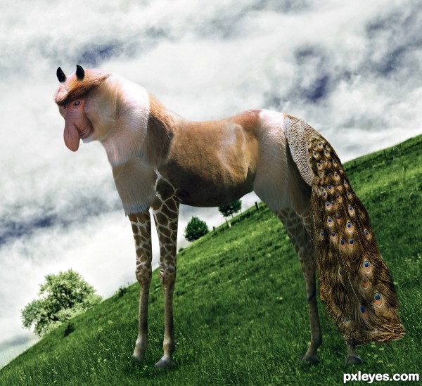
Skewing the horizon of the source pic even more doesn't work.
The crooked horizon makes the positioning of the animal look really weird.
It would also look better if either the entire thing was spotted like the legs, or the legs were unspotted to match the rest of the animal for visual consistency.
The weird horizon adds to the weird creature. I like it. Good luck 
Howdie stranger!
If you want to rate this picture or participate in this contest, just:
LOGIN HERE or REGISTER FOR FREE
this is a great pic, however i dont see how this relates to the contest subject. the mouth has just stayed the same and instead u changed the eyes.
this is a great pic, however i dont see how this relates to the contest subject. the mouth has just stayed the same and instead u changed the eyes.
Maybe move the eye down a bit, it seems a bit high on the forehead IMO. Good luck author!
The mouth did change, check the SBS for that. And I would argue that eyes are a huge part of a smile. The entry is my version of an ugly smile.
fair enough, just thought I'd give my opinion. good luck.
You haven't really done anything to the teeth. It is all about the eye and is not on theme
I wish that person never smiled at me'. Did you ever get disappointed when you see an ugly smile. Just before that, everything looks perfect and just when it happened you feel dissatisfied.
Your job in this contest is to create the most ugly smile that comes up in your mind. Broken teeth, yellow teeth, huge mouth,... and even unrealistic things that you might never see in real life.
Be creative and create the most repelling smile you can think of!
Change in certain parts of the face ie. teeth is not required, it's recommended. I was creative and this is repelling. It is exactly related.
So when he smiles an eye appears on his head?
eld81, if you think an entry is off theme, don't say so in comments. Red flag the image and let the mods decide. Since you've done nothing on the site so far, your opinion is sort of irrelevant anyway.
@ tnaylor21286 My response above was to metalchick you just happened to put in a comment right before i submitted mine, thanks for your opinion.
@eld81 Is that a serious question? Because it seemed like a sarcastic one. This piece depicts cycloptic baby boy so there is not a whole lot of seriousness going on. If you want to use your imagination this child is normal but when he smiles he becomes a cyclops, go right ahead.
@CMYK46 Go get em Tiger...
Yes it was a serious question. I am trying to figure out how this relates to the theme.
@ CMYK46, if you think my comments are irrelevant then maybe you should flag them and let the mods decide.
The smile is ugly enough to be on theme
Good luck author!
for what its worth, i think my baby (real) her smile is a lot nicer/cuter, tho i might be a lil biased :P
Howdie stranger!
If you want to rate this picture or participate in this contest, just:
LOGIN HERE or REGISTER FOR FREE