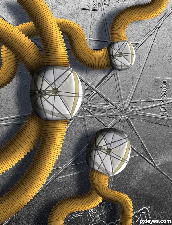
Heard the title on Star Trek :) (5 years and 3141 days ago)
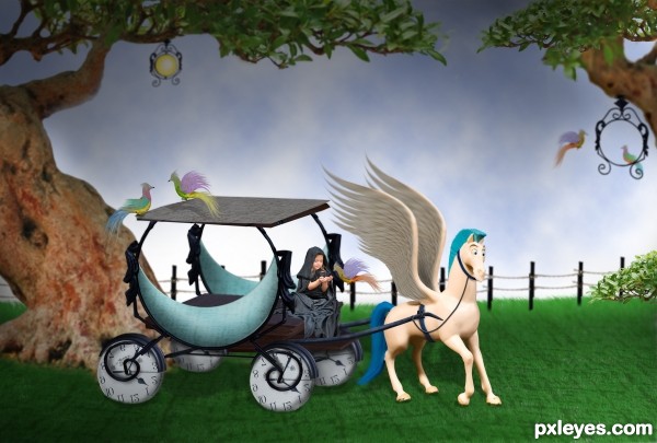
stocks mentioned and the rest is from pic provided and PS.... (5 years and 3147 days ago)

Extremely minimal use of the contest source.
hehehe...well, sorry, M. I know you must ask me SBS by saying extremely minimal use of the contest source,...SBS is here now,......not that extremely minimal I think....Thanks. M.
I like the Disney feel.. great job 
I like it .. has a sweetness to it that is very appealing (to me)
Great job on this using so many elements of the source. Love the human in the fantasy image, and the birds. 
Love it, great idea to create clock wheels 
Howdie stranger!
If you want to rate this picture or participate in this contest, just:
LOGIN HERE or REGISTER FOR FREE
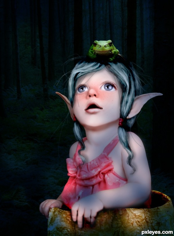
drew the hair, the hair bands, the skin overlay, and the freckles. (5 years and 3149 days ago)
Really nice work with the mottled lighting and the skin painting.
Playful and sweet 
thank you!
if only the frog can be as "painterly",.... as well as background.. good one 
thank you. i thought about it, retouching the frog, but i just wanted the girl to be "painterly" i will think about it some more... :P
Lovely entry
congrats
Congratulations....very nice work
Congrats!
thank you!
Howdie stranger!
If you want to rate this picture or participate in this contest, just:
LOGIN HERE or REGISTER FOR FREE
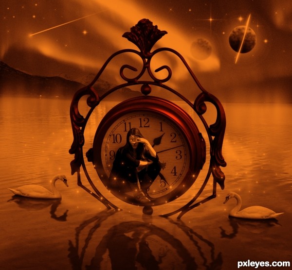
Thanks to Suvodeb, Adam Tibballs, Gunnar Hildonen, Daz smith and to Pxleyes for the image of the clock. (5 years and 3153 days ago)
Really cool image and 'duotone' effect, and right on theme!
Well DONE!!!
Quite dramatic. The reflections seem to be more like shadows [totally different from reflections], however. And the clock face is opaque, not transparent as its 'reflection' would suggest. Not clear where the star sparkles are coming from or why they don't reflect in the water.
love this image author. Your colours are right on theme.
Although this IS FANTASY , I also get a slight surrealistic feel.
My fav part of your entry is the woman on the clock. The things that i personally would adjust is the planet "RING" . maybe angle it instead of having it straight up and down and soften the fill on the other one ... giving the sky a little depth.
Remember these are just my opinions for adjustments.. easy to say after all the hard work has been done.
ALL THE BEST WITH YOUR ENTRY.
Thanks for the comments and positive input.
nice one....
This is lovely - surreal. The waviness of the reflections is great. Still, (to echo DanLundberg) I think reflections would appear more distorted, shortened, to appear on the surface of the water, not sink beneath. Good luck!
Lovely atmosphere...
rotating the planet to 45degrees angle may be better.
angle of the clock don't look right 
idea n colors are great 
Fantastic! right on theme, GL!
Fascinating work on this, great treatment of the clock image!
Very nice Author. Good to see you back at it. The best of luck too you
Creepy 
Howdie stranger!
If you want to rate this picture or participate in this contest, just:
LOGIN HERE or REGISTER FOR FREE
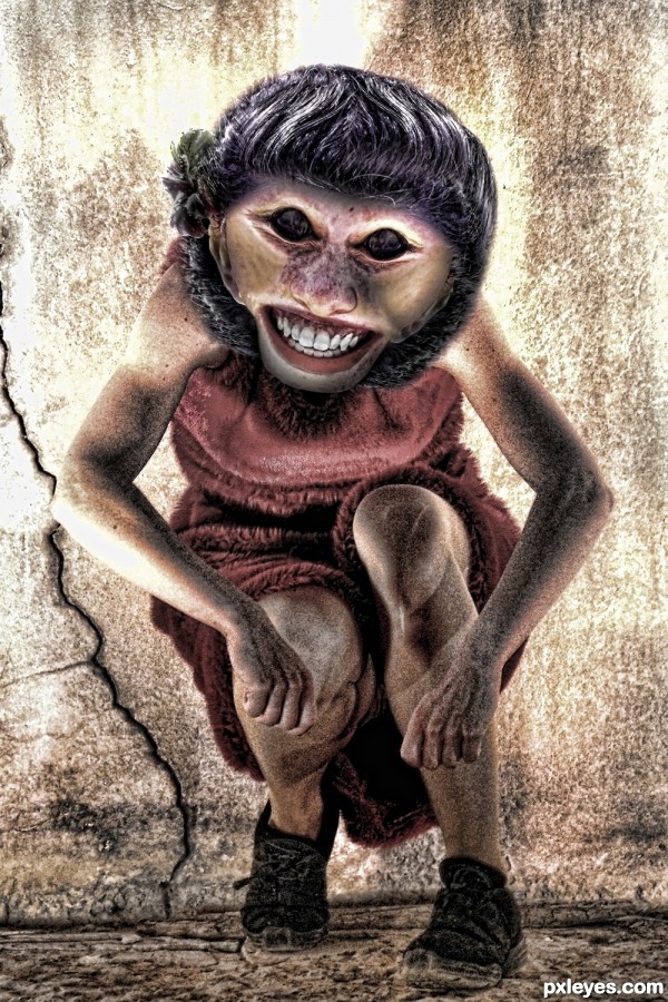
Daughter of Lilith (5 years and 3179 days ago)
Lol, good scary chop.
Great work here ... very clever and well put together!!!!
Fantastic piece...IMHO top 3...well done
Gorgeous, looks friendly 
very good work author ...GL!!
Howdie stranger!
If you want to rate this picture or participate in this contest, just:
LOGIN HERE or REGISTER FOR FREE
Nice idea and usage of the source..... Love the bevel/emboss texture.
Very cool image, love how you made the tubes, and of course that you were inspired by Star Trek!
Cool, looks illogical
Howdie stranger!
If you want to rate this picture or participate in this contest, just:
LOGIN HERE or REGISTER FOR FREE