(5 years and 3324 days ago)
3 Sources:
I felt a bit awkward posting this entry, as someone else has already done this idea. However, as I had already done quite a bit of work on it by the time I saw the other entry I decided to go ahead and put it up, anyway. I figure someone will tell me if similar ideas aren't allowed.
That being said, the entry kind of speaks for itself!
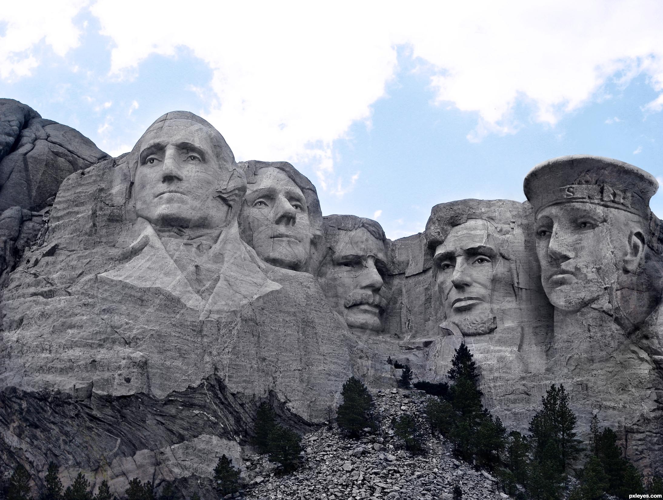
Thanks to Dynamix on SXC for the source of Mount Rushmore. (5 years and 3327 days ago)
No need to feel awkward, author! This happens all the time. It's happened to me as well. Glad you posted it. It's different and you used different techniques etc. It is in fact a completely separate entry by a separate author. Having said that...I really like what you have done. Extremely well done blending and shading. This is not an easy task. Thanks for posting and good luck.  .
.
well done.. :clap:
I agree with pixelkid. It is against the rules to copy someone's work but that's usually very obvious, It's not unusual to have similar ideas and some sources evoke the same ideas to many people. This is very well done and I'm glad that you posted it as well! 
Have to agree ... glad you posted as did a very good job!
Hi, just wanted to say thanks to you guys for your nice comments, they made me feel much better about the entry! And I've just seen that it got 1st, as well, which was unexpected, so I'm smiling big time and thanks everyone 
Congrats on 1st!
Congrats...
Congratulations!!
Congrats very well blended
Congrats!!
Congrats
Congrats ... now aren't you glad you posted it
Congrats on your win
Howdie stranger!
If you want to rate this picture or participate in this contest, just:
LOGIN HERE or REGISTER FOR FREE
Thanks MAXFX. (5 years and 3412 days ago)
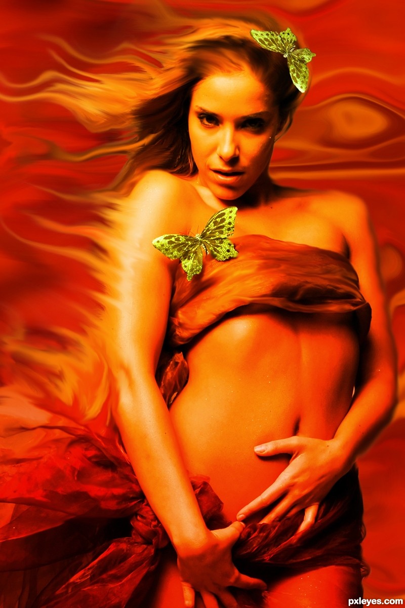
I like the way her hair blends into the fire...great pic.
very good, i like it good luck!
Nice work! GL!
Great job author...very well done
Howdie stranger!
If you want to rate this picture or participate in this contest, just:
LOGIN HERE or REGISTER FOR FREE

(5 years and 3422 days ago)
What sense (or lack of) would that be?
Oh, that he's blind and walking towards a broken bridge. Well you could put a bandage on his eyes ( around his head) to make it more obvious.
kind of looks like hes checking out the nice sunset
didn't you uploaded this one into the wrong contest  ?
?
http://www.pxleyes.com/photoshop-contest/16355/red-umbrella.html
GL
I think now it makes Sense.
yup it does now :P
This entry would fit better in other contest....
The light source on the umbrella in foreground is opposite the background light source...
I don't why he's senseless... HE'S DEAD!!!! I mean, I'm no medical doctor or anything but I think he would not live long with his head several meters in from of him. But the head looks like it's positioned weird.....
Even if he does not have senses any more... or he is dead.... it is still a nice image... (but it should have done better in the other contest).... good luck author.
Howdie stranger!
If you want to rate this picture or participate in this contest, just:
LOGIN HERE or REGISTER FOR FREE
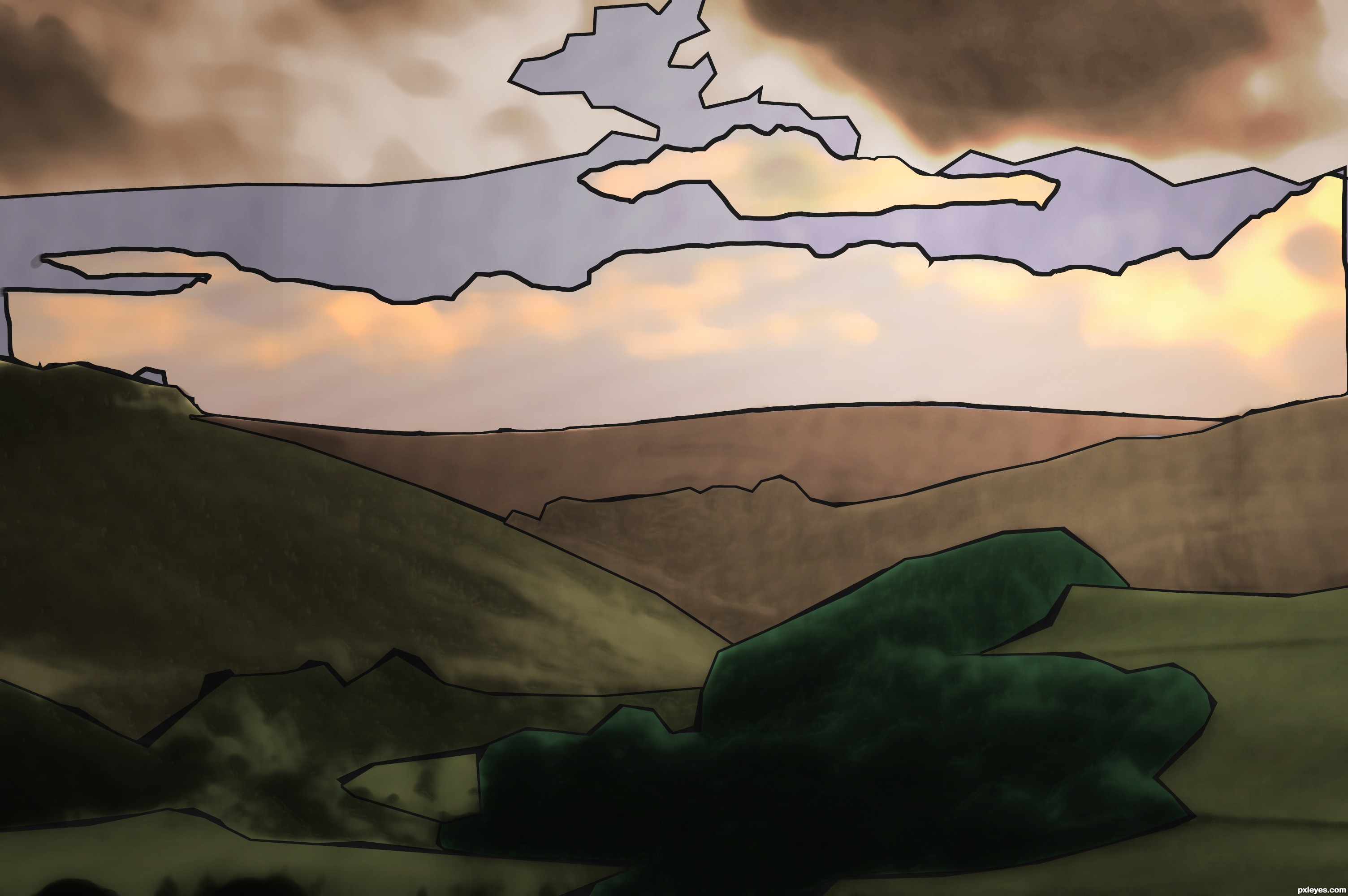
A stained glass of a landscape (5 years and 3426 days ago)
Good idea, you could add more details if you have time and should look great.
I think you should put the dove back into it somehow.
I agree with jawshoewhah.
Howdie stranger!
If you want to rate this picture or participate in this contest, just:
LOGIN HERE or REGISTER FOR FREE
Photography and photoshop contests
We are a community of people with
a passion for photography, graphics and art in general.
Every day new photoshop
and photography contests are posted to compete in. We also have one weekly drawing contest
and one weekly 3D contest!
Participation is 100% free!
Just
register and get
started!
Good luck!
© 2015 Pxleyes.com. All rights reserved.


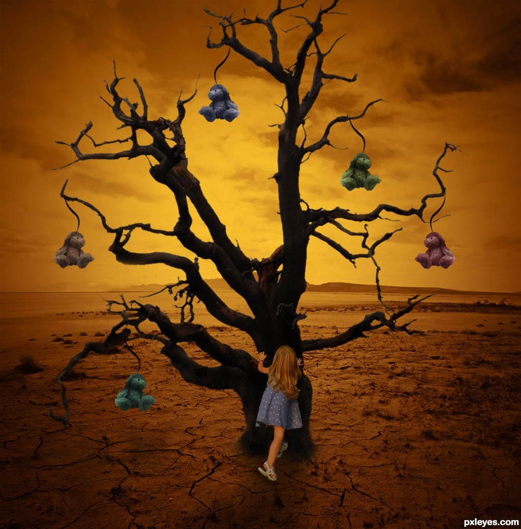
interesting approach author...At first i was think that there is no shadow for the tree and the kid. But now i see slight shadow...Shadow have to be a bit stronger and more consistent with lighting that u have now...best of luck
Great idea!
the kid floats a little otherwise very good image
Howdie stranger!
If you want to rate this picture or participate in this contest, just:
LOGIN HERE or REGISTER FOR FREE