Credits to
NefaroStock
biewoef
wookiestock (5 years and 3395 days ago)
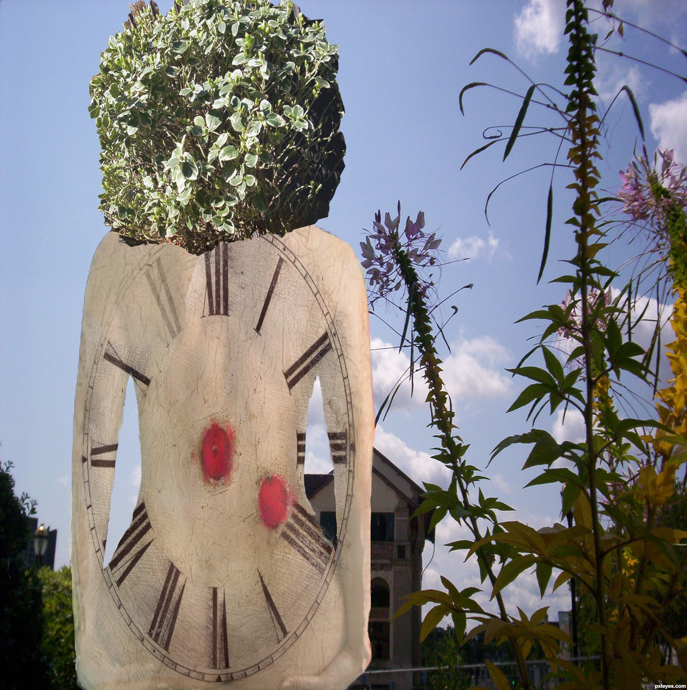
I thought the clock sort of looked like human back and I started there and then kind of got a little out of control. All the pictures and sources are my own photos and the clock so three photos. I improved it with RJRANUM stock photos, parts- 25 Incredible art there! (5 years and 3463 days ago)
There's too much going on- the main focus of the composition cannot be distinguished since elements are fighting with eachother= no harmony.
White element vs black element, both vertical vs green diagonal plant, my brain goes wha..huh !?! 
You had a good idea with the back, why not take a photo of someones naked back and warp/ distort the clock on it, play around.
A Ranum chick usually does the trick IF she's not dating any recent / current entry. 
But don't rely only on her - you need to do some work as well. Here's a nice back, her name's Candace Nirvana ( wow  ):
):
http://mjranum-stock.deviantart.com/gallery/1854062?offset=24#/d1ae7k1
What do you mean Ranum chick? Thanks for the link, I will look into it. Last time I took something from Deviant art, I got taken out bc it was copywrighted. I am taking in what you said since this is my first stab into the surreal.
Oh, Ranum chick = female model posing for Marcus J. Ranum - brilliant man, kudos to him.
On deviant whatever user has "stock" in his name, provides his images free to use- but you have to credit him, so read his terms of use. Some ask link with the work or to be informed by mail, etc.
The link i gave you is usable since is mjranum-STOCK.
Thanks Grey M that is very useful information! I have to work today, but I will see if I can do that tip. Again thanks.
Ranum' stuff is amazing......
Grey, with the last breath of my body I joing deviantart and I fixed it. Full credit to Ranim for his incredible pictures and the models too. By the way his art is incredible!
Grey, took out the shadow. It's done!
Well it looks better cause of the shape of the girl, but in order to make it stand out more you should adjust the background with levels(ctrl L), making it darker and blur it a bit.
Instead of that bush for hair i would use these:
http://cgtextures.com/texview.php?id=24807&PHPSESSID=a93838f6f73551a605c8878ac381b63c
It's copyright free, it's already cut and would make a nice touch to the pic, chromatically and volumetrically.
Contest is over, so you can't edit your image no more, but you can make it for yourself and enter it in Mix manipulations contest or in your portfolio.
PS: try dodge & burn to create light & shadow on the body.
very good start for a wonderful collage, good luck!
Howdie stranger!
If you want to rate this picture or participate in this contest, just:
LOGIN HERE or REGISTER FOR FREE
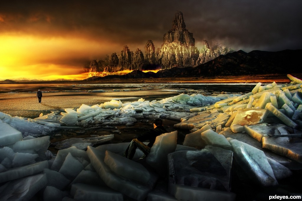
The fact that this could be reality is frightening. I tried to capture the sadness and loneliness of being a survivor.
Thank you to all source pictures (5 years and 3479 days ago)
Looks like some fantasy game, nice scene!
awesome work! I hope our world doesn't turn out like this but you did a great job on this 
I don't know it has something beautiful over it... reminds me a bit of WALL-E, all alone... There's like still hope in this image, love it!
Thank you for your comments, much appreciated
love the colours and the contrasting in this image definately my fav so far author
well done!
Very dramatic idea. Beautiful colors add more impact to the image!
Author entry is very nice,with the great mood, but your part in creating is minor...Background image is perfect,and hat down to a photographer....U'r just added few elements, and that's it...HDR images are allowed but when u use some of them, make some effort to change that photo just a bit. Love overall mood but IMHO this entry is on the line for removing...Sorry for my words but your previous entry has to be removed too...
Everyone is right about the great mood, a pity you can't credit yourself for that author because you really didn't adjust the image exept for the people ...
Besides from that, I think you have blended the person(s) very very well !!
Gl author !
Very nice atmosphere here, well done = )
Congrats for your third place, Gibbo!
congrats
Howdie stranger!
If you want to rate this picture or participate in this contest, just:
LOGIN HERE or REGISTER FOR FREE
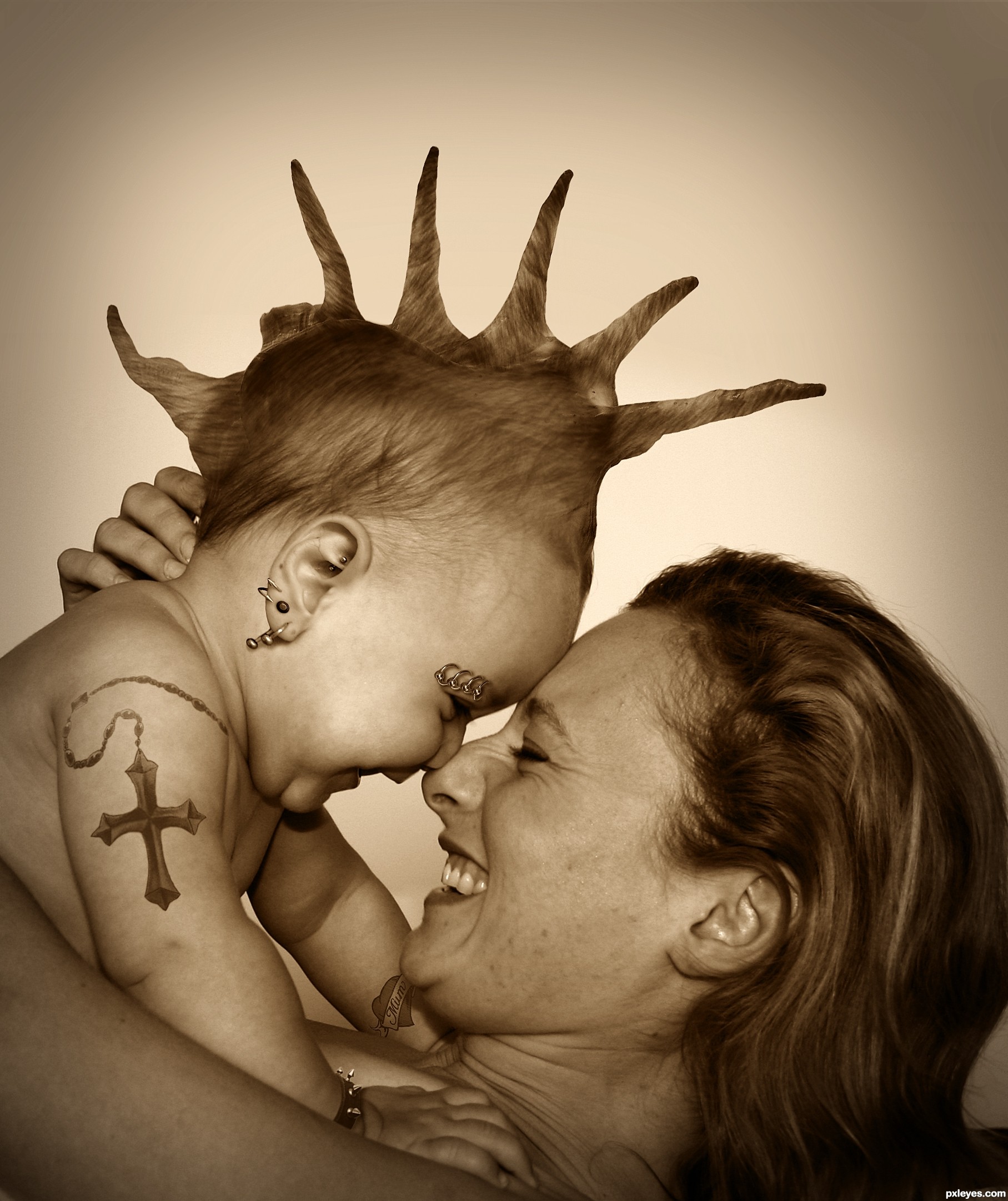
Ahh, they grow up so quick these days. One day in nappies and the next piercings, tattoos and a mohican. But they will always be mummy's little baby.
All sources from Flickr.
Please view in High Resolution. (5 years and 3585 days ago)
very cool work
simple & nice
Nice job adding the piercings to the baby, but the hair needs serious work.
I agree on the hair, but love the tatoo!! GL
Working on trying to fix the hair. 
Tattoo and piercings are very well done (only a crazy mother could do that with her baby!...) Hair "movement" needs to follow shell directions, to look more convincent.
I agree with the others on hair and tattoos, but great idea, and nice overall work.

Made some adjustments to the hair, as best I could.
Howdie stranger!
If you want to rate this picture or participate in this contest, just:
LOGIN HERE or REGISTER FOR FREE
(5 years and 3622 days ago)
Nice image. Would love to see what you can do without the liquify filter some day.
Very gooey and sticky.. very very cool!!!!
CMYK : hahahha, if not allowed within the rules of the contest, maybe I'll consider, .....
and thanks already present here
Really nice work here!
very very good work...best of luck author
aha.....anda memang salah seorang master disini,....karya2nya menakjubkan. biarlah saya memanggil anda suhu,......bagi ilmunya dong, suhu......hehehe....
Brilliantly Done..
Wonderful work. Your liquifying skills are amazing 
Fab work here author...gud luck
I LIKE IT ! G L
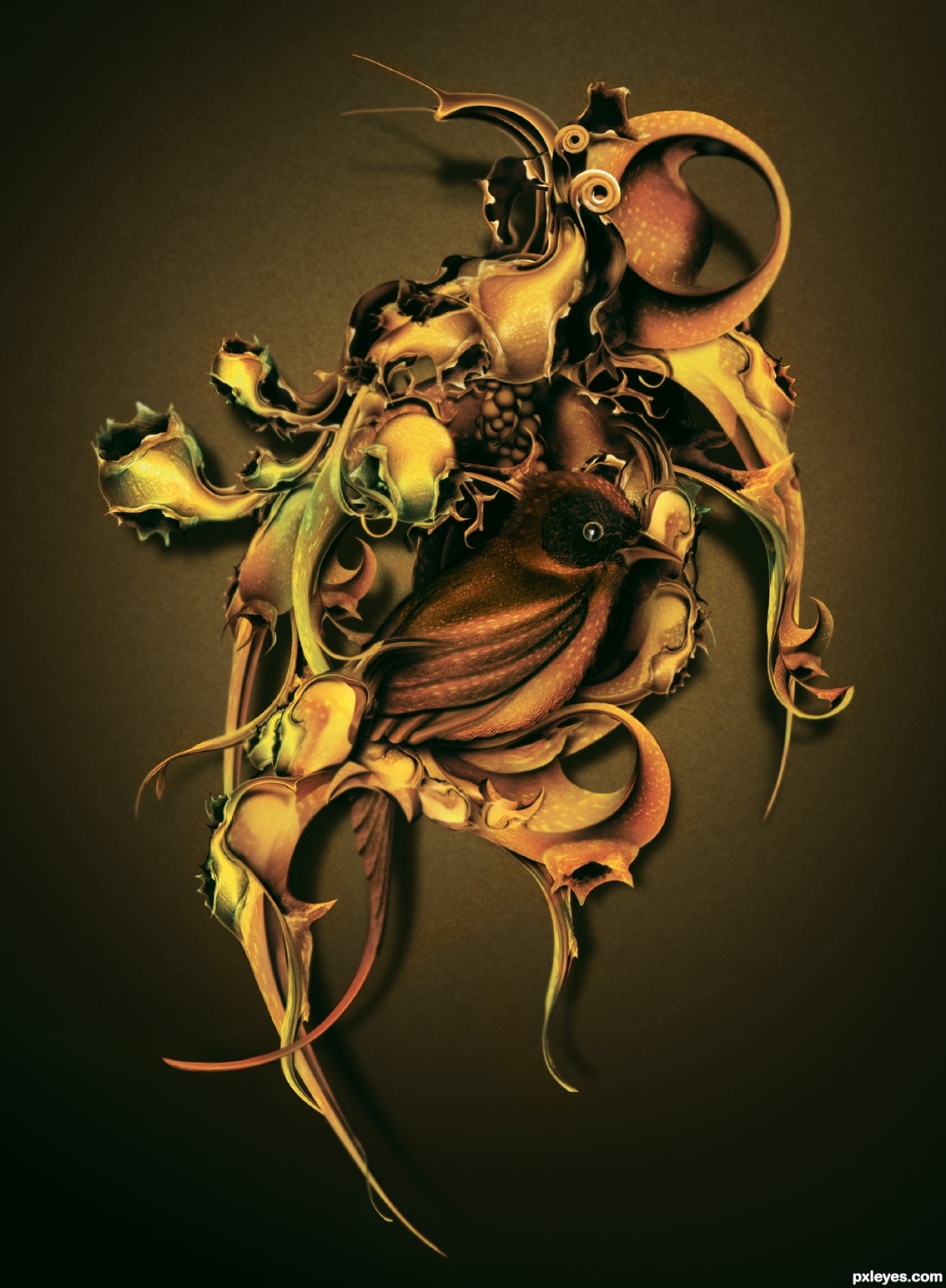
Very beautiful! First I saw only an abstraction, Picasso-ish; but I found a little bird there, a bit hidden. The colors are nice. GL, author.
nice
amazing!!!!!!!!!!!
Congrats!!!!
Congrats! for 2nd place
Congrats
Congratulation...
congrats! AMAZING work!
Congrats!!
congraty
Howdie stranger!
If you want to rate this picture or participate in this contest, just:
LOGIN HERE or REGISTER FOR FREE
Photography and photoshop contests
We are a community of people with
a passion for photography, graphics and art in general.
Every day new photoshop
and photography contests are posted to compete in. We also have one weekly drawing contest
and one weekly 3D contest!
Participation is 100% free!
Just
register and get
started!
Good luck!
© 2015 Pxleyes.com. All rights reserved.


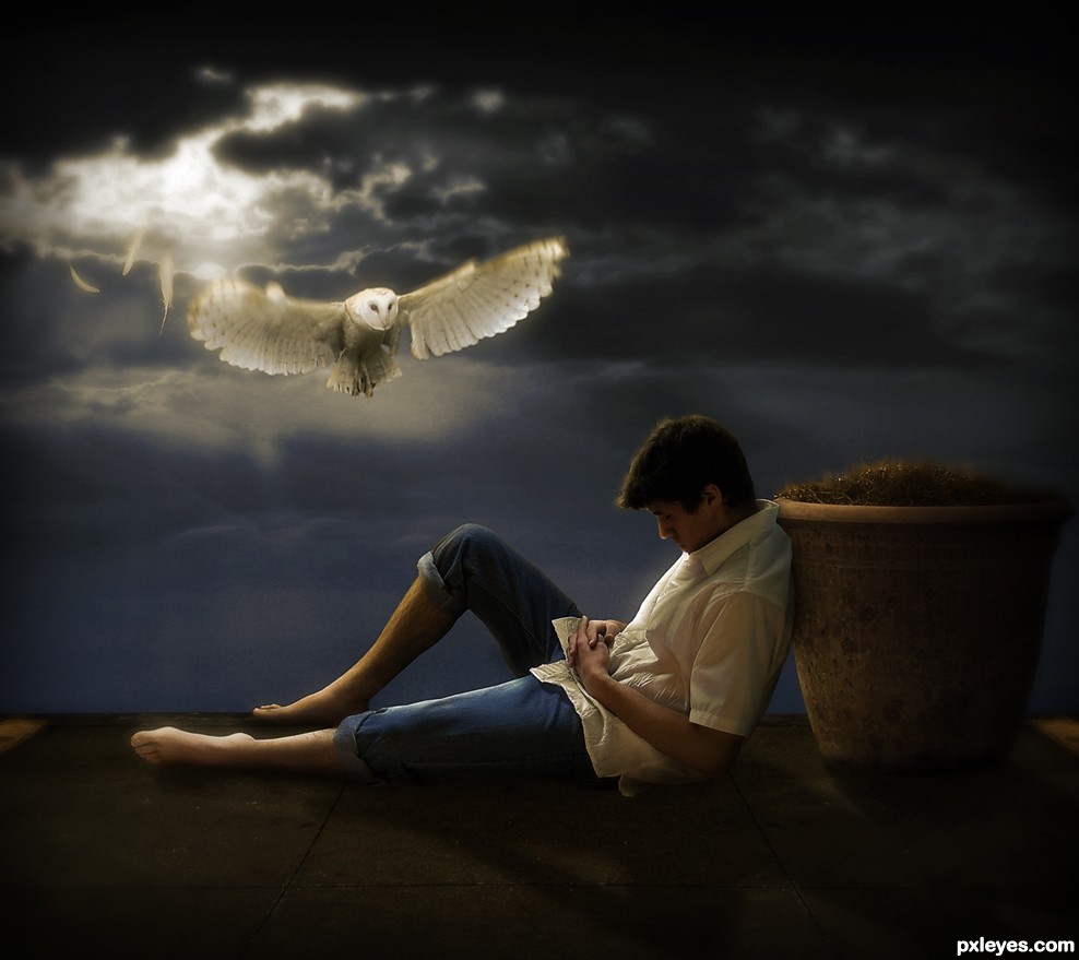
I like this one a lot!


1 nitpick and maybe 1 idea for you author
The nitpick: there's a light spot in the neck which should be dark.
The idea: maybe use a displacement map to fold the sky on a curtain? But that's just something which cames to mind, up to you to use it or not. Anyway... I really like this entry
Love the mood...GL author.
Thanks for the comments guys..at rob thanks for the advice, really appreciated..i'll remember the idea..i just dont like to make changes to my image unless it's a little oversight that wont change the actual image..i have removed the light spot from the neck tho..again, thanks!
fantastic work author...adding this feathers is great touch...mood is fantastic and overall look is top notch...well done
NP author, it's your entry and I like the way it is now too
Dreamy mood; really nice composition! Good Luck Author!
wow... love the mood.., good luck
Congrats for the 4th place..,
Love this ... again, very peaceful and deep imagery!
Howdie stranger!
If you want to rate this picture or participate in this contest, just:
LOGIN HERE or REGISTER FOR FREE