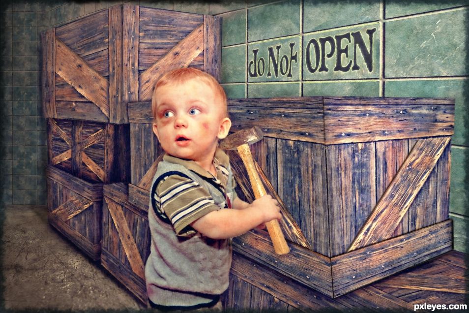
No, No, Don't smash those crates with the mallet. (5 years and 1173 days ago)
- 1: Child with boxes
- 2: Mallet
- 3: Floor texture

No, No, Don't smash those crates with the mallet. (5 years and 1173 days ago)
(5 years and 3170 days ago)
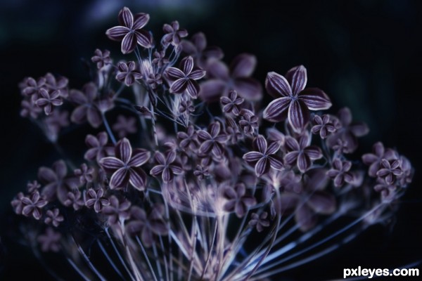
ooh... nice variation from Source... but need to 'soften' the flowers for better effect 
(now too sharp and hard looking)
Looks fine to me, I have no idea what aheman is talking about ( a high res could be helpful) good luck author and good thinking

Nice one! GL author!
Beautiful piece!
Howdie stranger!
If you want to rate this picture or participate in this contest, just:
LOGIN HERE or REGISTER FOR FREE
(5 years and 3190 days ago)
Well now we gotta see what's going to pop out of all those holes.. hehehe.. great job author 
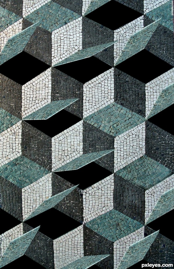
Nice idea...can you try to show some of the inside areas?
suggest:
use the tiles for the inside (black part), use 'Burn' to darken instead, remember to have 2 separate part for each inside-sides (since they are cubes) 
Makes me think of the Movie "The Cube"
Howdie stranger!
If you want to rate this picture or participate in this contest, just:
LOGIN HERE or REGISTER FOR FREE
http://youtu.be/qCQrrQ3R8as (5 years and 3299 days ago)
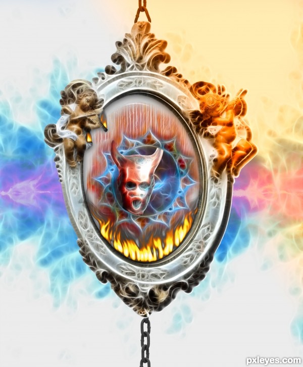
Too heavy a use of the Fractalius filter.
Funny song, lmao!
When I try to visualize the video, i see something darker with red vines of lava , many broken chains, etc, etc. Oh, and WIND en masse !
I'm not sure what you originally visualized and the entry looks pretty positive here, anyways thx for sharing the song.
Very very nice piece author...gl
Howdie stranger!
If you want to rate this picture or participate in this contest, just:
LOGIN HERE or REGISTER FOR FREE
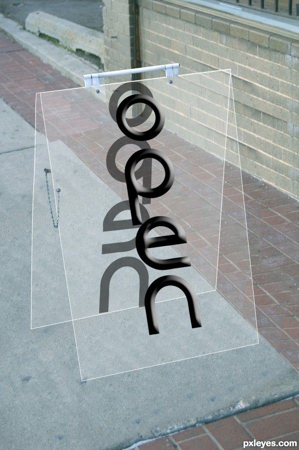
i used only photoshop & no other resources (5 years and 3328 days ago)
The lettering on the back is much larger than on the front - there is no space above or below it. Since the signs are clear, this looks very inconsistent.
major work on cloning out the background.. very well done.. good luck!!
The acrylic effect is quite fun  Not going to nit pick the cement/brick alignment, wouldn't know it was there if I hadn't seen the original pic
Agree with above comment about how much work was involved here. It's too bad that entries that garner all this technical work rarely get the 'wow' votes and 'faves'. I can appreciate what you've done here author! Perhaps add some noise and then blur to the letters a bit. Maybe use the healing brush to get rid of the repeaters where you've cloned. This might help. 
You did a good job.... GL author.
thanx.....
v-good
cool....work
Congratulations!
Congrats!!
congratulation...
Howdie stranger!
If you want to rate this picture or participate in this contest, just:
LOGIN HERE or REGISTER FOR FREE
An admirable effort that would be improved by use of the perspective tool, and choosing a light source so as to properly shade the planes on the crates. The boards should be given thickness.
Thanks Bob. I appreciate your comments. I am not sure how to do the perspective any better. I used the boxes on the source image of the boy as a perspective guide and I did use the perspective tool to warp the box pieces I made. As for giving the board thickness, I need to think about how to make them look thicker. Would adding more shadows help or should I bevel them? I guess I'll just experiment and figure it out unless you feel like giving me some tips on the process?
congratz!
Thank you
Congrats SkyAngel!
Thank you.
Congrats!
Thank you.
Howdie stranger!
If you want to rate this picture or participate in this contest, just:
LOGIN HERE or REGISTER FOR FREE