Only source image and PS used. (5 years and 3337 days ago)
(5 years and 3341 days ago)
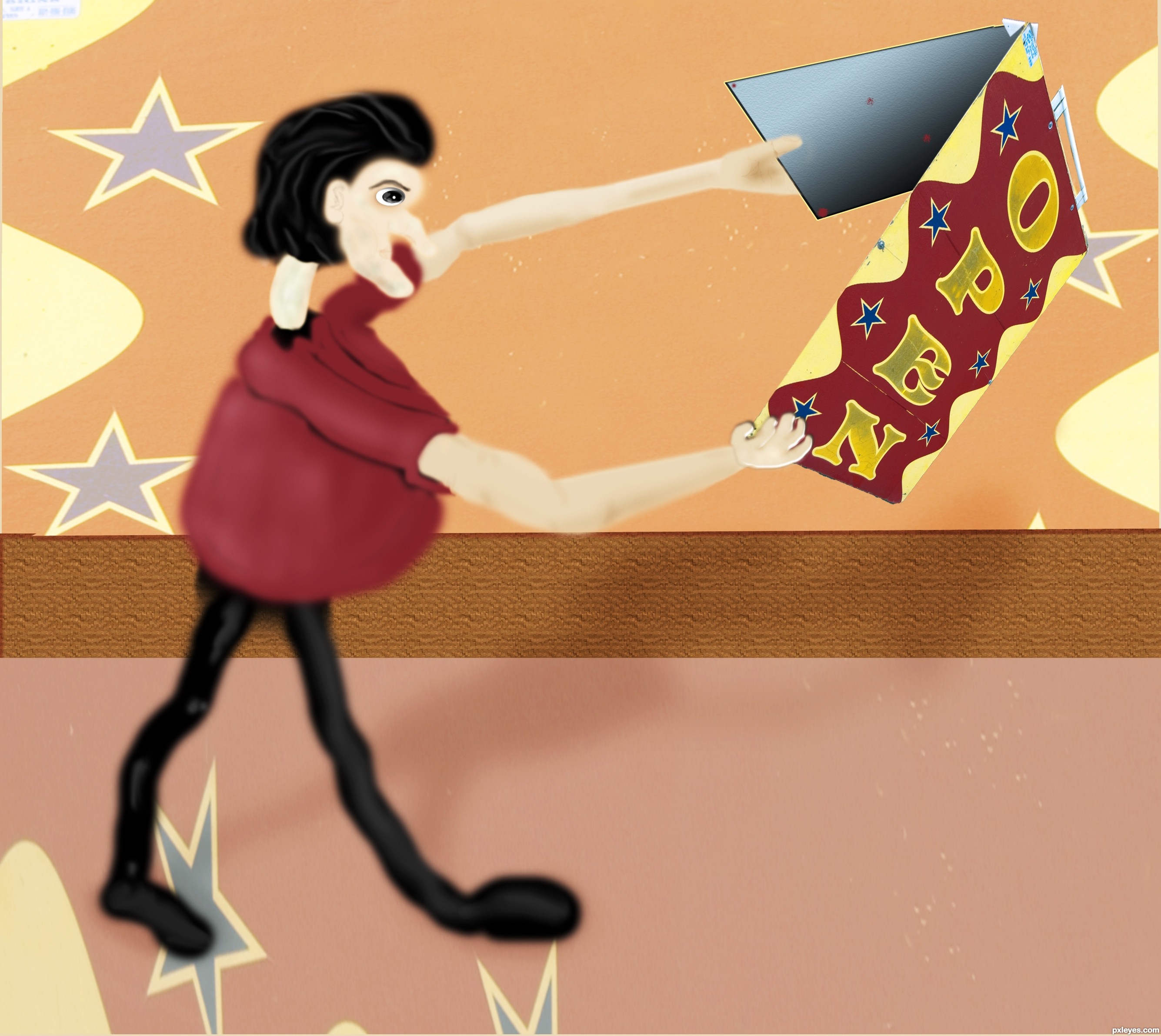
The idea is good but the perspective is not correct. It would have been better if you created your sign in a normal rectangle and then as a whole transformed it onto the board. To do this you could use the transform/perspective or transform/distort.
Edit: Perspective is much better now.
Thanks solkee I redid any better?
nice work author...u should work a bit more on a perspective of stop sign...everything else is cool...gl
Thanks erathion Here's a redo
Sorry I'm a nitpick on grammar....It's 7 days not 7 day's 
Christy Thank You Much I took care of it
Your idea is good... I wish you could have done much better with the source, not only changing text...but transforming the image into something nice and beautiful....check the entry with the yellow flowers..... Good luck!
Thanks Yes its nice I may have never thought of that in that direction Thats why each time I do an entry I learn from others who may have gone and taken art classes or learned from other members who give comments to help inprove my skills Thanks
Howdie stranger!
If you want to rate this picture or participate in this contest, just:
LOGIN HERE or REGISTER FOR FREE
Hope You like it friends...thank you....
other 2 sources used:
TREE:
http://linzee777.deviantart.com/art/Tree-Stock-2-151772727?q=gallery:linzee777/11543667&qo=50
((thanks to Linzee777))
PITCHER:
http://salsolastock.deviantart.com/art/Clay-Water-Pitcher-69339231?q=boost:popular%20in:resources%20pitcher&qo=17
((thanks to SalsolaStock))
(5 years and 3360 days ago)
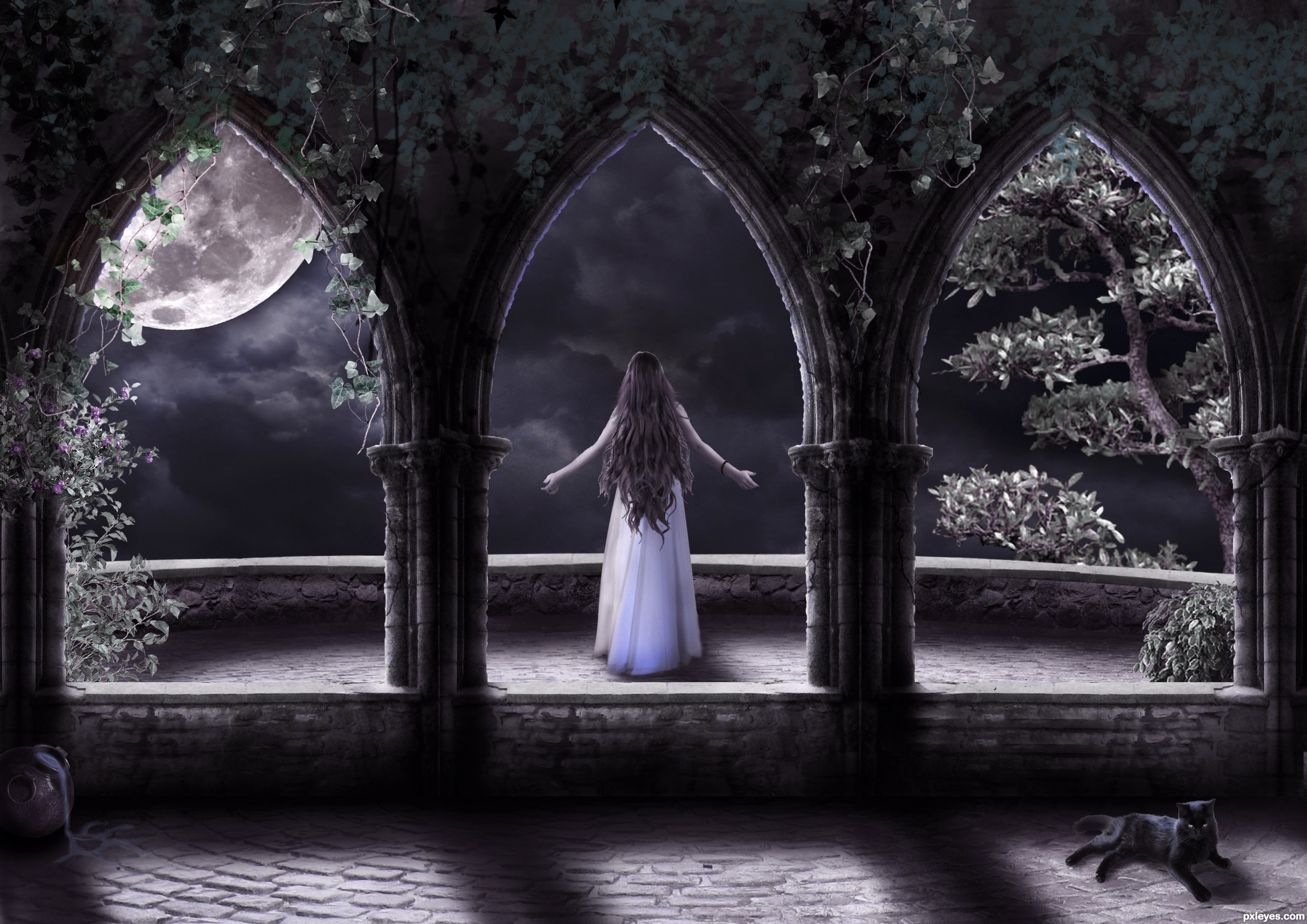
great mood
wonderful work, can't say more. Love the way you kept adding and adding things to make this image, this mood. Absolutely gorgeous, my fav. Good luck author! 
Impressive amount of work and love the results. Nisha is right ... the mood is wonderful!
 I do think that the arches/pillars could use bit of clean up ... there are tiny bits of the original image showing when viewed in high res and the edges could be improved.
As the stone in the arches and pillars are old, the edges would have pits, dents and cracks that would show when viewed in profile. If you use a layer mask you can "push" the mask in with the smudge tool in places like where the round stones meet each other (there would be a slight indent). Roughening the edge and taking away that straight-edge mask look would really help. Let me know if this doesn't make sense and I can try and explain better.
EDIT: Changes look good.
Scale problems: Leaves are too big, cat is too big. Woman figure has white outlines that could be easily removed by selecting the figure, contracting 1 pixel & deleting. Good concept that could benefit with some tweaks...GL author.
Thanks a ton ARCA and CMYK46 for ur precious suggestions...indeed it did improve the overall feel of the image( i think so)...further suggstions r more than welcome 
Fantastic mood and great composition author...love the purple feel and your moonlight is amazing...well done man
Thumbs up dude
Kinda surreal...love the shadows.
Love it , nice job author
Howdie stranger!
If you want to rate this picture or participate in this contest, just:
LOGIN HERE or REGISTER FOR FREE
(5 years and 3388 days ago)
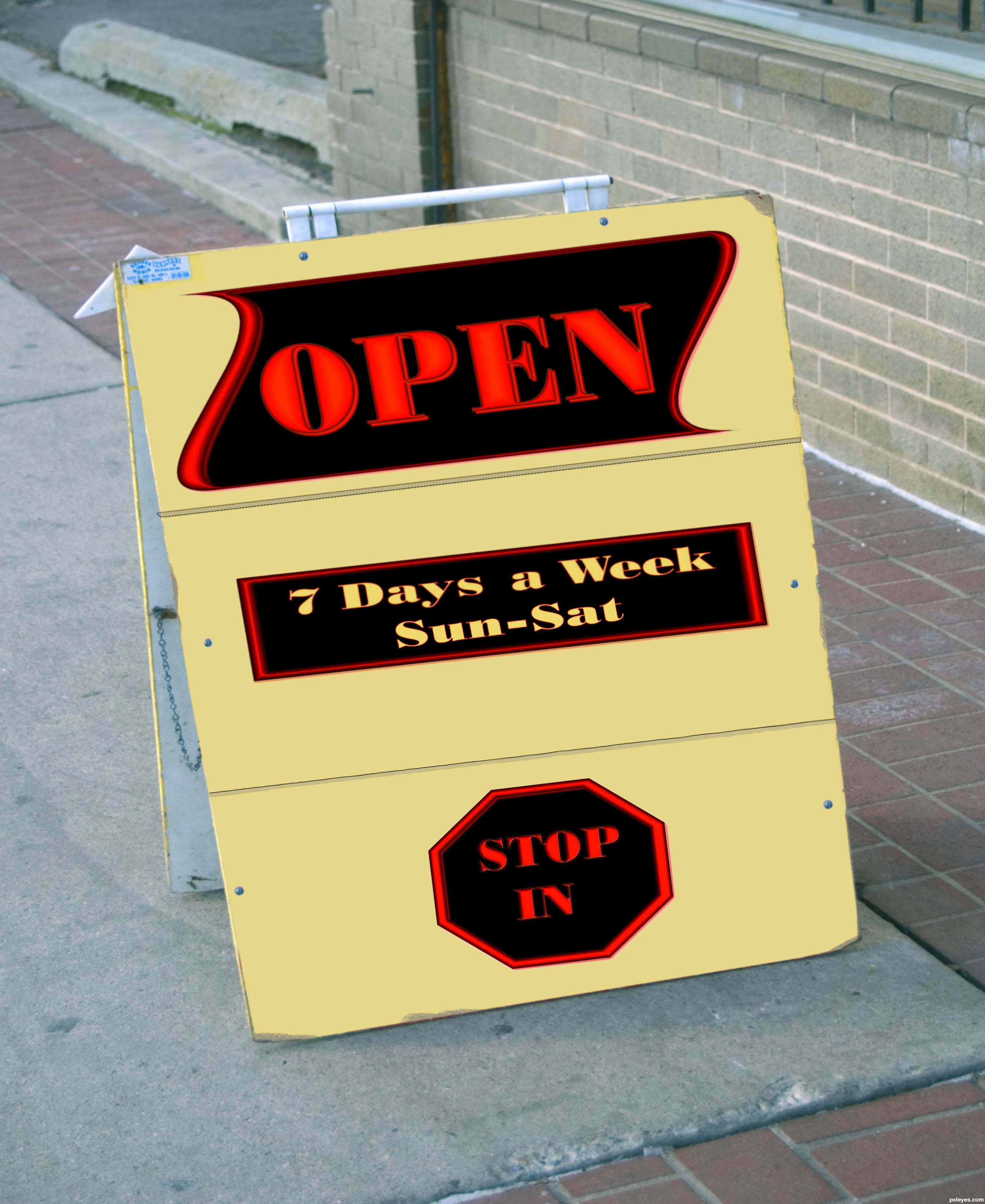
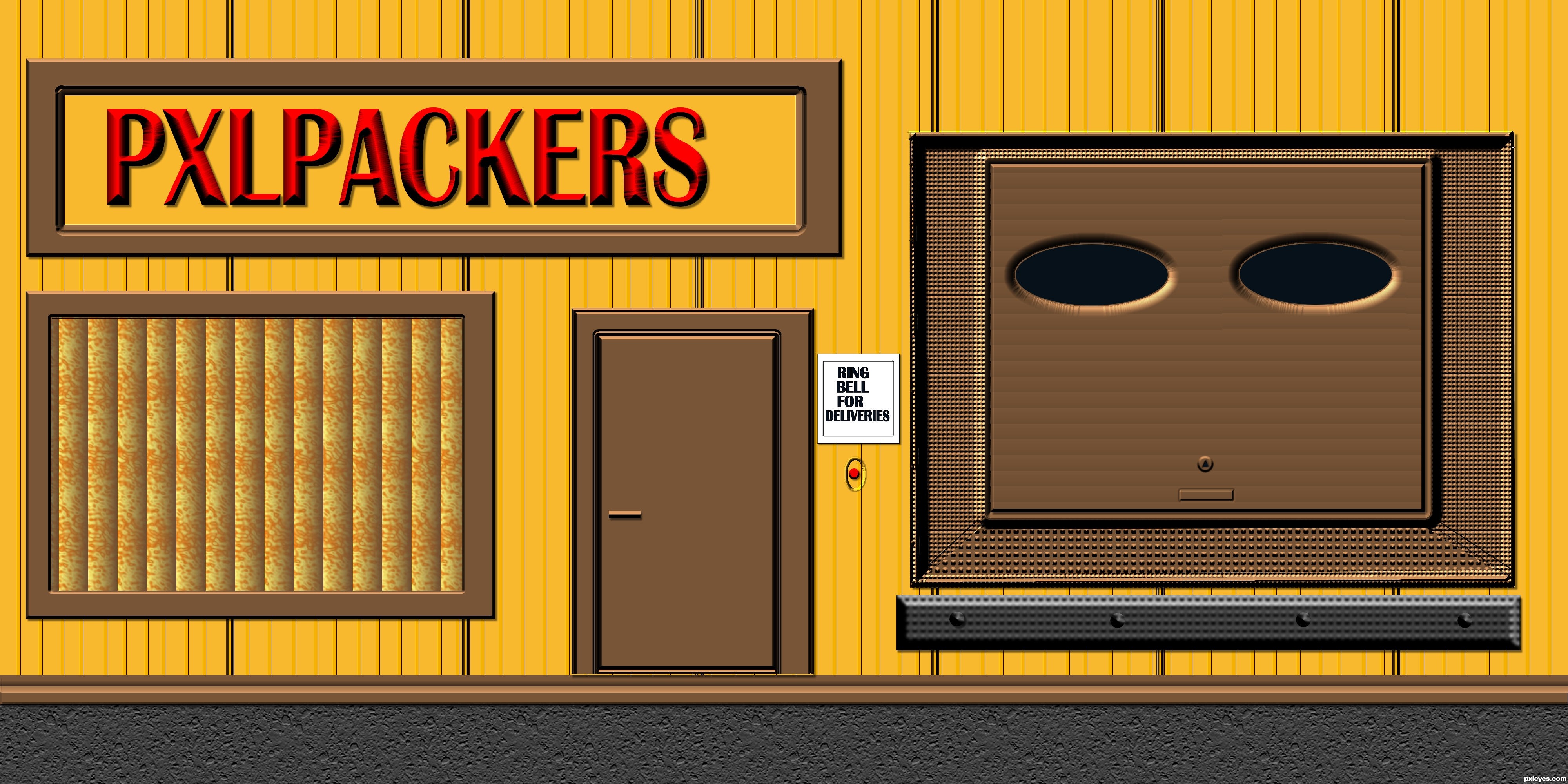
So, how many PXLs could a PXL packer pack if a PXL packer could pack PXLs?
 GL!
GL!
Howdie stranger!
If you want to rate this picture or participate in this contest, just:
LOGIN HERE or REGISTER FOR FREE
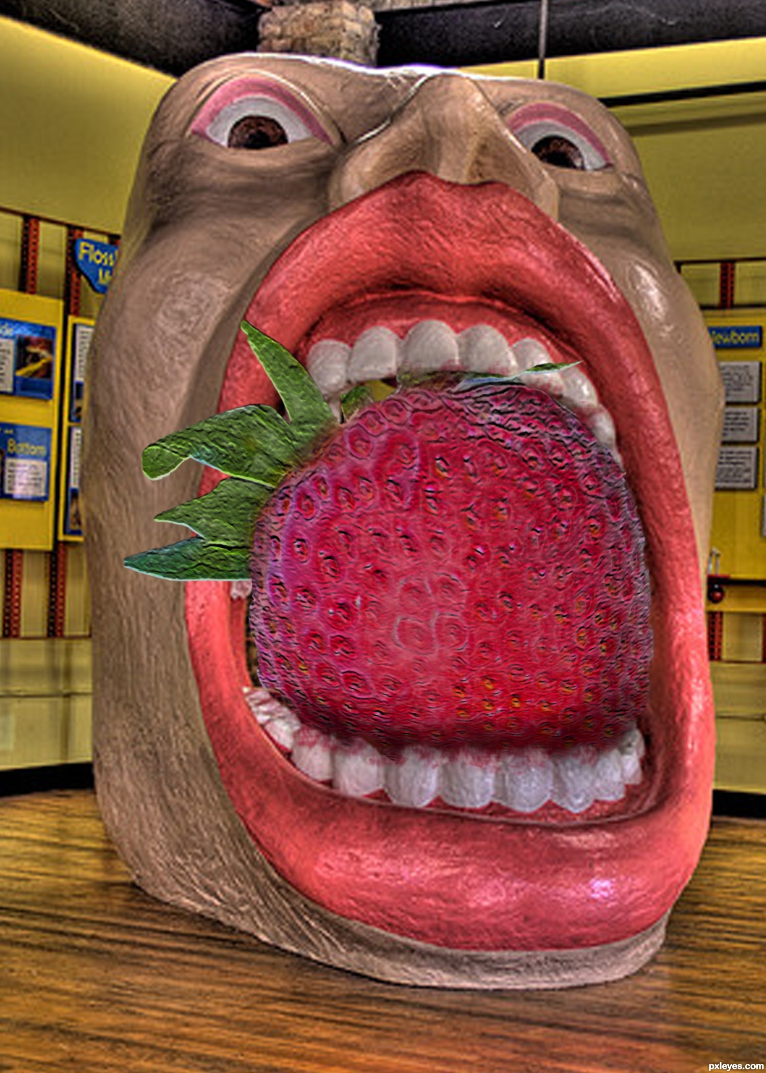
Thanks to upchuck_norris for the image of the mouth. (5 years and 3490 days ago)
OMG its a real Big mouth.............good work author!!!
Well thank you mistic...
nice work on matching the textures
Alan2641, thanks for the compliment!
this is magnificent... good job
(play with the burn tool. I could see some major shading for this.. hehehe good luck author
ROFL ...what can I say ... it wonderful!
Drivenshlush and arca, thanks so much for the comments!
What a mouthful! GL
COOL.....
Congrats Diane...
Congrats Disco diva! great work
Congrats!!
congrats... nice work
Howdie stranger!
If you want to rate this picture or participate in this contest, just:
LOGIN HERE or REGISTER FOR FREE
Photography and photoshop contests
We are a community of people with
a passion for photography, graphics and art in general.
Every day new photoshop
and photography contests are posted to compete in. We also have one weekly drawing contest
and one weekly 3D contest!
Participation is 100% free!
Just
register and get
started!
Good luck!
© 2015 Pxleyes.com. All rights reserved.


The figure is really blurry compared to the source image. You need to use a harder edged brush when you paint.
Thanks for your comments.. I just tried to make a figure and I don't know anything about paintings.. next time I will use harder brushes.
This is a place to learn....and you will learn if you are patient, and look around to some of the works in the contests... you will get ideas and you will do much better in the future. Any way... GL author.
Thanks for your comments @ Geroge55 . Patience is my probs. Most of PS works I am doing from my office, only when I get intervels.
Howdie stranger!
If you want to rate this picture or participate in this contest, just:
LOGIN HERE or REGISTER FOR FREE