Photoshop Pictures: Opening


results 1 - 3 of 3

The Ancient City - created by Robart523


The Ancient City
Favs: 4SBS: 13Hi-resRank: 3/21Score: 69.5% (30)37778 views

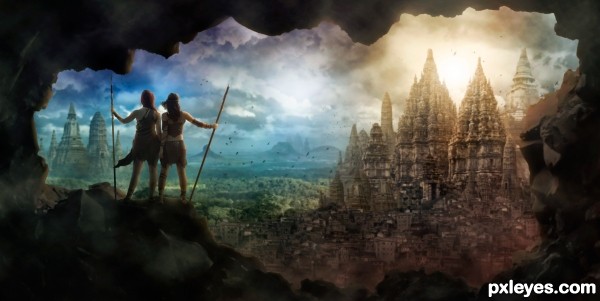
I created this epic view from several pictures of temples and ruins! Lots of digital painting, shading, and coloring to get it all to blend together.

Thanks to Tasastock and RaeyenIrael-Stock for the image of the girls. (permission is in the SBS) (5 years and 2787 days ago)

9 Sources:

avatar Nickk
Nickk says:

Nice mood ! This is an eye catching image !!
GL

avatar spellweaver

Yes, very nicely done, like to see a tutorial for this one

avatar robvdn
robvdn says:

Great image

The perspective on two of the bigger temples on the right are off though, might be able to fix that by rotating and or skewing it. Otherwise: good mood, great color combinations, I like the framing in the rocks... a classic epic game scene

avatar Sofie73
Sofie73 says:

Wonderful!

Howdie stranger!
If you want to rate this picture or participate in this contest, just:

LOGIN HERE or REGISTER FOR FREE


Opening Night at the Gallery - created by artgirl1935


Opening Night at the Gallery
Favs: 0SBS: 11Hi-resRank: 14/21Score: 50.9% (0)6608 views

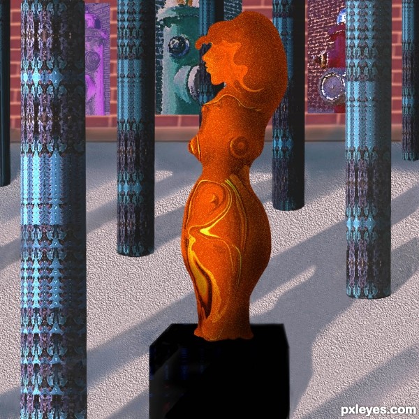
Sculpture, columns, background all made from the source. No outside sources used. Please see detailed SBS. (5 years and 3224 days ago)

avatar greymval
greymval says:

Smart idea, it would have looked far better with more time invested by:
-arranging the composition so it would be a simmetrical perspective vs the assimmetrical statue.
-Insisting on highlights of the sculpture like the light was comming from above, vs a general light from the left.
- columns having a base.
- color pallete including complementaries : blue vs orange statue, or red vs green columns.
I'm sure you already know all these, that's why i wish you had more time.

I see you edited the color, nice

avatar locale
locale says:

Nice work.. Good luck..

avatar erathion
erathion says:

nice work...gl

Howdie stranger!
If you want to rate this picture or participate in this contest, just:

LOGIN HERE or REGISTER FOR FREE


opening in a few days... - created by SilvanaDD


opening in a few days...
Favs: 0SBS: 12Hi-resRank: 7/21Score: 54% (5)5564 views

only source used (5 years and 3798 days ago)

avatar GolemAura
GolemAura says:

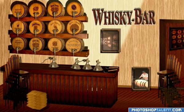
NATOR LIKES TO PARTY.. this really reminds me of the Basement Retreats that are so popular... great use of source and fun subject

avatar Tuckinator

good work

avatar CSevrip
CSevrip says:

Maybe if u fix the perspective of other furnitures automaticaly fix the barels

avatar Nav777singh

great idea looks real good

no avatar
olga says:

good work author! GL

avatar nishagandhi

great

avatar gopankarichal

good idea. the font whisky bar spoils the look a bit

avatar pingenvy
pingenvy says:

This is a great idea. There a couple of issues. The perspective is off. The vanishing point for the ends of the barrel shelves is at the picture on the wall, but the vanishing point for the bar is way off to the right. Another thing is that the shadows coming from the barrel shelves should not have a gap where the shelf joins the wall. if the light source is below. This has a lot of potential, but the perspective issues are difficult.

author says:

thanks for all comments and helpful advices. I changed the font and I've tried to change parts of the perspective.

avatar chakra1985

nice

Howdie stranger!
If you want to rate this picture or participate in this contest, just:

LOGIN HERE or REGISTER FOR FREE