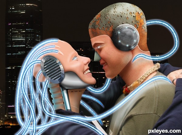
OK Hopefully I'm not off theme - as this was the only image I could find that was close to what i wanted it's not full body but it's a little more than heads and shoulders... (not if you look at the woman though :P )
Anyway - I think high res would be better to view this at..... so check it out!?....
OK so, onto the theme of this concept..... quite simple really, high tech and old tech mixing it up?!.... :) (5 years and 2628 days ago)


 . Nicely done. Congrats!


No worries, author...you're right on theme, and good work, too!
PS: Great SBS.
Well done image. Good attention to details, like the point where the fiber crosses the neck of the boy.
Congrats, good work!
Thankyou!!... I really struggled after a year off of serious PS work.... :S
For me the light on the two persons is to bright. Not works good with the background.
Why? - how do you know that there isn't a light source out of the picture? based on the shadows from the stock the shadows are on the underside... just because there is a dark background, doesn't mean that the forefront object also needs to be as dark! nor do you have to present a lightsource in an image....
Also.... based on a photography point of view... you use a flash to illuminate the subject at night (so the background would be dark)or in the daytime in the case of portraits infront of the sun.
Thanks for the comment though
Sure. But I think the mood would be a lot better.
Howdie stranger!
If you want to rate this picture or participate in this contest, just:
LOGIN HERE or REGISTER FOR FREE