(5 years and 3571 days ago)

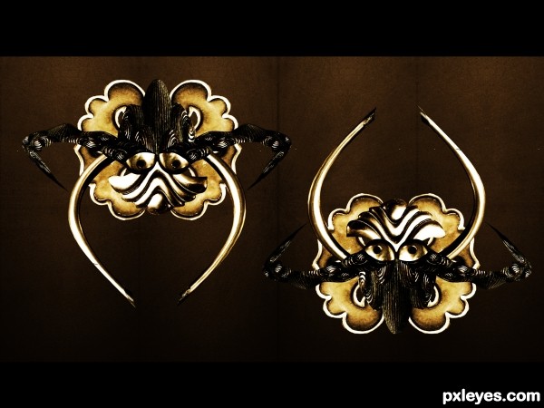
All the image was made by the source
I DARE YOU IF YOU SEE THE LAST POINT ON THE PICTURE.
View the high resolution to solve it (5 years and 3580 days ago)
this is cool,but i don't see source image here...
I will upload the SBS Soon and you will see how i made this image from the source
cool entry, love how you came up with it. gl
Howdie stranger!
If you want to rate this picture or participate in this contest, just:
LOGIN HERE or REGISTER FOR FREE

(5 years and 3604 days ago)

Hmmm, I don't think there is so much here... :O
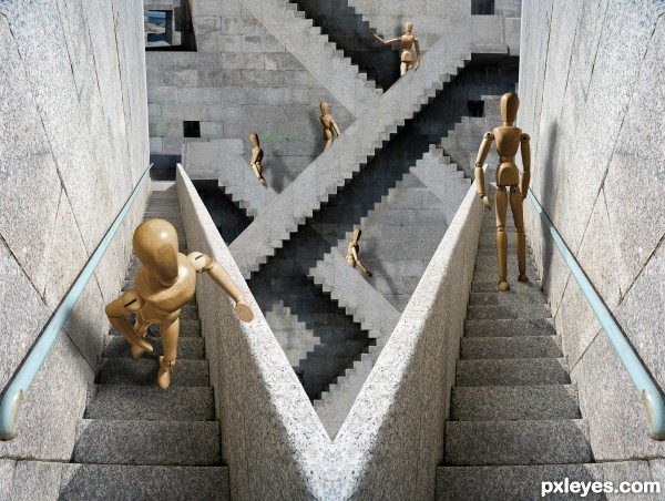
took me a second.. but I got it.. EXCELLENT!!! (maybe darken under his feet just a bit to ground him but that really isn't necessary since you achieved the optical allusion.. sitting on the back of the bench.. LOLOLOL
GUYS GUYS!!!! the man is sitting on the front of the bench .. but the bench facing the other way.. perspective of the seat is doubled.. hehehe.. it was hard for me to see at first.. but it is quite clever... bravo author
The idea is certainly good, but I think it would even better if you could get one source for the man sitting on the bench (unfortunately the man source only contains a part of the bench), so the viewer will be less distracted about the fact that you pasted the man in the other bench image (for some reason it looks too pasted imo, maybe it's the way you added shadows). Good luck!
get it now  , gl
, gl 
Very creative! Maybe if the title referenced the bench instead of the man, initial confusion would be reduced. BTW I would expect his feet to touch the ground closer to the bench.
nice attempt ............. all the best to u ............... 
It took me a second to figure it out too. Nice 1! GL!
Lol, I got it at the first 2 seconds...
i like it but ,i didn't understand it
this is actually quite cool! although the shadows are way too strong
thanks for correction
I'll try to fix it ..
Very very nice work!
nice idea
Very good concept.
Howdie stranger!
If you want to rate this picture or participate in this contest, just:
LOGIN HERE or REGISTER FOR FREE

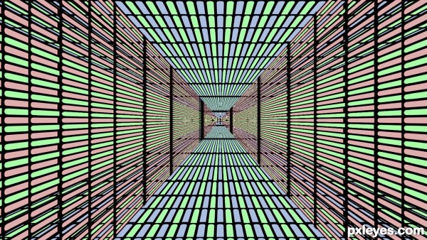
I hope you get confused enough
Only own sources were used :P (5 years and 3606 days ago)
Very very nice, like it, GL 
very cool 
Too many different light sources, but still a nice job. Good luck.
Maybe the different light sources are part of the illusion :P. I like this one, good job.
A lot to like. The illusion might be more compelling, however, if the right-side figure were on the same step level as the left-side figure. Additionally, the I think background is distracting because its dark shadows dominate the center (initial focal point of viewer) but then has no optical-illusion component. A simple stone wall (with maybe a window) with vertical mortar lines consistent with those of the left- and right-side walls might be better as a background. [BTW in background, top figure's left hand should be casting a shadow.]
nice and GL............. 
This is very cool! 
it is very sweet
it is very sweet
Gud Luck... Very nice 
now that soo twisted, nice work
great work ! 
Great job author...best of luck
A big Escher fan?
I LOVE the Escher quality of this!! Best of Luck and Well Done =)
Great blending and composition shadow work really helps the illusion
Congrats! 
Congratulations! 
Congratulations for 3rd
congrats 
Congrats! for 3rd place
Congrats for 3rd place!
Congratz to 3rd 
Congrats for 3rd!!!
congrats........ nice to see u back...
Congratulations!
good wrk... congrats...
Congratulations!!!!! 
Howdie stranger!
If you want to rate this picture or participate in this contest, just:
LOGIN HERE or REGISTER FOR FREE

Thanks to Martiweb & Gergerger7 for the nice stock ;-)
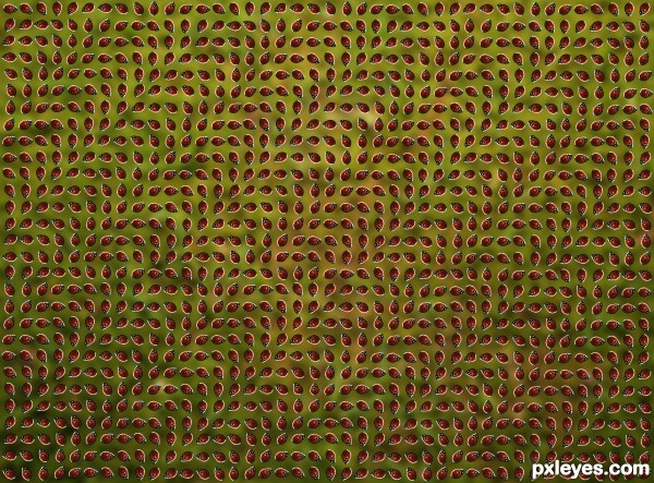
I'll be having nightmares about these creepy crawlies for the next few days :-)
I used a tutorial Of Pawel Kiec as reference. Thx to Pawel Kiec.
Please look at it in high resolution.... :-) (5 years and 3606 days ago)
lol I was thinking about doing one very similar to this. You might want to post "see semi (before zooming in) hi-res", The illusion is not as clear when it is a smaller size.
Overall though, I like the complimentary colors used, and the illusion is a great one. Good luck author  .
.
stunning, they seem to be really moving, very well done 
nice work author ,=p
Very nice! Really good work, good luck
Using the beetles [not to be confused with The Beatles  ] really makes this cool. Cropping the image so it's wall-to-wall beetles possibly out to infinity might make this even more disturbing.
Oops  yep i will change the spelling..... thx DanLundberg
wow, it really waves. that's cool!
great work ........... 
 There's a lot of waves of ladybugs... I'm going nuts!
brilliant
Thx for the nice comments to all 
nice job
ok, i can't make out what it is suppose to be because just it won't stay still... Great job!!
This is good.
Ooooo, they are moving and waving  I am happy that you Author, created this image using lady bugs not cockroaches


Howdie stranger!
If you want to rate this picture or participate in this contest, just:
LOGIN HERE or REGISTER FOR FREE
Howdie stranger!
If you want to rate this picture or participate in this contest, just:
LOGIN HERE or REGISTER FOR FREE