(5 years and 3908 days ago)
(5 years and 3930 days ago)
nice
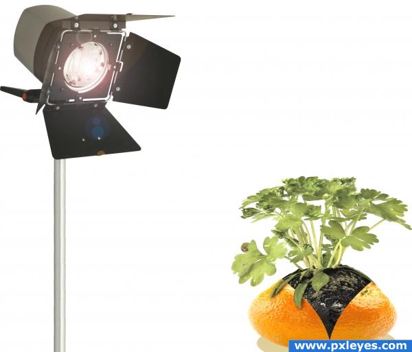
Hmm.. what's the studio light for?? i really like the image, but i don;t see the need for the light, maybe make a background fo some kind. Good luck!
The light is silly, and your image is distorted...the orange skin could use some thickness.
Put in a background, fix the shadow,take out the orange, color the lesves orange and you've got a better entry!~ sorry, needs work!
very nice 
Howdie stranger!
If you want to rate this picture or participate in this contest, just:
LOGIN HERE or REGISTER FOR FREE
(5 years and 3958 days ago)
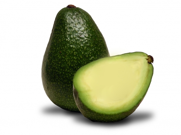
This looks incredibly like this tutorial: http://psd.tutsplus.com/drawing/create-a-citrus-fruit-design-from-scratch-in-photoshop/ so I don't think you have used the source image.
Now thats a change from an avocado to an orange good luck!
No sign of the source image.
nice transformation
no use of source huh? but u can make source look like as orange color good luck and sofar so good so u can just overlay it on source
looks nice , but is there any source image or sbs??
..... what happened to the orange??!!
'just simple editing' - 'just simple marks'
nice 
Howdie stranger!
If you want to rate this picture or participate in this contest, just:
LOGIN HERE or REGISTER FOR FREE
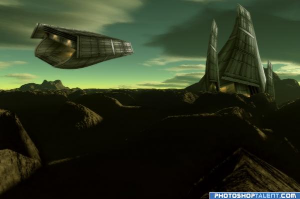
I created the alien landscape using the famous "Terragen" software. The ship and alien outpost were created using the blue container image. No other images were used.
(5 years and 3969 days ago)
cool!
very nice. but seeing as how you didnt do very much it doesnt feel so original. good job on ship and w/e that thing is. 
Can't use the background Image... find CC images. read the site rules and guidlines etc  the site you took the bacground from says "he creators of the images retain all rights to their images"
Nice idea good luck!
Annabat I created the image. "The creators of the images retain all rights to their images". I did not take the background image from the site, please read the discription and sbs. Background image was created using the software.
good sbs, nice entry, i'd like to know where to get terragen!
I already posted the website. Check under sources used for this entry. Thanks 
Here is the URL just in case you can't find it.
http://www.planetside.co.uk/content/view/15/27/
If you created it in another software you also have to have and sbs for that part as well. You have to sbs for all parts of the image.
It is impossible to give the sbs for that software. You will understand once you use it. I would have to provide over a hundred steps in the sbs. I will try my best to put the important parts in step 26. Thanks
nice
wow! great color scheme. good work
wow author looks like you're great with this software!!!! You rock!!!
Thanks

GR8 work.....
Pretty cool image. Maybe some more contrast for the background to fit better with the spase ship and station. Good luck!
nice 
This is very good entry !!! I do like it very much 
 great SBS too
Update: Contrast fixed
very creative
Cool sci-fi scene nice Terragen work super stuff!
Nice work. Great rendering from terragen.
This is very *VERY* nice! Well done!!!! 

 !
!
congrats
Congratulations for 1st
Congrats!
Congrats! Way to go! Great entry!
Congratulations.
Congrats!
Thanks everybody 
Howdie stranger!
If you want to rate this picture or participate in this contest, just:
LOGIN HERE or REGISTER FOR FREE
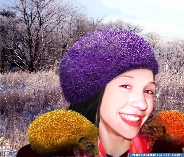
All my own photos were used along with the source image. SBS will follow, but I used mostly airbrush, paintbrush, transform tools, color and balance. (5 years and 3974 days ago)
very cute piece.. hehehehe.. very nice tones.. one itty bitty nit pic.. and it really isn't a big whoop, you might want to keep the color of the hedge hogs face on the orange one it's natural color.. it would help in the realism.. OH YEAH,, WELCOME BACK
EDIT: I just noticed the incredible masking work you did on the edge of the hat, I've been working on that little hedge hog off and on and I could NEVER do such a good a job you've done.. I have no patents for that kinda detail
EDIT:NICE EDIT..good LUCK!
Nice work and interesting creative design 
Thanks so much Golem. I uploaded the wrong image-had already changed it. Good to be back!!
 strange as it is, it is totally convincing!
lol, good luck =)
orange i think but still a gread idea good luck!
nice.
The new seasons colours..
nice idea 
Very cute, I like it! In my opinion you could work with exposure - brightness/contrast to match the background... but it's only my opinion)
lol  interesting that hedgehog looks much better in these colors, than in his native
groovy!!!
good job and good luck
thats fashion lol 
blur the hedgehogs or sharp the girl... nice idea, but how can this animals be so relaxed?
Nice! Especially for a relative newbie. 
Definitely a new trend  Good luck!
nice
Howdie stranger!
If you want to rate this picture or participate in this contest, just:
LOGIN HERE or REGISTER FOR FREE
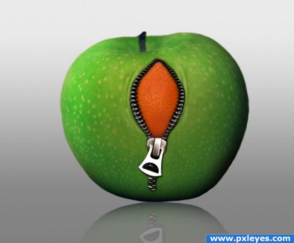
I think it would look better if it was the other way around...the orange unzipping into an apple. That way you could show some of the inside of the white pulpy underside of the orange. But what you have doesnt look bad either, nice job with the wrinkles and reflection.
Great job on the folds!! The whole image looks great! Good luck!
very nice wok and funny idea
nice blending work there author, looks almost real lol i dont like apples, but if the inside tasted like orange, i just might take a bite heheh
Same here. Im more of an orange person
I love this idea. Very well photoshopped aswell. Good Luck!
wow awesome!
very cute,simple and clear work.gr8 job author!!
Very imaginative!!! Loving this!!!
nice job on the reflection
Howdie stranger!
If you want to rate this picture or participate in this contest, just:
LOGIN HERE or REGISTER FOR FREE