(5 years and 3966 days ago)

Ok first is a cool effect
second is very simple
I hope you like it!!
No external source used! (5 years and 3966 days ago)
it will be good, but reflection need some work more, if you care... but it probably does not fit in to your concepts...  good luck!
centering might be helpful, its very heavy on the right side because of the black rectangle... IMO.. good luck, nice image
Good luck.
nice 
What is this?
What is this?
Howdie stranger!
If you want to rate this picture or participate in this contest, just:
LOGIN HERE or REGISTER FOR FREE

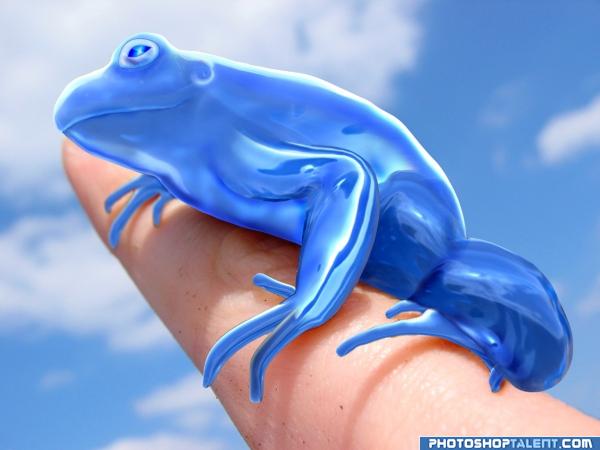
This first time I done something like this, I hope you guys like. I had a problem getting the hind leg, this was a nice challenge for me and I enjoyed it :)
Thanks to Scyza for the frog image :)
http://www.sxc.hu/photo/168449
Sorry for the late SBS hope it helps some. (5 years and 3966 days ago)
nice G.L : )
Nice result! See your original frog image? The furthers front paw and the back paw have some blur, that's because of the depth of field. You also see that on the finger itself. If you can manage to give those paws in your image a same kinda blur effect, would be very nice! Up to you though. Good luck!
lovely piece of work -- nice use of the source
Beautiful frog!!  IMO I think the frog does just fine on its own and doesn't need the face reflection, but that's just my opinion. Good job and good luck!
excellent work 
very well done 
Excellent shadows 
High marks for a great job  Kudos!
Great Job!! I love it...Best of Luck 
nice
Cute! Beautiful entry! Well done!
very nice. only problem is, gel feel is gone from the top areas(legs are perfect)
blue frog - friendly frog  good luck!
Exceptional Work, I love the face reflection, subtle enough not to be obtrusive, excellent
love it! nuf said.
owwwww wow...........really grt wrk author.........
Look just like a sweet little ornament for a special collection. Blue and shiiiiiiiiiny 
Reflection doesn't work, otherwise a well made image. 
thanks everyone for your comments,  I wasn't sure about the reflection either just wanted to try something and get opionions. I appricate all your wonderful coments and i'll make some adjustments.
preety cool job, but its more luking like a toy...
ooo lovely work!!! 

wow great!!! good job! 
Like what's mentioned above...the blowback color on the flesh shouldn't be red/warm...it should be a cooler color.
nice work well done i love it nice idea
Really nicely done! Love the way you made his eye.
fantastic
beautiful 
Strong entry.. good luck author!!!!
Good-looking image very nice crafted quality work!!
you did very well, keep going
Congrats! 
Howdie stranger!
If you want to rate this picture or participate in this contest, just:
LOGIN HERE or REGISTER FOR FREE

ONLY SOURCE IMAGE USED......
(5 years and 3967 days ago)
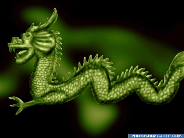
very nice.. maybe change the back ground to a color that contrast with the subject so it pops more..but green is a good solid.. I think my eyes are over whelmed with all the Blue we've been seeing lately.. hehehe.. it's a great piece in any light.. good luck
interesting idea good luck!
nice 
Nice job! GL!
Pretty ok! It would be nice if you could give the manes from middle to behind a bit sharper edges, just as you have near the dragon's head and neck. Good luck!
very nice G.L.
thanx wazowski for ur suggestions made changes
Very creative!!  You are a good artist! Well done!
good
nice 
Howdie stranger!
If you want to rate this picture or participate in this contest, just:
LOGIN HERE or REGISTER FOR FREE
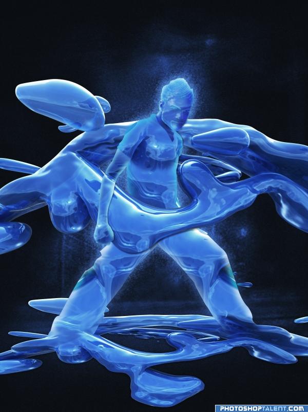
super image.. I'd love to see the same idea done with a nude.. it would make it more timeless, right now the expression and pose make it very XMEN/FANTASTIC FOUR which is AWESOME.. good luck.. and high high marks
excellent work.. nice sbs.. gl
what a power! good luck!
I keep speculating what the symbolic meaning behind this could be, so many.. fascinating Great work!
grt grt work............................................gl author
IN LOVEEEEEEEEEEEE......super concept.....
Well done! I'd get rid of the hard angles on the hand and the leg below the hand, since everything else is soft curves...
nice
Looks quite ok! Agree about the soft curves, I'd suggest a same kinda thing for the hair. If you can add some highlight (from the original source) on the shoulder, would be nice too. Good luck!
nice
Nice one Author....... Good Luck.
even looks easy,very nice thanks 4 step by stp
this is great!
 GL
GL
good job
Very cool, love the idea I don't know if I like 2 of the gel images showing like that, the one on the ground looks good but looks like there wasn't much effort put into the one that flows around him. Very nice results
Amazing work! Great result anf great job with the splash around him.
nice detail left in the face still, good job
good work. nice use of source
great
Excellent use of the source top job!!
Congratulations for 3rd
Congrats!
congrats!!
Congratulations.
Congrats!
Congrats!
Howdie stranger!
If you want to rate this picture or participate in this contest, just:
LOGIN HERE or REGISTER FOR FREE