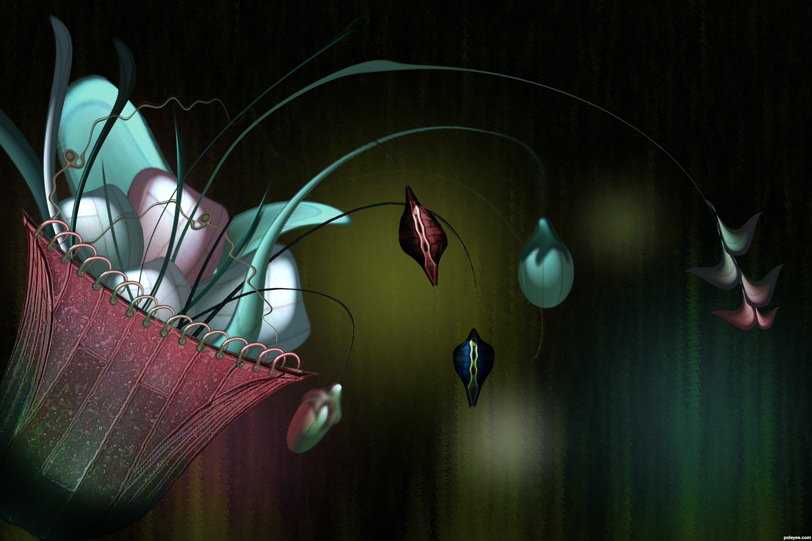
This was inspired by the flower based at the lobby.
Everything is manipulated from the roof of the gazebo.
Hope you like it. (5 years and 3216 days ago)
(5 years and 3439 days ago)
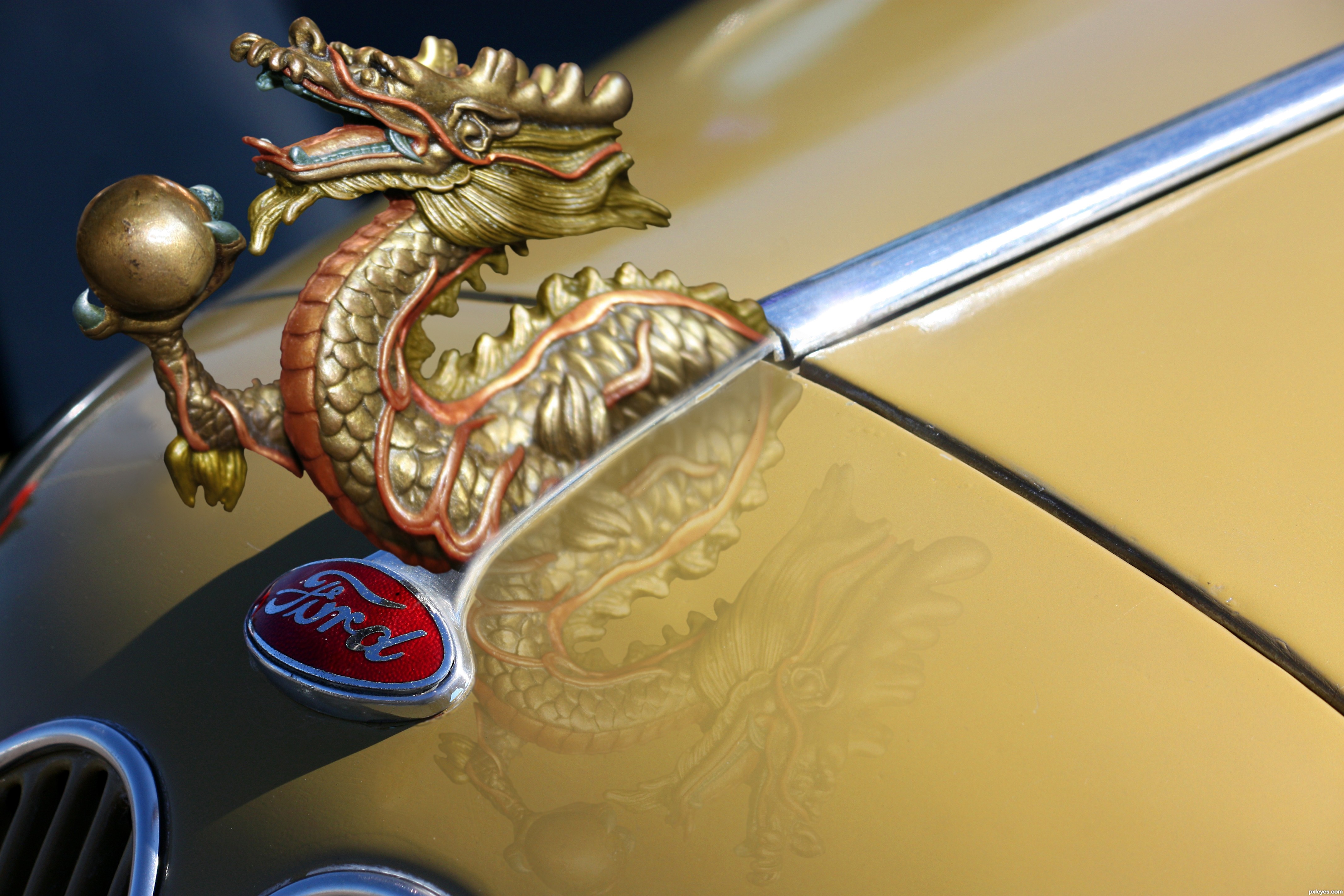
Can you use the word 'Ford'? Maybe just slightly tweak it.. other than that i can't find anything to fault.
Good work 
Edit: LOL.. good answer Author 
Ponti, I don't see why not, it's just a photo of a car hood. Besides, it would have been too hard to change it to Nixon. 
LOL Nator...the car shot was a great find...right color & angle. And you gotta admit that old Ford logo has stood the test of time, just like the Coca-cola logo!
ford-chinese version 2012
Looks like a Fiat to me - but what do I know, I'm just a girl...
wrong shadow on the dragon - perfect montage and good reflection...
Very cool and creative. While admittedly over-grand for a today's Fords, your hood ornament merely replaces another equally ornate one from the 1930's in your source image. As locxoul noted, you retained the source shadow which included an under-belly opening that your replacement ornament doesn't have/fills in. The reflection is an intriguing addition since your source doesn't have one. It should probably be more subtle but more problematic is that its perspective is more like a shadow than a reflection.
I would've liked to see a sharper line where the dragon meets the car. But having said that this is a really nice source find and really nice execution. I know the reflection isn't supposed to be there but it looks damn good there now.
Lovely work. Like the way that you have done the red/orange colour over a portion of the dragon ... ties it in beautifully. And it is cool that the Ford logo has and almost dragon skin texture to it. Well done!
Top entry author...Very well made creation...Best of luck
Good idea...like the colors and fits in perfectly
@ Dan Lundberg & Chalty: Look at the source pic. It certainly does have a reflection, which I removed, so the dragon reflection absolutely belongs. Fixed the shadow...thanks.
distort a little bit more on the reflection following the car contour ll make this a perfect reflection - still ve wrong drop shadow of the dragon that s still ve flat shadow... but this got me 75%vote 4 the idea/update.., gi author - this ll stand againts doorknoker 4 photorealistic lookin...
Great image, shame about the ford badge but you`ve managed to make it passable well done and GL
Howdie stranger!
If you want to rate this picture or participate in this contest, just:
LOGIN HERE or REGISTER FOR FREE
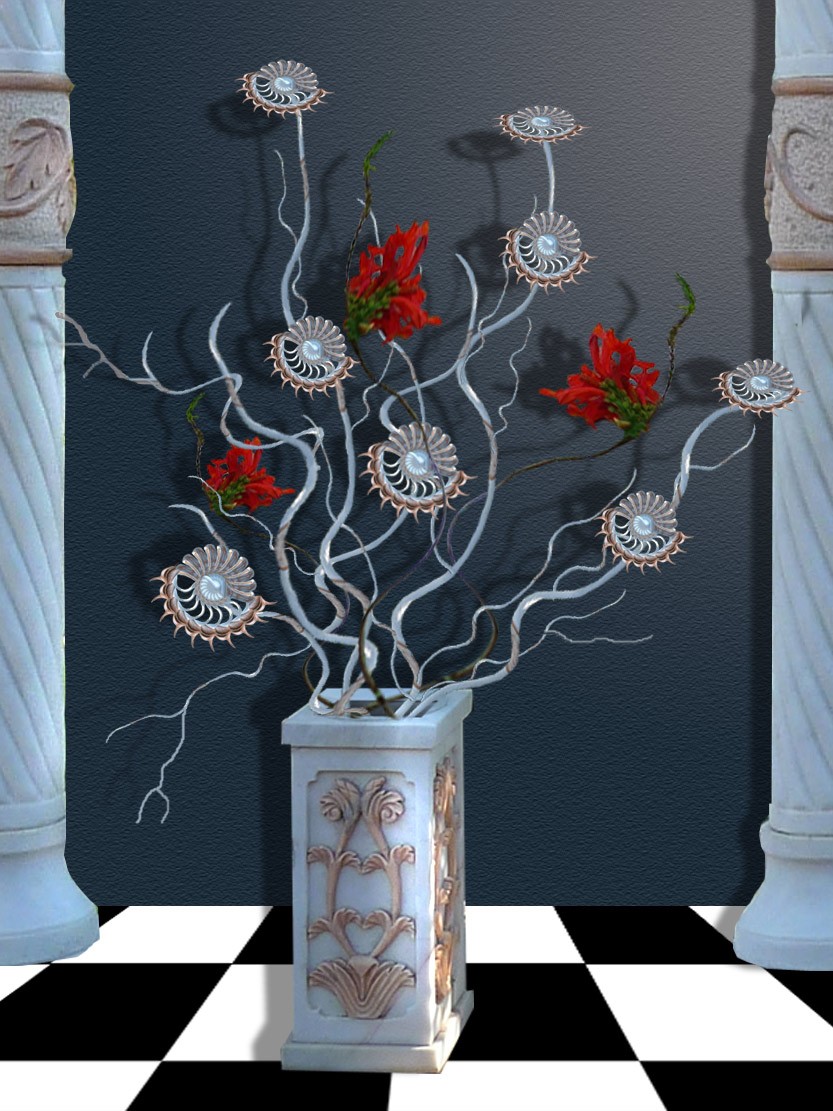
No outside images used. (5 years and 3768 days ago)
Shadows are inconsistent with light source, column on right has no shadow at all...
I'll post two positives since someone else posted two negatives........ I'm sure you put a lot of effort and a few hours into it. Good job on the pattern of the liquified flowers, and the branches. Cmyk is right though - fix the shadows and I'd also say work with some adjustment layers.
I will correct the shadows... thank you for observation.
UPDATE: Worked more on the shadows.
Nice liquify work. Here is picture of shadow reference, which will work best for your entry. .
http://1.bp.blogspot.com/_Eiwce13X738/R1yxs683tiI/AAAAAAAAA8Q/AkVqE8ZeDfg/s320/ShadowWall.JPG
I hold my vote till see how much you improve.
lovely image, will hold votes for changes.
I corrected the shadows...(I hope they are ok now), there won't be more improvements for this image, as time, is almost gone. Thank you for taking the time to look at it. Good luck to participants...!
Howdie stranger!
If you want to rate this picture or participate in this contest, just:
LOGIN HERE or REGISTER FOR FREE
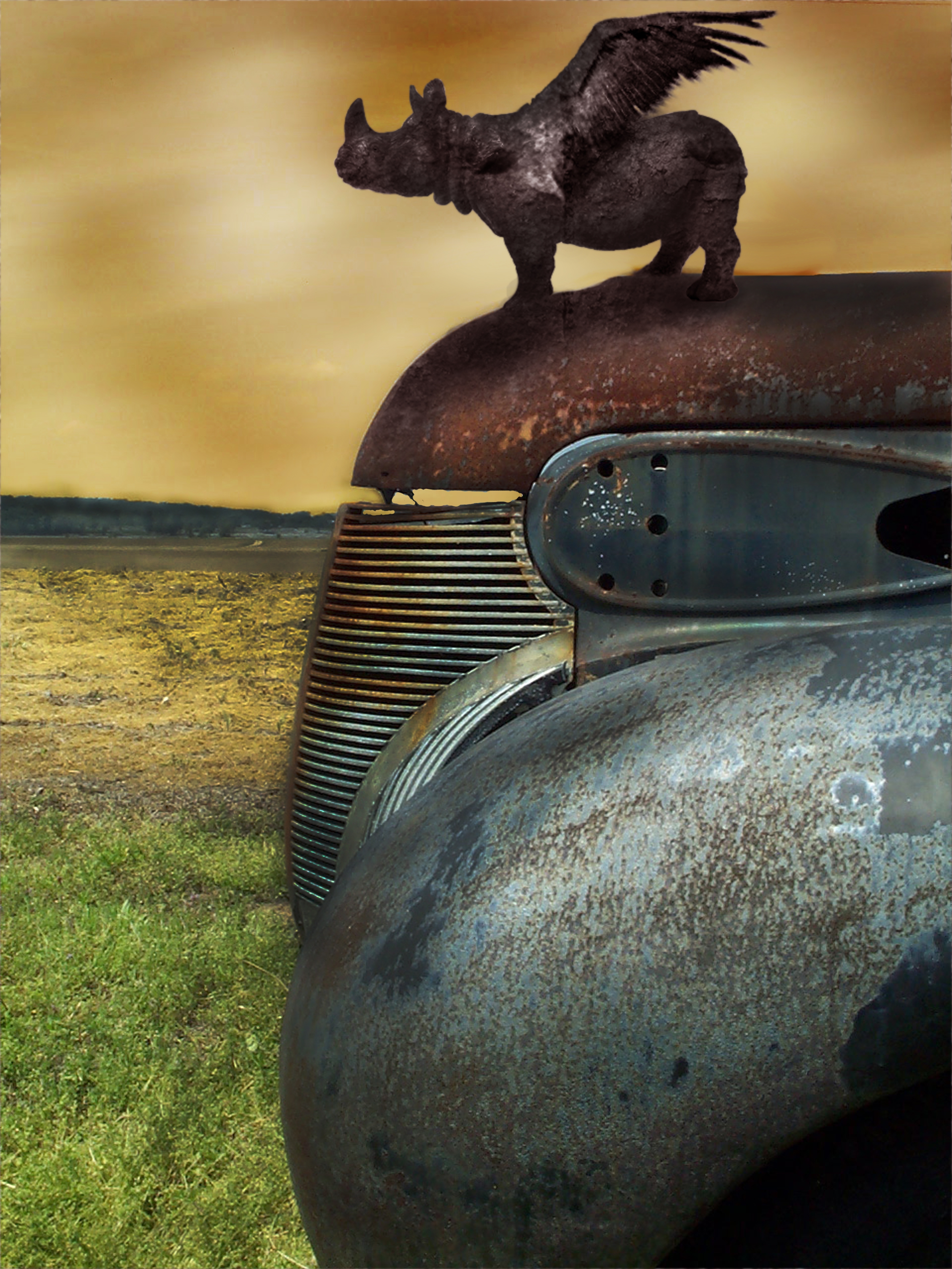
Thanks to CraigPJ, Wazooo, and www.cgtextures.com for the great pics!!!
fixed blue sky still showing through car... (5 years and 3867 days ago)
hehehehe.. cute (great use of source)
Nice idea, looks great! One thing - the ornament looks more like stone than metal, so maybe try to make it really shiny, then add some rust textures. That's just my opinion (it looks great as it is, so you don;t have to change it) Good luck!!!
Nice image...not so sure about the render clouds, but if you wanna use them, fill in the blue spots under the hood from the original sky...
Image looks great, but the clouds effect is a bit too obvious. Still, awesome job!
Cool chop. Try to make the hind legs look more attached to the hood though.
very nice antry... i think it would be even better if you can apply some rust onto it (the reddish one) if you look below the rusted piece of the hood you can see you frogot to remove part of the old sky
I think you've achieved good balance in your composition; I like the rusty feel and how you used the source
HELLOOOO...there's still blue sky in the cracks under the hood...!
sorry...didn't see that....I will fix that now!!
Howdie stranger!
If you want to rate this picture or participate in this contest, just:
LOGIN HERE or REGISTER FOR FREE
Photography and photoshop contests
We are a community of people with
a passion for photography, graphics and art in general.
Every day new photoshop
and photography contests are posted to compete in. We also have one weekly drawing contest
and one weekly 3D contest!
Participation is 100% free!
Just
register and get
started!
Good luck!
© 2015 Pxleyes.com. All rights reserved.


Superb work author...best of luck
Thanks a lot.
Really nice image, very creative textures.
thanks pearlie...
very nice compose of the background - and the rest is very good as well
Howdie stranger!
If you want to rate this picture or participate in this contest, just:
LOGIN HERE or REGISTER FOR FREE