Credits to:
v-k-s
shadowed-light-waves
stock-gallery (5 years and 3247 days ago)
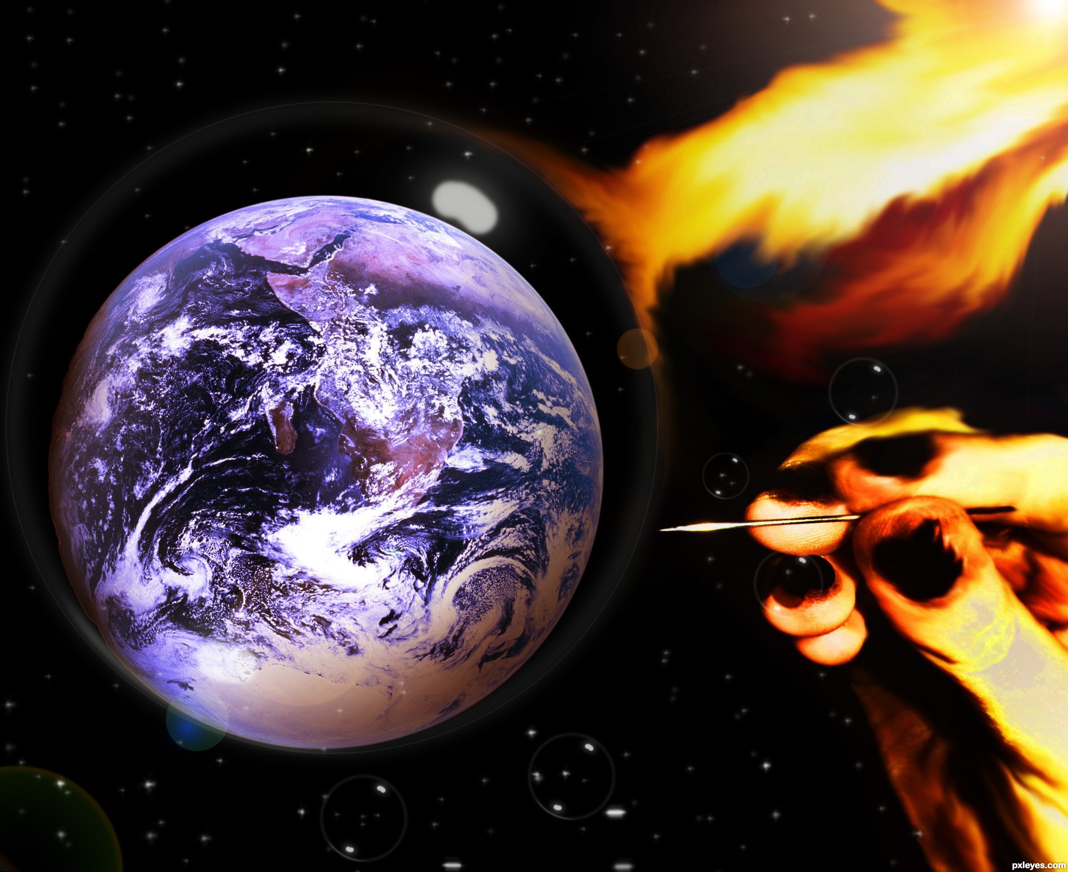
the bubble is the ozone layer here,we use different types of chemicals in our daily life which are destroying the ozone layer (5 years and 3371 days ago)
The light reflection "spot" is misplaced and makes no sense. It should be a reflection of the sun shining on the planet, not an odd, squarish light spot.
There is also no light reflection/refraction from the flame, which is so bright that it would be MUCH lighter along the bubble "edge," not a dull orange that barely shows on the bubble at all.
there are many ways you can suggest someone about their work.people do not come here for getting a rough criticism about their work..most of us come here for have some fun and learn something through competition s.There are many ways you can help someone to improve their works.But hurting their emotions is definitely not the way.It never works.words like"makes no sense" only disappoints a participant nothing more..u may have much knowledge about photos , lighting,and reflections but there are many friendly ways to admit those.I always appreciate your honesty..but always be careful how u admit them.
You are not in training . I received a couple of slaps on all weeks.
ACTUALLY IT'S HARD TO FIND THE BUBBLE ON YOUR PIECE, AND YOU SHOULDN'T BE OFFENDED AS THIS CRITICISM WAS NOT ROUGH AND BESIDES MossyB POINTED TO YOUR MISTAKES. YOU SHOULD HAVE SAID "THANK YOU" AND CORRECT YOUR MISTAKES.
It's an obvious technical flaw, and I pointed it out.
Comments are just that. I commented on what I observed, which is incorrect light reflections on your bubble. Whether or not you choose to agree, or get hurt feelings is YOUR response, which I have no control over.
This is a competition site, and while we all come here to have fun, it's not a day care, and part of submitting your work for public comment means having a thick enough skin to not whinge when your technical mistakes are pointed out. If you cannot endure any criticism, you can always not elect to allow public comments.
I do not need to "be careful" in stating what I see. Perhaps you need to be more careful in what you render.
well Its not about my feelings sure its not because I am with this site about 1.5 year almost.so my skin is thick enough while guys like you around.well its more a COMMUNITY then a competition site IMO, thats what i wanted to say.where competitions are fun ,scoring points are fun also.I have received many criticisms since I am here, I always appreciate those ,but is it sensible in a community to admit your suggestions way like this.?..and @ANDROLA I have said in my previous comment that"I always appreciate your honesty"..so I guess I thanked him/her there,but what I wanted to say I don't really like the "way" he/she suggest, not just mine only.
Author is partially right,Mossy, you always sound way too serious when commenting, that's cause you never use smileys and have no avatar (anti-social written all over  ).
).
Although I honestly dislike when someone points to my mistakes even though they are 100% right (and they even use smileys and avatar), the thing i hate the most is having a low or average score and no one telling me why.
You should be (somehow) glad that Mossy commented and believe that she has no hidden interest in making you feel bad. And she was pretty much right, so..if you have time, you could try to improve your entry.
LOL. I can see the bubble. Yes your work needs a little work author, and Mossy's comments are here to help you. (as are every one elses)
Though she(are you a she Mossy, LOL) tends to sound like a robot, very impersonal, but as greymval said she has no avatar and doesn't use smileys, i would if i knew how
Don't take it to heart.
Keep up the good work, we can only learn from our mistakes and sometimes others guidance.
Members who suggest how your image could be better are doing you a favor. If you choose to be insulted by their comments, you had better be a genius who can afford to ignore them. In this case you are not.
why you guys misunderstanding me ?I didn't feel insulted, I always appreciate those suggestion come to me ,they always help me to improve my my work am grateful to you guys,
But there should be a little respect for the work while you suggesting someone ..thats all what I wanted to say
I am probably one of the most sensitive people around....even I didn't think MossyB's comment was a "rough criticism" EVEN without smileys! Why should people have to put smileys after a sentence? How about people just think about the many ways the sentence can be construed and pick the most favorable one?! People always think the worst first. I think MossyB said things constructively politically correct!
By the way author, I like the whole image except for the fingers. It looks as though the fingers have been burnt. I'm not sure if that is what you were going for, but it just doesn't look right 
"It's up to us as the authors to decide what works best in the end"-spaceranger and I believe in this and feel like this way.
Howdie stranger!
If you want to rate this picture or participate in this contest, just:
LOGIN HERE or REGISTER FOR FREE
(5 years and 3407 days ago)
very very nice work author...Title explains a lot of things...best of luck
Thanks Erathion, the title does say a lot
nice job on the depth
I could stare at this for hours! So peaceful and full of hope Well Done Author and Best of Luck!
Thank you Christy
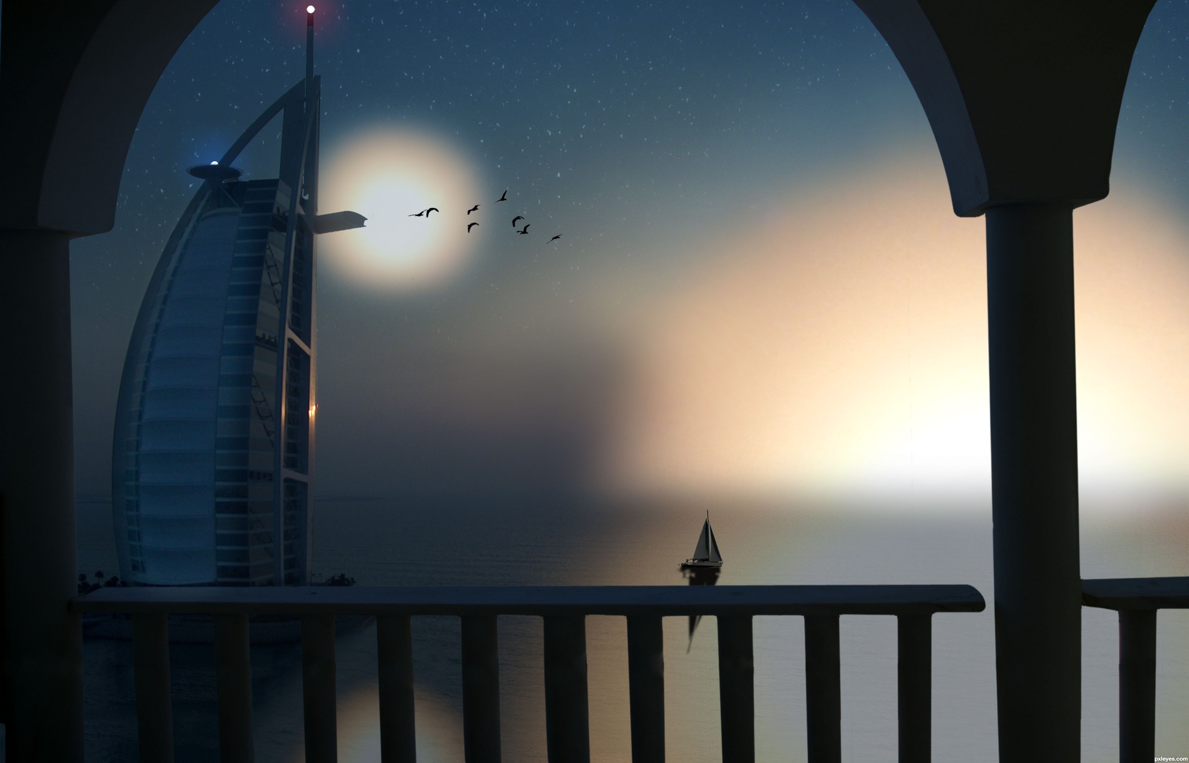
Definitely worth viewing in high res! Very peaceful and well composed image.
Beautiful image! I agree, there's such a sense of peace and quiet, and your thoughts are so true. We must make the most of each new day. GL
Howdie stranger!
If you want to rate this picture or participate in this contest, just:
LOGIN HERE or REGISTER FOR FREE
(5 years and 3435 days ago)
I'll just turn around thank you very much LOL very neat Idea author.. good luck
very good idea and neat work author...mood is very very nice...IMHO this could be your best entry for now...best of luck
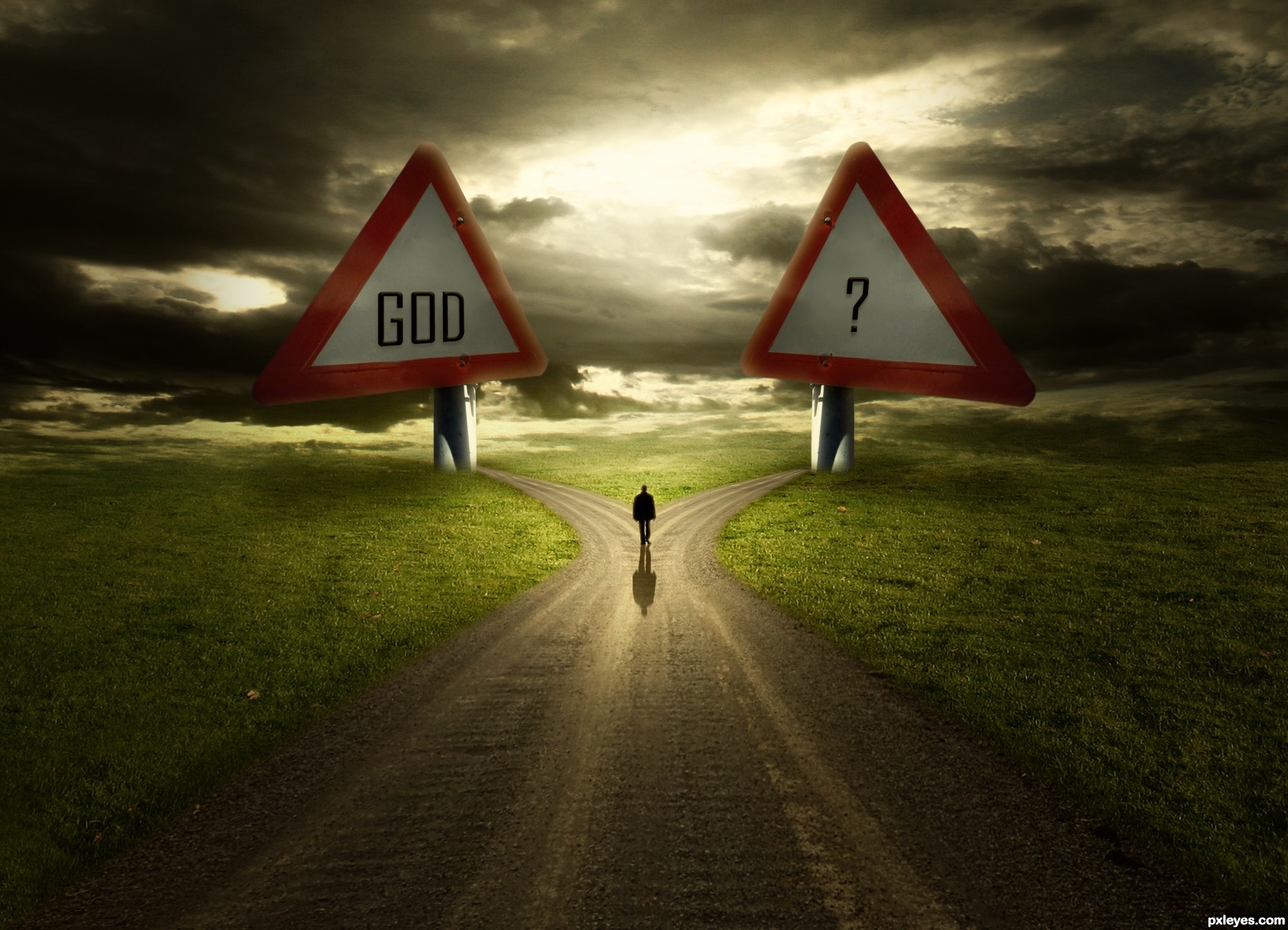
I suggest you have a look again at the traffic signs, the positioning and perspective is completely wrong. Not to hard to change that.
It's very nice, just fix some things, I think the size is too exaggerated, the screws lose the sense at this size, and I think that would give you center a little more plates to the base. GL
Wanna see the SBS too, i will hold my vote 
very good concept.. good luck
Agree with above, especially the perspective.
There's no difference between "GOD" and "?"...just a matter of perception. But please try to revise the image as per the suggestions above.
I like it and the idea is great.You got my vote.
@erathion Wow...thanks mate. @petersheep You're right about screw. It fixed.
Thanks everyone for your words. And to point out mistakes about perspective. Can you clearly describe .. ?
Hi author, i see the modification...nice!!! about the perspective, I think if you centralize the center of the plate with the base would be perfect.......nice Job GL!
Hi author, i see the modification...nice!!! about the perspective, I think if you centralize the center of the plate with the base would be perfect.......nice Job GL!

great image!!!
Excellent work, loved the lighting! Dramatic and expressive! My fav!
Love the idea and the lighting. Would have loved it even better if the source was a finger post and not a warning sign. But since it is, I find this just great. 
congratulations...
Congrats!!
congratulations...
very nice.., congrats
Howdie stranger!
If you want to rate this picture or participate in this contest, just:
LOGIN HERE or REGISTER FOR FREE
I have another 2 sources here is the links becouse on entrys page is only 10 sources:
http://www.flickr.com/photos/kevinsteele/24771587/
http://www.sxc.hu/browse.phtml?f=view&id=1187553 (5 years and 3462 days ago)
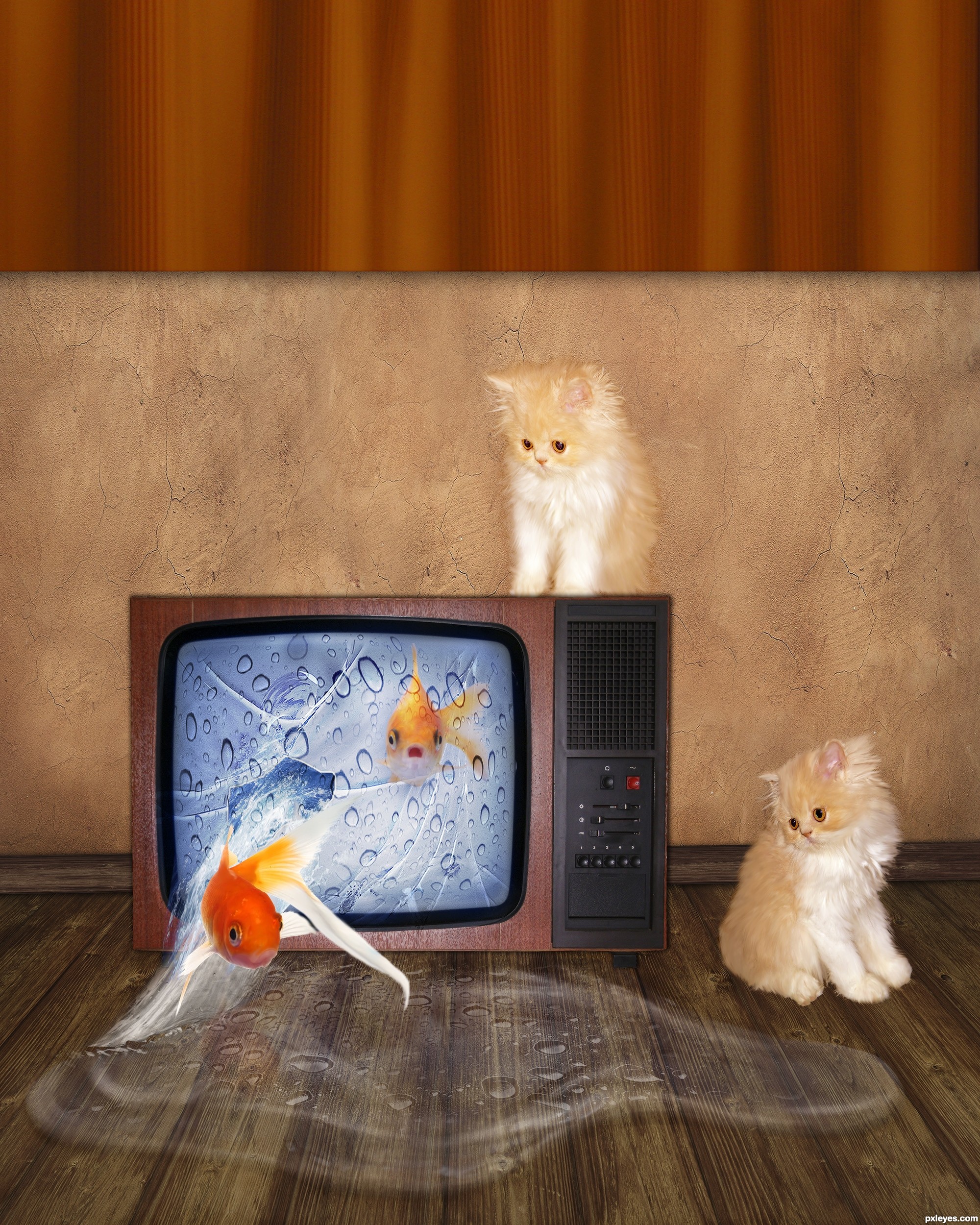
nice concept, but the water looks artificial...
Good idea with a scale problem: TV's too small, goldfish too big.
(No source for TV).
thank you for the suggestion ! the link for tv is on description because was more than 10 sources.
very cool work and great unique idea...GL
Blub
blub?
Well, a fish "says" blub.. Anyway.. Only tried to be funny.. Better stick with being serious I guess Anyway, I like the idea!
Very cute creation = )
Howdie stranger!
If you want to rate this picture or participate in this contest, just:
LOGIN HERE or REGISTER FOR FREE
Photography and photoshop contests
We are a community of people with
a passion for photography, graphics and art in general.
Every day new photoshop
and photography contests are posted to compete in. We also have one weekly drawing contest
and one weekly 3D contest!
Participation is 100% free!
Just
register and get
started!
Good luck!
© 2015 Pxleyes.com. All rights reserved.


Source links are not working. Very neat scene, good luck.
Yeah..my bad..fixed..thanks Akassa!
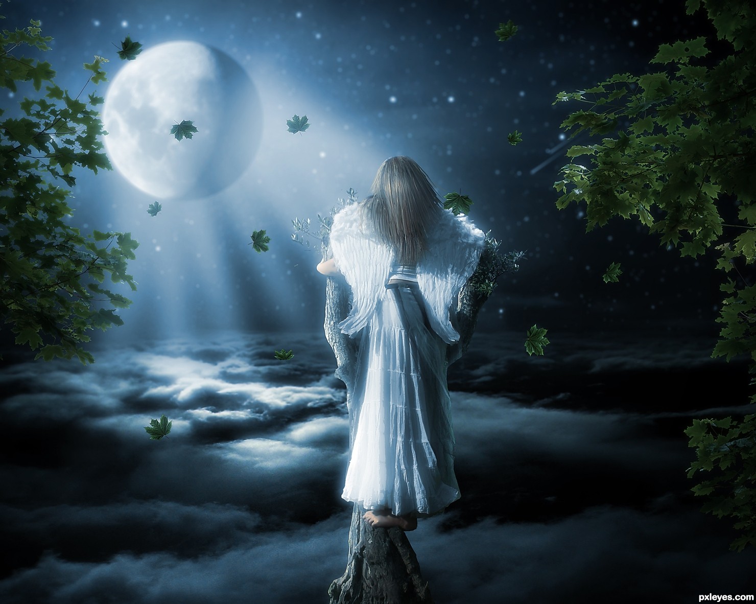
moody mood mood mood.. lovely
Nice composition, but I'd tone down the bright light on her left side, since you've emphasized the moon beams coming at her from the back. Or move the moon over to the left, so the illumination is more consistent.
~M
Nice Congrats
Howdie stranger!
If you want to rate this picture or participate in this contest, just:
LOGIN HERE or REGISTER FOR FREE