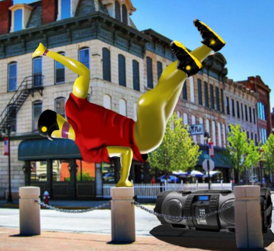
not your typical break dancer (5 years and 3351 days ago)
- 1: Boom Box
- 2: Street Corner
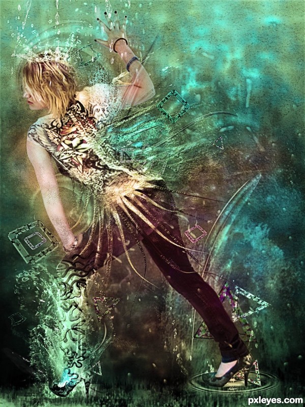
Thank you Ali181, Mqtrf, Gotmeamuse and Hilleke (all from PxlEyes) for the lovely stock images.
Many thanks also to Baringa-of-the-Wind and Midnightstouch from Deviantart for the splash brushes. (5 years and 3363 days ago)
Nice.
great work author...gl
fabulous work...gl
good work and good luck
i love the colors, good luck!
Many thanks to all for the support! 

Howdie stranger!
If you want to rate this picture or participate in this contest, just:
LOGIN HERE or REGISTER FOR FREE
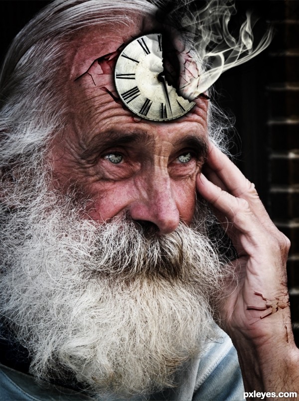
Can't provide SBS due to the fact that I forgot to turn the History limit up. Sorry!
Elements:
Smoke Brushes (Licensed)
Action essentials 2 crack textures (Bought/Licensed)
Clock Second Hand (Created it myself with Photoshop)
Please vote and comment. Thanks :D (5 years and 3369 days ago)
Very original!
Thanks ponti55. I appreciate your kindness.
Nice one!
Very nice concept author....best of luck
Thanks people. Actually I never knew that this would reach 300+ votes. Thank you so much! 
is that Father Time?  creative idea, maybe next time a Mother Nature would make us smile
Howdie stranger!
If you want to rate this picture or participate in this contest, just:
LOGIN HERE or REGISTER FOR FREE
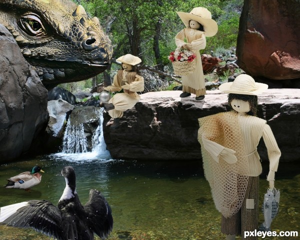
All source images are owned by myself, no external sources used. (5 years and 3409 days ago)
Love this image. IMHO you do not need the head of the iguana, the other objects look real nice, even the ducks. Good luck.
Very cool union author...best of luck
I like the placement of the people, but I agree the lizard head is too much, makes the image crowded. The people also could have used more shadows. But as for the image as a whole, its very nice, just don't like the lizard. But of course thats just my opinion.
Thanks for the comments...I agree...I guess I went overboard with the lizard head...live and learn.
...and also for your third place!
 Congrats again!
  Keep chopping!
Howdie stranger!
If you want to rate this picture or participate in this contest, just:
LOGIN HERE or REGISTER FOR FREE
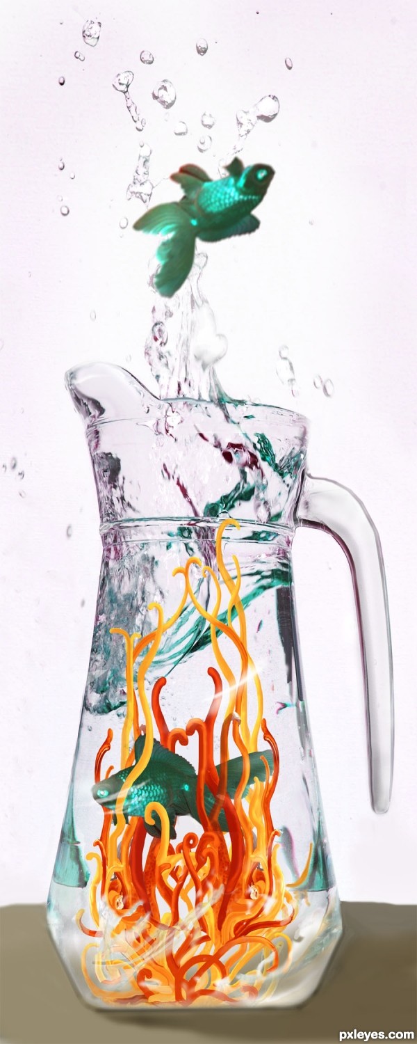
Thanks to bliss at morguefile.com for the fish source photo; also, to kblount at mfile for reference I used to do the shapes from the lemon in the main source photo. (5 years and 3421 days ago)
Great job adjusting the color reflections at the top of the pitcher!
cool work author...
To Moderators: wow I'm screwing up all over the place, first I gave a VERY wrong vote, I accidently pressed enter too soon and the author ended up with a VERY low vote that was not intended, then I wanted to redflag you to let you know and forgot to write it in the text box there, very sorry. And sorry to you, author, a low vote was not intended for you, I like your creation. 
Howdie stranger!
If you want to rate this picture or participate in this contest, just:
LOGIN HERE or REGISTER FOR FREE
I working on it.
I hope to have it done by the end of the day.
very nice construction author...especially on the legs...GL
Thanks.
No high res image?
I checked the check box for high-res. I don't know why it didn't save as high-res
Author, you can resubmit with "Save hi res" checked...no reason it shouldn't work. GL.
I did twice, something not working. I'll try again later
Nice entry! Only suggestion would be a harder edge on the leg and a shadow under the hat. Good luck!
Author, I'm not sure how big you started your entry out as, but it seems you need to make it high res first, meaning a good size would be at least 1000 PXs high and wide but a good size is 2000 to 3000 pxls. If you started with a low res canvas to begin with, then it won't give you high res just by checking the box.
That is probally what I did wrong. I tend just to make a 7by5 inch new canvas and pull the new layers in.

Thanks for the advice though, should help in the future
Howdie stranger!
If you want to rate this picture or participate in this contest, just:
LOGIN HERE or REGISTER FOR FREE