Photoshop Pictures: Out (page 17)


results 81 - 85 of 156

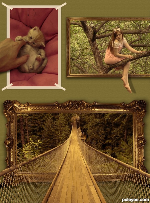
No Bounds - created by chromathoughts


No Bounds
Favs: 10SBS: n/aHi-resRank: 3/50Score: 61.9% (25)21469 views

please view in high res before voting, thanks :)

Credits :

http://almightyblah-stock.deviantart.com for the suspension bridge image.

http://phoeebstock.deviantart.com for the image frame.

http://eirian-stock.deviantart.com for the apple tree image and tha cat image


P.S: The background is a simple default pattern overlay of grayscale paper available in photoshop... :) (5 years and 3463 days ago)

4 Sources:

avatar Tuckinator

vey complex

avatar erikuri
erikuri says:

I agree with Tuck; great effects.

avatar wazowski
wazowski says:

Well done and convincing job. Good luck!

avatar hereisanoop

very nice done

avatar erathion
erathion says:

Fantastic creation author,great effects and very cool mood...well done

avatar Ressiv
Ressiv says:

The bridge has a very nice perspective! The other two kind of fade in the background because the bridge is getting all the attention. For me the other two are just distracting. I would go for just the bridge creation and do some more with that one! Good luck!

no avatar
decre says:

creative , perfectly done.. good luck

avatar Drivenslush

It's very amazing that you took three TOTALLY different types of images and made them work... that's just AWESOME... good Luck!!!

avatar indianwarrior

this is perfectly on theme n truly out of bounds, good luck author

avatar skeletor
skeletor says:

Sweet!.... I like it

no avatar

Lovely concept and really out of bounds.......Good Luck Author.

avatar Lelaina
Lelaina says:

Congrats for your third place!

avatar nasirkhan
nasirkhan says:

Congrats! for 3rd

avatar hereisanoop

congrats for the 3rd

avatar langstrum
langstrum says:

Congrats for your first top 3 place, keep it up

avatar chakra1985

Congrats!!!

author says:

thank u all for ur nice comments n support

Howdie stranger!
If you want to rate this picture or participate in this contest, just:

LOGIN HERE or REGISTER FOR FREE


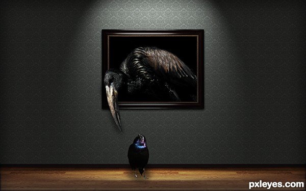
THE BIRDS - created by DYNOSSAURUS


THE BIRDS
Favs: 2SBS: n/aHi-resRank: 11/50Score: 56.7% (0)13143 views

Thanks a lot to:

http://dracoart-stock.deviantart.com/

http://archistock.deviantart.com/

and

http://stratification.deviantart.com/

(5 years and 3463 days ago)

3 Sources:

avatar erikuri
erikuri says:

This is very nice! Well done work, and GL!...

avatar DanLundberg

Nicely creepy. Not sure how big bird would fit inside the frame if it stayed in bounds. I think stronger big-bird beak shadow is warranted and little bird has virtually no shadow at all which makes it appear fake and floating.

avatar GarethWaring

Nice work but shadows could do with a tweak

avatar Tuckinator

nice lighting!

avatar erathion
erathion says:

Very moody work...good luck

avatar serialkiller

great idea, author! as others said, you can slightly fix the shadows and it will be perfect good luck

avatar oasisman
oasisman says:

I like this - very atmospheric. good luck

author says:

Thanks a lot for the all coments...

avatar skeletor
skeletor says:

Very cool!

Howdie stranger!
If you want to rate this picture or participate in this contest, just:

LOGIN HERE or REGISTER FOR FREE


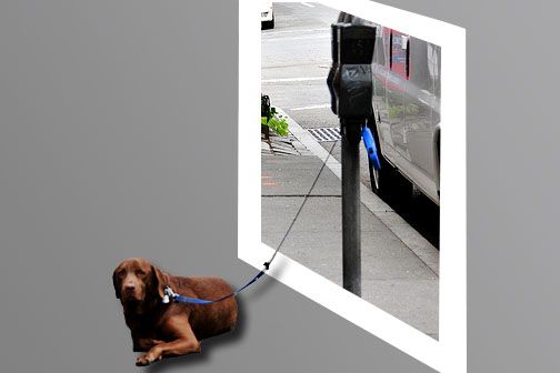
dog gone out - created by janetww


dog gone out
Favs: 0SBS: 4Hi-resRank: 49/50Score: 48.7% (0)6382 views

Ed Yourdon for the photo (5 years and 3464 days ago)

1 Source:

avatar chromathoughts

gud 1, good luck

no avatar
Keiley22 says:

looks neat but no high res... would love to see another background behind the dog though to make the frame stand out more i love ood images, they are my favourite
avatar erathion
erathion says:

Idea is great but to be more effective demands few more things to work on it...First thing is gray background...my idea is to add some image of the beach or something like this.Frame should be thinner and work a bit more on perspective of the frame...With position shadow don't match,have to follow line of the dog...I will hold my vote...Good luck

avatar dekwid
dekwid says:

yes, just like erathion says,..author.

avatar erikuri
erikuri says:

When I learned about this technique (OOB), the tut I followed showed an image like this, with a grey background. But it turns the image a little monotonous; if you add a new BG, as erathion said, like a beach, or a contrastant image, like grass, for example, your main image would pop up.

avatar Tuckinator

the perspective of the picture frame is wrong but cool idea all the same

avatar jawshoewhah
jawshoewhah [banned] says:

ALWAYS upload a high res entry with PH contests. It will really improve your overall score and show up the details of your chopping skills. No less that 1000 pxls wide should be sufice but on average 2000 to 3000 pxls is more preferable.

Howdie stranger!
If you want to rate this picture or participate in this contest, just:

LOGIN HERE or REGISTER FOR FREE


coming out of the dark - created by jack2


coming out of the dark
Favs: 0SBS: n/aHi-resRank: 41/50Score: 46.8% (0)5514 views

(5 years and 3464 days ago)

1 Source:

avatar erikuri
erikuri says:

Author, image is too small; upload it in hi res, please...

avatar Tuckinator

hmmmmmmmmmmm....strange

avatar jawshoewhah
jawshoewhah [banned] says:

Sorry too small a high res to see good detail. Upload high res in future and it will seriously help your score. No high res? Then find one that is. Images that are of low quality are a bad choice to chop. Try to keep them at least 1000 px wide.

avatar solkee
solkee says:

Author, next time click on the sxc.hu image and download the high resolution image. Joining the site is free and you can download as many images as you want.

Howdie stranger!
If you want to rate this picture or participate in this contest, just:

LOGIN HERE or REGISTER FOR FREE


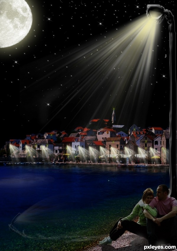
chilling out - created by jack2


chilling out
Favs: 0SBS: n/aHi-resRank: 14/50Score: 50.4% (0)4842 views

(5 years and 3471 days ago)

2 Sources:

avatar erikuri
erikuri says:

Very romantic mood...

no avatar

its a little bit blurry

avatar Tuckinator

this is a great idea author the light coming from the lightpole looks a little unrealistic...maybe blur it some more...other than that cool image

avatar Mata
Mata says:

I think that sea is too light, at dark sea is almost dark, bit of gray is missing.

no avatar
Keiley22 says:

The people look as if it is day time. When it is night, the water is alot darker due to reflection of the sky, maybe add a bit of the moon reflection to it as well
The background is still somewhat bright for just street lights to be shinning.
However, nice idea... just give a bit more work

no avatar
billyF says:

very romantic .. like it :d

avatar spaceranger

You've got some image residue on the left in the water. You also need to remove the image in the crook of her elbow. I agree about the lighting issue as well.

author says:

ok thanks to every body i have make som changes let me know

avatar Ressiv
Ressiv says:

It feels like the pole is shooting at the people. You would hardly see any rays coming from the light in real life.

Howdie stranger!
If you want to rate this picture or participate in this contest, just:

LOGIN HERE or REGISTER FOR FREE