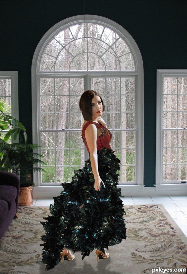
Use Source
1 own photo for bodice
1 photo for back ground (5 years and 2589 days ago)
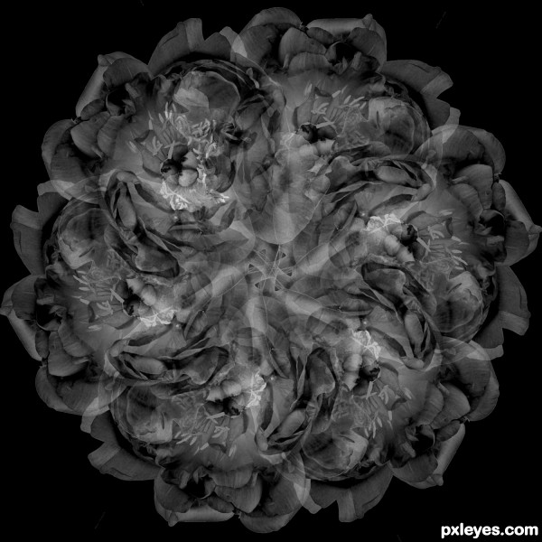
This picture is made in Photoshop CS6 by copying and turning (angle=60degree) the original picture. Each layer was in normal mode, opacity 50%. After creating full circle I merged the layers and went for image -> black and white, choosing the settings there for a desirable resulting picture.
White background of the original picture was removed at the start of transformations, using magic wand. All the way after i used just black background on a separate layer. (5 years and 2597 days ago)
Howdie stranger!
If you want to rate this picture or participate in this contest, just:
LOGIN HERE or REGISTER FOR FREE
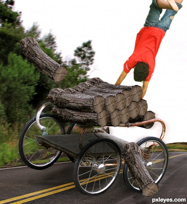
Source image, 2 outer sources and PS.
Thanks to http://www.sxc.hu
1. http://www.sxc.hu/photo/1097805
Author: abcdz2000
2. http://www.sxc.hu/photo/1413873
Author: danjaeger (5 years and 2602 days ago)
Very Funny . GL author.
Howdie stranger!
If you want to rate this picture or participate in this contest, just:
LOGIN HERE or REGISTER FOR FREE
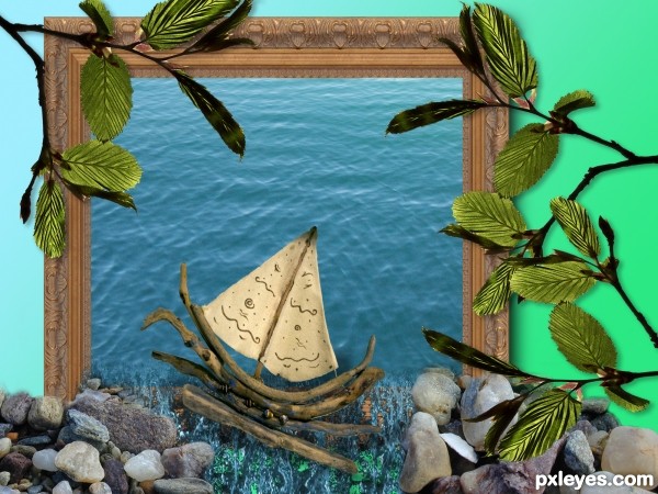
Used Photoshop to build up the image. Using layers, selection tool, eraser, free transform, and drop shadow filters.
UPDATE changed the perspective of the water, and added pebbles so they don't look like they're floating :) (5 years and 2618 days ago)
I think some perspective to the water inside the frame would help make it more believable; would like to see a high res image too!!
What I like : its so easy made, just put some pebbles here and some leaves there, and it's
done, nice!
What I like : its so easy made, just put some pebbles here and some leaves there, and it's
done, nice!
What I like : its so easy made, just put some pebbles here and some leaves there, and it's
done, nice!
Howdie stranger!
If you want to rate this picture or participate in this contest, just:
LOGIN HERE or REGISTER FOR FREE
(5 years and 2619 days ago)
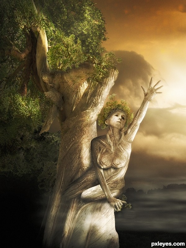
Nicely done image. Her left knee looks a little sharp on the edges, and a bit too bright. The dark halo around the leaves in her hand is a bit distracting. However the colours of the sky and tree work really well. Well done. 
really good tree work, agree about the tree in her hand being a bit distracting though. Holding my vote 
I find the breasts are a bit strange... maybe add some shadows in the middle. The colors and overall mood are beautifull, nice work!! 
Thanks for Your comments and votes.
Howdie stranger!
If you want to rate this picture or participate in this contest, just:
LOGIN HERE or REGISTER FOR FREE
Howdie stranger!
If you want to rate this picture or participate in this contest, just:
LOGIN HERE or REGISTER FOR FREE