(5 years and 3845 days ago)
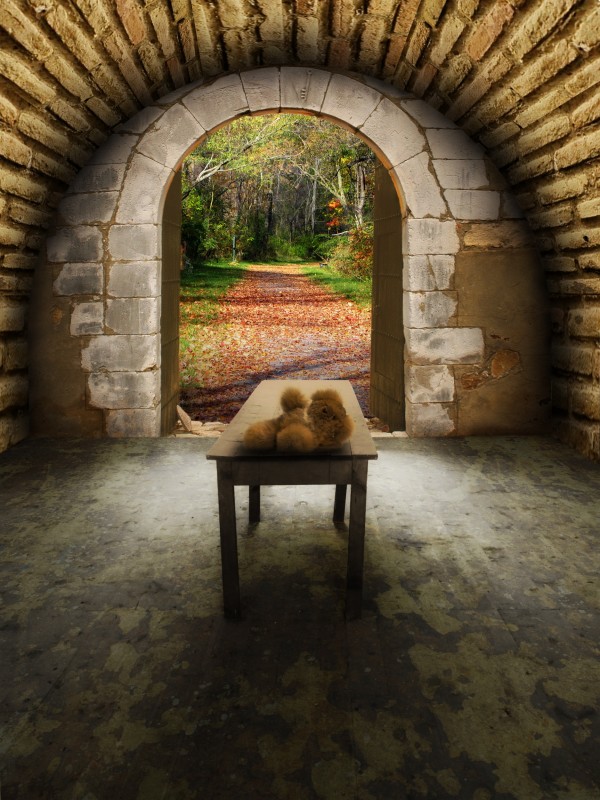
- 1: Medieval door
- 2: Landscape
- 3: Brick wall
- 4: Teddy bear
- 5: Concrete floor

(5 years and 3845 days ago)
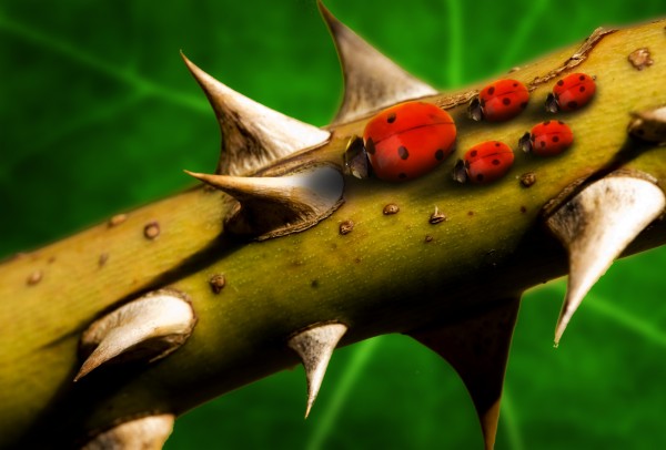
"Mind the thorns, kids, and don't push!" (5 years and 3847 days ago)
Excellent idea.. wonderful shadows and great use of source! What you could try to do is change the spots around to show that they are different ladybugs, but that's up to you. Good luck, and high marks from me!
Edit: Quick change!! Now it's a lot more convincing. Good luck!
Thanks Ponti  Spots changed...
Great use of source, very unique. A little fuzzy in high res but ONLY in high res. I will still give it higher than average.
Howdie stranger!
If you want to rate this picture or participate in this contest, just:
LOGIN HERE or REGISTER FOR FREE

Made using photoshop. (5 years and 3856 days ago)
that is one crazy bunny... cool image author.. GL>
Eclipse tool? ROFL. More color!
What did the bunny smoke before the show ? Cool image !
hahah Funny 
Wow, the rabbit looks cool and his whiskers are nicely curved 
nice 
congrats! 
Congratulations for 2nd
Congrats for your second place!
congrats!
Congrats
Howdie stranger!
If you want to rate this picture or participate in this contest, just:
LOGIN HERE or REGISTER FOR FREE
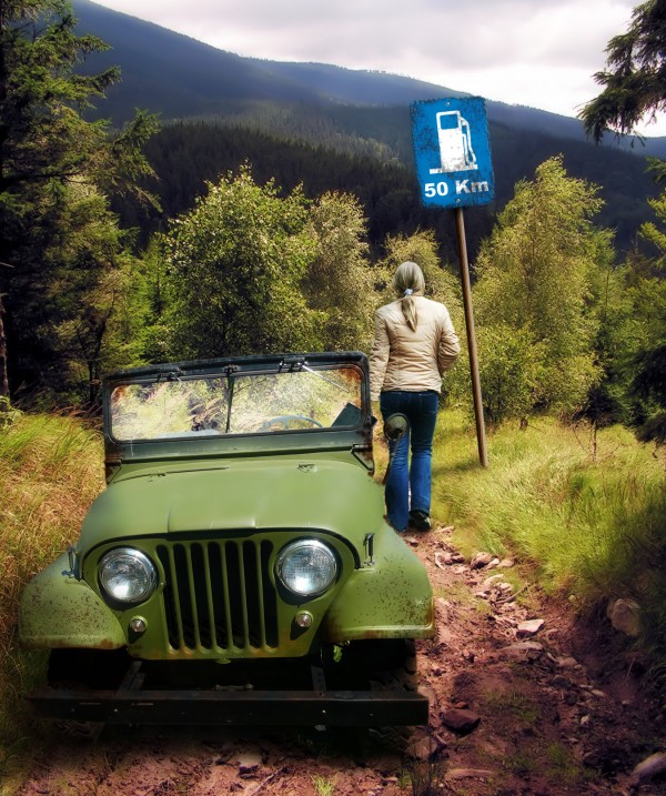
Out of gas in the middle of nowhere LOL.....
...
Credit model: Darkas http://www.sxc.hu/photo/708400
Post and service sign are my art...
Brushes and textures are PS default... (5 years and 3857 days ago)
I like the blending and really nice idea. I agree with Nator...try raising the jeep up or shrinking the woman...good job, author! 
Thank you guys  I tried and changed... Hope it's better. BUT there's still that damned shadow behind the grille in front of the jeep...
Nice scene.
Howdie stranger!
If you want to rate this picture or participate in this contest, just:
LOGIN HERE or REGISTER FOR FREE

(5 years and 3870 days ago)
Interesting. IMHO would be better if the girl was in color and she was closer to the opening of the shell...
The image looks real good, the background blends nicely with the shell, the jumping girl, adds life to the image. I personally think, that you do not need the text. (My opinion). This image speaks by itself. You can make the shell a little biger, and the girl jumping from inside.Very well done and a nice work! Good luck!
Thank you CMYK and George. I had used the text because some may understand the message without words, some may need words to link the image to the message 
Author, your image looks much better. I am sorry I told you about the text. Like you say, some, need the written message over the image. But I think, the "Tittle tells everything". I love your image now, the added color is wonderful too! good luck!
Author, the image is much better...IMHO the type in the header is enough. Good luck! 
Thank you guys for your helpful suggestions and comments 
Thank you guys for your helpful suggestions and comments 
Thank you guys for your helpful suggestions and comments 
I missed the first previus chops but it looks cool as is 
Very nice grunge image! 
Howdie stranger!
If you want to rate this picture or participate in this contest, just:
LOGIN HERE or REGISTER FOR FREE
Maybe the wood & stone shouldn't be the same color, but good job over all...

Thank you CMYK Everything colourized or texturized now...
Wow...really a LOT better now!
i dont know, but the perspective seems a bit wrong from my site of view.. i really don't know .. :p
Well put maXed. There are two things that make for this impression: the table, which is askew, and the path outside. The table bends to the right and the path to the left. I didn't change the original table and the floor under the texture
Its the door that looks askew. I see you were trying to follow the trail but I think it would look better if it was just equally balanced with the same width on both sides. Just my opinion.
Right, I turned round the wall where the door is about -1º. It's the same degree I turned the source image round as to get its horizontal lines straight (It's easy to see the source image is askew when you turn the grides on). I turned the landscape round too, a bit to the right. Thank you
the teddy bear looks out of place i don't know if you can do this lol (but probably just add a new layer) add noise to the room on the inside and leave the forest bright so it catches your eye
Thanks for your suggestion kayaklovergirl, but the idea is not make the forest catch the eye but integrate the whole. As for the teddy bear, I think that an abandonned toy in a place always makes emptiness and loneliness greater. Well, one may assume that there was a child in the room and now he is playing in the forest out there
This image, looks real good. Illumination coming from the outside is good. Probably darkening the wall (front) by the door, a little, and the doors look kind of dark. If light is coming from the outside and the door is open, it would be a "little" more highlight over it. A kind of clear, brownish color will do it, just like you did at the bottom left, by the door stop, (stone). The teddy bear is ok as it is, and it brings a special feeling to your work. Good luck!
Thank you George! Changed...
looks better....
Nice work author. Looks nice
Howdie stranger!
If you want to rate this picture or participate in this contest, just:
LOGIN HERE or REGISTER FOR FREE