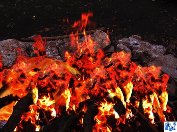
Changed from day to night using adjustment layers. Layered fire from source and stock to give illusion of more flames.
thanks to stay4while at www.sxc.hu (5 years and 3881 days ago)
- 1: source1
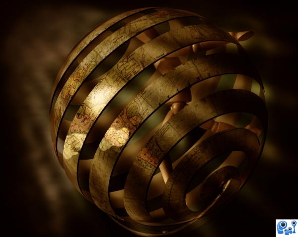
Only Source used. (5 years and 3884 days ago)
Wow...
Great idea, and well done...there wouldn't be art & type on the edges, though...
nice image!
Why wouldn't there be art and type on the edges? The Author may have wanted it that way............I like it very much just as is! I love the lighting and the mood. (art and type included!)  nothin' like a little eye candy!
nice
brilliant idea and absolutely well done
Very creative use of the source 
Author, IMHO the edges are crisp and well defined now, and work better with the light source...good luck! 
Thanks CMYK46 for suggesstion 
inspiring work!
The mood is absolutely lovely! I really like the warm colours combined with the lightning and just your whole idea. Especially how you changed the globe. It looks like all this poor figure can do is run, run and run without ever getting out. Good luck!
Wow is right!
I've said it before and I'll say it again: WICKED COOL!!!! \m/
Excellent use of source. Great lighting and mood. Feel sorry for the figure inside.
mood of light rays are looking gud
great concept
Looks like allot of thought and imagination went into this one. I love it!! Good Luck to you!!
is a little confused...try to give more space to the man !
Very very nice idea,i like the color's so much.....
great work,gl
Wonderful use of the source, Love it!! Best of luck to you
Poor wooden guy  Great entry
great job 
Uh very hard... But very nice looking and final result, good luck 
Congratulations for 2nd, fab entry.
Congrats for your second place, Nasir!
congrats
congrats
congrats! 
congrats. great work!
Howdie stranger!
If you want to rate this picture or participate in this contest, just:
LOGIN HERE or REGISTER FOR FREE
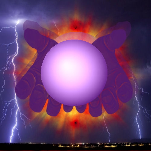
Two of the filters used I can not find one sites closed? I gave one you showing why (5 years and 3886 days ago)
where did the hands come from, need a source link please.
Keiley22 The hands were done with a mask that I've had for long time I don't have a source for sorry
gud work
Sorry i dont think the colour combination is so good.. When i looked at the picture first time it was like .. ANOTHER COLOUR! .. It kinda not fits in .. cool idea tho.
It's supposed to be like an explosion with the hands looking like a speed warp coming out.
PErsonally, I think it would of looked better if you used the lightening in an outline of the hands and sphere and maybe make the hands holding the sphere.
nice 
Howdie stranger!
If you want to rate this picture or participate in this contest, just:
LOGIN HERE or REGISTER FOR FREE
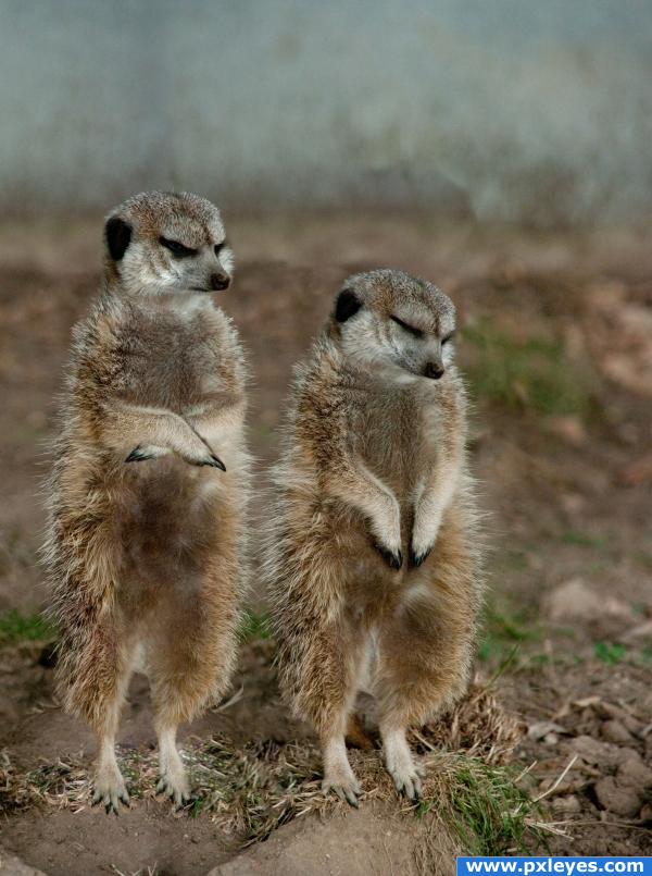
Sleeping on the job....guess he's gonna wake up soon... (5 years and 3890 days ago)
nice 
Howdie stranger!
If you want to rate this picture or participate in this contest, just:
LOGIN HERE or REGISTER FOR FREE
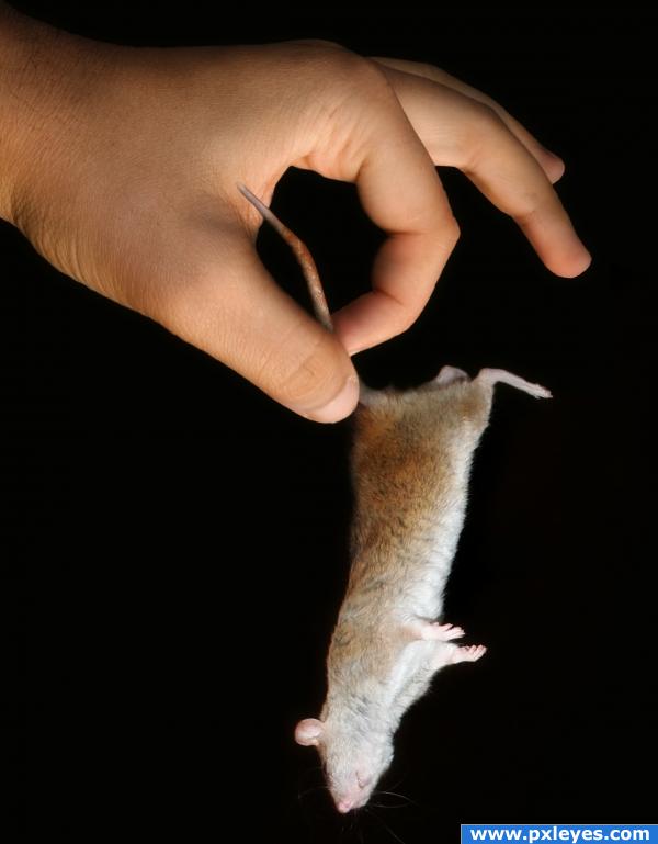
I used black background to take advantage of the rat background, and so I didn't have to deal with hair... lol...
Credit: cyborgsuzystock at http://cyborgsuzystock.deviantart.com/art/rat-05-45241279 (5 years and 3894 days ago)
Good masking, nice shadows, and it looks simple but seems like a lot of work. Good luck!
very believable
Simple but effective - nice image!
gl
Simple and unique. GL.
very simple in the concept but very effective work. well done author
Nice work....Very well done. Best of luck!!
great 
Howdie stranger!
If you want to rate this picture or participate in this contest, just:
LOGIN HERE or REGISTER FOR FREE
will melt the marshmellows that one.
Howdie stranger!
If you want to rate this picture or participate in this contest, just:
LOGIN HERE or REGISTER FOR FREE