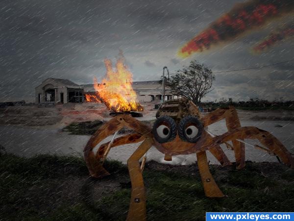
Hope you like it.
The mechanical spider or whatever you'd like to call it is made from parts of the digger in the source.
Do see SBS. (5 years and 3882 days ago)
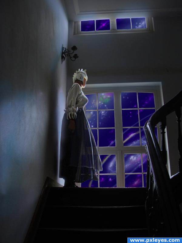
She is slowly transformed by the vision outside the windows. (5 years and 3883 days ago)
Great coloring, i like the way you made her dress look like silk.
i agree, very nice work on the woman, on the outside, try to make it a darker blue and maybe make some of the galaxies and stars different colours to add variety.
Interesting idea with lots of ragged edges...
I like space grandma. But like CMYK46 said some ragged edges. You should work on window panes.
Thanks for your comments. I am working now on the window panes and I will fix the colour of the sky. Will update my entry later.
I fixed the window panes, darkened the sky and added some colours to the stars.
it's like she's waiting for somone from outerspace to come pick her up.
I think you did a great job!! Maybe next time make the sci-fi sky the usual color, black. Then you can make some blueish/purpleish gasclouds and some bright stars wich bring the light into the room.
Howdie stranger!
If you want to rate this picture or participate in this contest, just:
LOGIN HERE or REGISTER FOR FREE
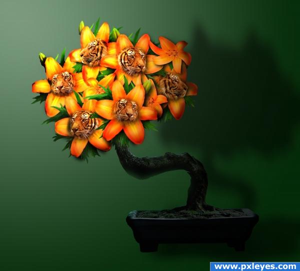
Good 'ol fashioned tiger lilies...careful...they may bite!!
Thanks to swami75, big-d-stock, harper07 for the great photos!! (5 years and 3886 days ago)
Hehe, very nice :p
wonderful color
The one on the far left has its forehead cut off...otherwise very good work. (Might be good to differentiate the horizontal & vertical planes).
love the shading in the background
Howdie stranger!
If you want to rate this picture or participate in this contest, just:
LOGIN HERE or REGISTER FOR FREE
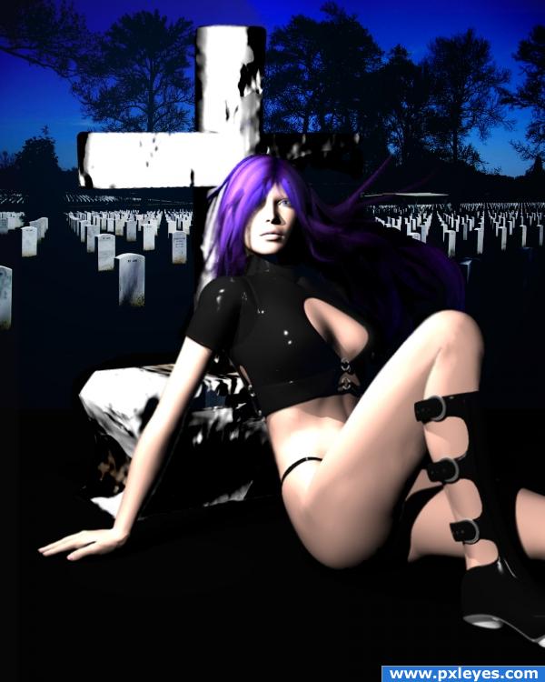
No sources used except original image....
DAZ freebies used:
RAVENOUS boots/jacket/panties, can be downloaded at renderosity.com; Mitsu-hair for Aiko, can be downloaded at Daz3D.com
touched up the gravestone a bit... (5 years and 3893 days ago)
I don't really understand, but it's a nice image! Good job 
Light source on figure is opposite light on tombstones, edges of cross need blurring, bottom edge is too regular, since it's on grass...
i'm gonna stick with the lighting...my light in the Bryce scene is placed to the left of the model, and that's where i placed my light filters as well....but i'll def work on the rest of what you mentioned...
All you have to do is flip the background for the lighting to match...
i like this image! and i dont get it either but i like it all the same!
either way, in order to flip anything, i'd have to do it over, because of the masking.....so here's a semi touched up gravestone, my quick fix.
btw, cmyk - which background did you mean i should flip, the graveyard scene, or the model?!?!?
back ground is usualy in the back.. meaning the graveyard in this case...
hey Eladine, you're pissing me off. (:
The graveyard scene...I thought it would be an easy fix. 
(Assuming the girl & cross are on different layers and the graveyard's behind them...).
thanks cmyk....i had to question cuz my original BG layer is the model scene...and i layered the graveyard on top, thus my confusion. It's a pretty simple do-over, so even if I don't do it for the contest, I want to do it for practice, so I can get a better perspective on lighting. i appreciate the tips....
author ur reply is uncalled for O.o if you have personal issues can you keep that to privat? this is not the place to vent them...
eladine: i'm sorry, but you choose to comment on my work, and i can't say i've been happy with some of them.
while the idea is good and points for playing with the 3d programs, the poser and her tombstone look very blurry... but again, nice try, you will improve fast 
thank you everyone for tips and advice; although i may not re-do this piece, i keep it all in mind for future work.
Very nice... Love the hair colour...
Howdie stranger!
If you want to rate this picture or participate in this contest, just:
LOGIN HERE or REGISTER FOR FREE
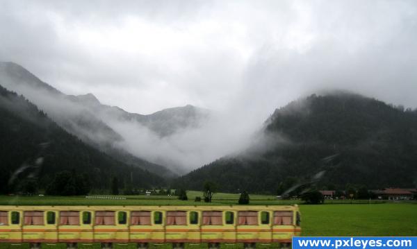
sent my big little train out of the station (5 years and 3893 days ago)
too simple
what is too simple? the work on the train?
i like the background!
author... to prevent a TOO SIMPLE comment try to put together a detailed Step By Step.. by doing this people can see the care you put into the construction.. (especially the burning and painting and color matching etc... this makes the work known and helps in the voting  ... good luck!!!
No tracks?
Howdie stranger!
If you want to rate this picture or participate in this contest, just:
LOGIN HERE or REGISTER FOR FREE
I like it, but i'd definatley like to see an SBS. Good luck
Thanks ponti55, I will get to work the SBS.
Good image...flames should have the same intensity above roof line...
Thanks CMYK46, and yeh I know what you mean. I'll work on that.
Made that change now CMYK46.
Love the take on the source Author.. I love the eyes.. keeps the mood light Perspective expansion on the feet is awesome
Thankyou for such an encouraging comment GolemAura.
SBS is now up and running.
hahaha love how wacky the spider looks almost cute ! :>
it's coming to take me away haha, it's coming to take me away hehe
Howdie stranger!
If you want to rate this picture or participate in this contest, just:
LOGIN HERE or REGISTER FOR FREE