
A homeless snail...well semi homeless (5 years and 2717 days ago)
5 Sources:
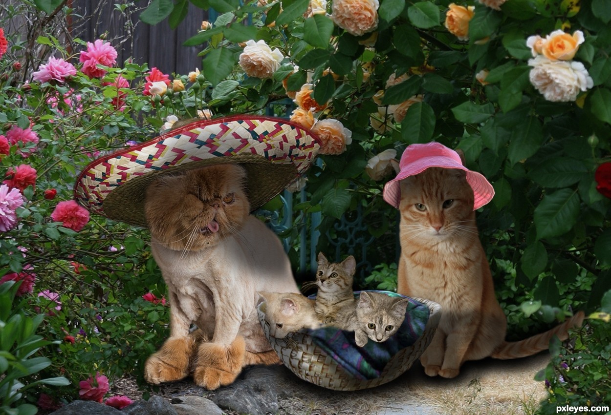
Thx bartt from flickr .... Cat
Thx buckler-smith from flickr... Mexican Hat
Thx charlesfred from flickr...Pink Hat
Thx Kenfargetdotcom from flickr....Kittens
Thx andriesk from flickr....Garden Path
Thx Melissavenable from flickr... Basket
Thx frozencapyvara from flickr... Blanket/Cat (5 years and 2731 days ago)
I love the theme !
nice work author
I think cats need more blue on their fur , because the background hase more blue
maybe one time auto color makes what it needs
also I believe that basket specially bottom of it is not cropped properly , also its shadow needs to be more dense
sorry that I always mention the down parts of the works , Its because I want them to be perfect
as I said before , I love the main idea , now the ugliness is kinda cute !
good luck dear author
Thanks Shizar...will work in suggestions. Comment appreciated.
I am looking forward to it !
also I think some woolen could make it more fun !
maybe some in the basket and some in front of kitten's eyes ...
even you can turn the flowers to woolen !!!
that could be awesome !
GL !
Made some changes to the original post. Not sure about adding the green color to the cats... added a blanket insted of yarn or woolen. Shadow is darker
Howdie stranger!
If you want to rate this picture or participate in this contest, just:
LOGIN HERE or REGISTER FOR FREE
thanks to almudena-stock
Aegean-Prince,jagged-eye
FrozenStarRo,*HumbleBeez
KYghost,cplcrud (5 years and 2731 days ago)
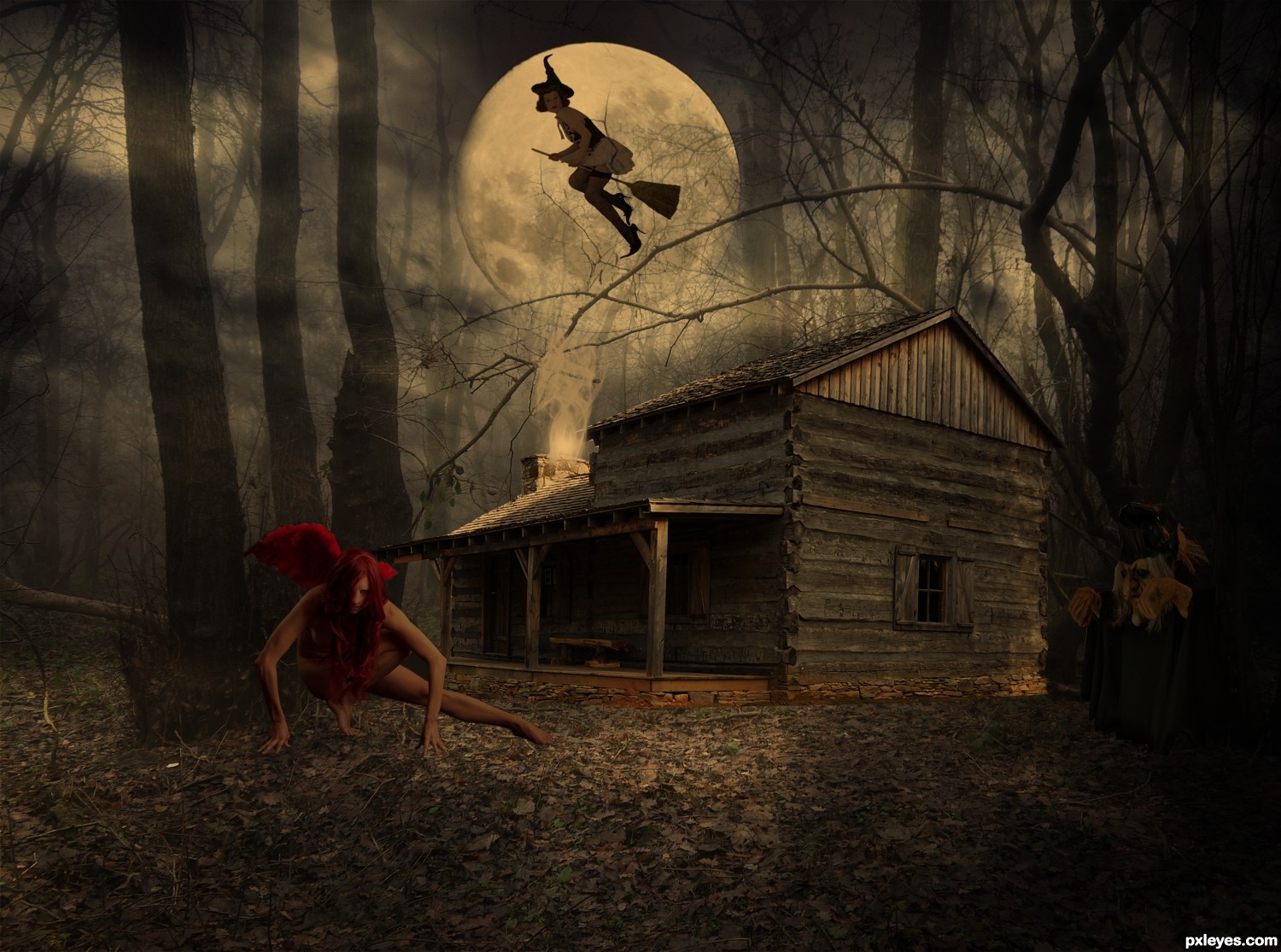
The rim of the moon wouldn't be showing in front of the trees.
hope that got it
Howdie stranger!
If you want to rate this picture or participate in this contest, just:
LOGIN HERE or REGISTER FOR FREE
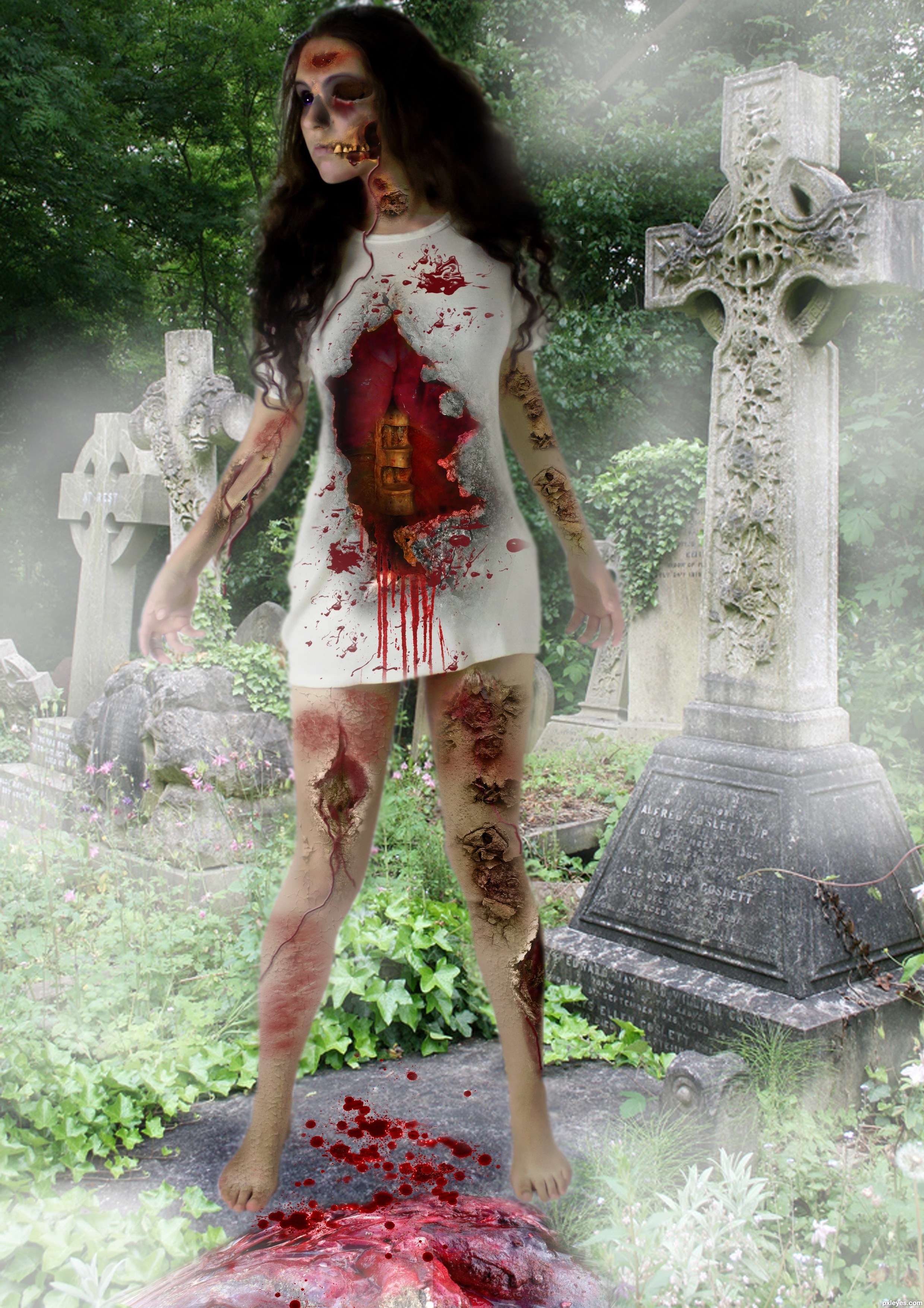
http://trisste-brushes.deviantart.com/art/wounds-25145474 thanks to trisste-brushes (5 years and 2761 days ago)
She looks too cut and paste, like she is floating above the walk path. The head is also anatomically off, with the face looking too large and far away from the rest of the head and neck.
An interesting concept, but the technical execution needs a bit more attention to detail.
thanks mossy but i didn't touch the head and neck , take a look at the original picture of the model
You have so many sources, hard to find which one. It will help in the future if you title them such as "head and neck," "lungs," "wound," etc. instead of "Source 1," "Source 2," etc...
You're right, the body is unaltered from your source. It then becomes your overall composition that makes it seem too large and poorly placed within the image. This is a visual "illusion" created by the eye's movement from your other elements, colors, and value choices. But since your focus was a zombie effect, more than an optical illusion of distortion, I still stand by my last statement that your technical execution needs work to create a more visually believable balance of the elements used.
ok thanks
Howdie stranger!
If you want to rate this picture or participate in this contest, just:
LOGIN HERE or REGISTER FOR FREE
(5 years and 2791 days ago)
cool
Congrats Bob!!
Howdie stranger!
If you want to rate this picture or participate in this contest, just:
LOGIN HERE or REGISTER FOR FREE
Photography and photoshop contests
We are a community of people with
a passion for photography, graphics and art in general.
Every day new photoshop
and photography contests are posted to compete in. We also have one weekly drawing contest
and one weekly 3D contest!
Participation is 100% free!
Just
register and get
started!
Good luck!
© 2015 Pxleyes.com. All rights reserved.


Thank you for your help dustfinger,i have done what you suggested, it looks much better now
Good idea with this, author. Snails carry their homes anyway, but you've made this one a tent! Good work on the patch, too.
Thank you
Howdie stranger!
If you want to rate this picture or participate in this contest, just:
LOGIN HERE or REGISTER FOR FREE