Photoshop Pictures: Over (page 6)


results 26 - 30 of 44

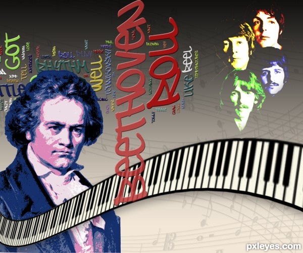
Roll Over......Beethoven - created by dollmommy


Roll Over......Beethoven
Favs: 0SBS: 7Hi-resRank: 16/18Score: 52.4% (0)7084 views

Created word cloud at http://www.wordle.net/ by just dropping in the text choosing colors and font. Thanks to dag at flicker.I used Lassus font for my music note background. Thanks to redheadstock for the brush I used for the piano keys. (5 years and 3481 days ago)

3 Sources:

avatar DanLundberg

Interesting, but I think some spinning blur around Beethoven's edges, for example, might capture some of the "roll over" aspect that is largely missing from your image.

avatar itsdesign
itsdesign says:

good luck

avatar jadedink
jadedink says:

i love the font! totally going to bookmark that wordle site. and i think the way you did the keyboard gives it teh "motion" dan is suggesting you don't have in your image. along with the font which is rolling from one direction to another....
so..i guess its in interpretation. dan doesn't seem to see the "roll over" aspect, but i say it is definately present! GL author.

avatar RAZ0R
RAZ0R [banned] says:

avatar swordfish
swordfish says:

nice entry........ all the best.........

Howdie stranger!
If you want to rate this picture or participate in this contest, just:

LOGIN HERE or REGISTER FOR FREE


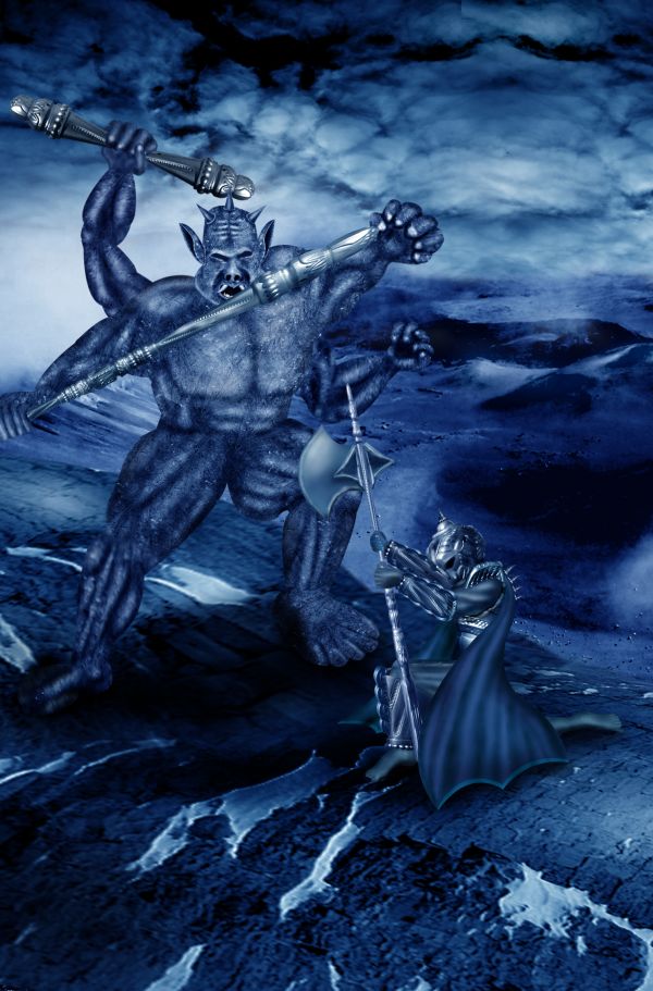
Get UP...! Battle is not OVER. - created by hereisanoop


Get UP...! Battle is not OVER.
Favs: 5SBS: 15Hi-resRank: 5/18Score: 60% (30)17191 views

Thanks and credits to 'garwee' and 'nlolv'. (5 years and 3517 days ago)

5 Sources:

avatar Mario
Mario [banned] says:

WOW WOW WOW this is a piece of art...well done author and good luck

author says:

This is for you Mario... Happpy that you like this.... Thank you...

avatar shaadow
shaadow says:

Yes mario, this is a great piece of art. I jealous, how lucky you are.... think you will not forget this birth day ever ...................

avatar ikrumon
ikrumon says:

the warrior is extra ordinary

avatar genuine2009

thank you!!! .. and your work is too hard!!!

avatar erathion
erathion says:

great job author...good luck

avatar Drivenslush

aWeSoMe

avatar Drivenslush

great idea

avatar jaskier
jaskier says:

Good work.

avatar chakra1985

Congrats!

Howdie stranger!
If you want to rate this picture or participate in this contest, just:

LOGIN HERE or REGISTER FOR FREE


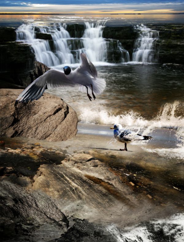
Over the Edge - created by Widiar


Over the Edge
Favs: 0SBS: n/aHi-resRank: 4/18Score: 58.1% (21)19428 views

Just a huge amount of handwork, with blending all the layers and finding a way to make them match each others. Tried to do a clean cut with the bird (seagull) and give it a better coloring too.

I gave some colours for the bird(s) and spend a lot of time altering the colours for different source pictures, as the colour palette was very different in each.

Tools used: layer blending, masking tools, warping tool, perspective tool. Hue/saturation and colour balance tool+channel mixer. Clone tool and render/lightning effect.

A slight gaussian blur added finally with some colour tweaking, to remove excess colour from the lower part of the image (mostly red). (5 years and 3574 days ago)

5 Sources:

avatar demi
demi says:

nice done

avatar loopyluv
loopyluv says:

Good work, but maybe make the flying seagull a tad bigger, for depth...coz at the moment the gull on the ground looks like it is the same size...GL

avatar Mozzafan07

this looks great in high res....nice work!

avatar artgirl1935

I love the work you've done. Colors and blending are great! It seems that the horizon over the falls is far too high for the angle of the source bird. I would like it with just what you've added in the foreground. GL to you.

avatar elficho
elficho says:

good work, but the bird thats on the ground is huuuuuge

author says:

I think some of you guys are seeing the lower part of the image as some kind of mountains or something.. it tries to be just some bedrock under the water/sea. It's true, the horizon doesn't really match perfectly with the original bird view, but the flying bird is very close to the original bird in my idea, as well the original is close to the viewpoint.. So it's not some sort of freakish giant bird really But thanks for the comments, I can see you problem here. I think if I would have cut off the very lower part, the perspective would have been more 'realistic' looking for you.

avatar Govindrathod

Good one.....

avatar chakra1985

very nice

Howdie stranger!
If you want to rate this picture or participate in this contest, just:

LOGIN HERE or REGISTER FOR FREE


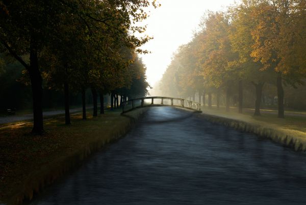
Footbridge over river - created by fezjez


Footbridge over river
Favs: 0SBS: 5Hi-resRank: 4/18Score: 58.1% (21)13354 views

A lot of painting here (Hope that's OK). Found the perspective and lighting on the bridge quite difficult, so any comments welcome. (5 years and 3600 days ago)

avatar jaescoe21
jaescoe21 says:

i think this looks so beautiful great job. i wish i could live somewhere where it looks like this gl

avatar jawshoewhah
jawshoewhah [banned] says:

Veru nice! GL!

avatar ponti55
ponti55 says:

Beautiful entry.

avatar Suky04
Suky04 says:

very nice!

Howdie stranger!
If you want to rate this picture or participate in this contest, just:

LOGIN HERE or REGISTER FOR FREE


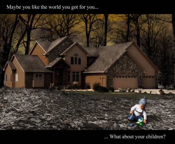
Think it over - created by divair


Think it over
Favs: 0SBS: n/aHi-resRank: 11/18Score: 54.5% (0)5217 views

Credit:

Clouds brushes by leboef - http://leboef.deviantart.com (5 years and 3609 days ago)

6 Sources:

no avatar
maXed says:

i think the kid is too bright..

author says:

Thank you maXed, but it's on purpose, just to call attention both to the child and plant, both are growing and full of life, contrasting with the scene...

avatar jawshoewhah
jawshoewhah [banned] says:

i don't think making the child so bright was nessesary

avatar chakra1985

very nice

Howdie stranger!
If you want to rate this picture or participate in this contest, just:

LOGIN HERE or REGISTER FOR FREE