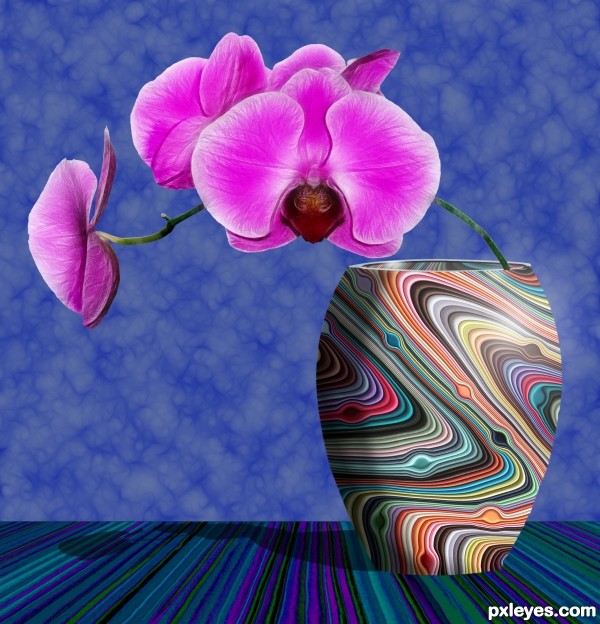
(5 years and 3110 days ago)
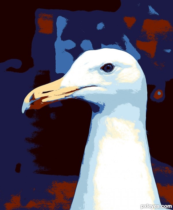
Cropped image and changed to Indexed colour -10 (5 years and 3173 days ago)
This turned out very well. Good contrast!
Sweet! 
Howdie stranger!
If you want to rate this picture or participate in this contest, just:
LOGIN HERE or REGISTER FOR FREE
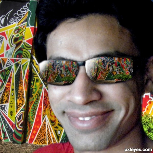
See the reflection of the source painted wall in my glasses. (5 years and 3321 days ago)
author.. a simple suggestion.. if you place the original image (of the man face) over itself and then blend it with multiply or overlay, you may actually get enough resolution/detail to improve the image greatly.. (High Pass is helpful as well) IMHO, right now.. the eye reflection is super detail and the head of the man is quite blurry.. without a high res that is all we can see.. but good luck. it's a fun image all round
Thanks for your feedback friend......
Howdie stranger!
If you want to rate this picture or participate in this contest, just:
LOGIN HERE or REGISTER FOR FREE
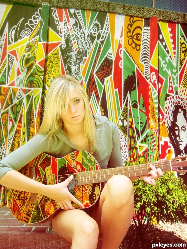
thanks to nighthawk7 for the "unwritten solo 2" photo (5 years and 3326 days ago)
I like it .... soften the edges of the girl, simple blur tool set at 4px will make all the difference I think...mainly the coat/sweater  GL
GL
Thank you for your comments, I will consider for future works
Original idea and nicely done! GL, author!
Very nice composition author..i agree with Geexman about softening girl edges...her left leg and right upper arm demands a bit more softening...GL
Nice work.
gud job .............. 
In case you don't know, you can edit entries until they close (Friday) My stuff-My contest entries - and upload changes there next time.
Thank you @greymvak, next time I'll edit, now is too late to edit this one, it's in the vote phase.
Congrats for your first place, Enblanco!
congratulations...
Congrats, well done 
Congrats!!
Congrats on your win
Howdie stranger!
If you want to rate this picture or participate in this contest, just:
LOGIN HERE or REGISTER FOR FREE
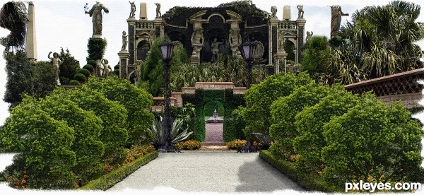
(5 years and 3474 days ago)
please view high rez !!! wayyyyyyyyyyyyy better!!!
It's a shame you've kept the trees 'cloned' and not made and differences to them individually as the rest of it seems quite well put together...
It would be easy to add differences to the trees because it is a texture. Just use the cloning stamp to copy a section and draw in extra leaves giving each one a different shape.
thanks for the comments, ill go make corrections
good attempt

Wonderful concept.
Howdie stranger!
If you want to rate this picture or participate in this contest, just:
LOGIN HERE or REGISTER FOR FREE
Thank you so much for the suggestion!
Good design but rather flat looking, needs shadow under the vase, the stem should be leaning on the opposite side inside the vase as the weight of the flowers would designate
If you look, perhaps checking the Hi-Res, you will see that the shadow is to the left behind the vase. Since it is sitting on a level surface, there is no shadow beneath it...
The stem is curved from the weight of the flowers, and hence bends from the base on the left inside the vase, to the right, with the arc then continuing back to the left outside the vase...
Creative and cool. Would love to have seen slightly softer edges to the vase and where wall meets surface. Perhaps a slight soft darkening on right side of edge of vase to show more cylindrical shape...but nonetheless...very nice job.
Since it was supposed to be a tabletop near, but not up against the wall, a softer edge would have helped, you're right.
A shadow on the right side of the vase would have been difficult with the light source highlight where it is, but possibly down near the bottom...
Thank you all for your comments, it is SO helpful to get the viewpoints of other eyes than my own, and helps me improve my skills with every entry!
good try
Great work. Artistic and creative. Fab colours and it includes my favourite subject - flowers!
Howdie stranger!
If you want to rate this picture or participate in this contest, just:
LOGIN HERE or REGISTER FOR FREE