(5 years and 3692 days ago)
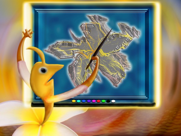
No external sources only the source image used. (5 years and 3767 days ago)
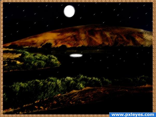
Interesting but a bit blurry...
this is cute. Agree with CMYK there are areas where the image is blurry..
Howdie stranger!
If you want to rate this picture or participate in this contest, just:
LOGIN HERE or REGISTER FOR FREE
(5 years and 3791 days ago)
Love this!..good luck!
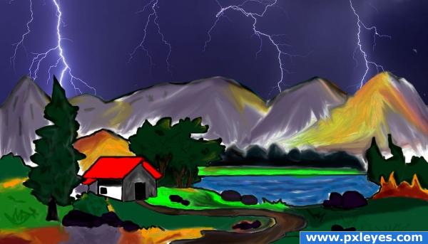
nice painting. interesting use of source. GL >
There's particles on the sky that don't look like they belong especially to the right. The two difference resolutions looks odd. I would try to match the source image used more to the texture and resolution you created.
great job 
beautiful painting!!!! I love these types!
Howdie stranger!
If you want to rate this picture or participate in this contest, just:
LOGIN HERE or REGISTER FOR FREE
no external source... (5 years and 3796 days ago)
Good work! 
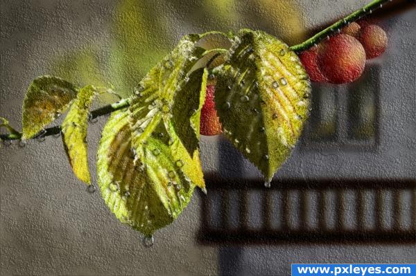
Too much texture, otherwise not bad...
Wonderfully artistic, i think the texture really makes this piece stand out. Good luck!
I agree with Mikibo. The texture is nice but your SBS is lacking.
good paint  good luck to you
thank you all for nice comments...
I love this! One of the best images i;ve seen in quite some time... really excellent work! I love the texture and the water drops... good luck and VERY high marks from me!
good job 
thank you all for comments and votes...
Howdie stranger!
If you want to rate this picture or participate in this contest, just:
LOGIN HERE or REGISTER FOR FREE
(5 years and 3800 days ago)
i can't really see anything
like it
hmm nice.
very nice
nice 
Howdie stranger!
If you want to rate this picture or participate in this contest, just:
LOGIN HERE or REGISTER FOR FREE
i think this would be much better, if you can use the plant texture in the painted parts as well
thanks...i will try that!
very clever idea !
thanks...i changed it so theres texture now!
much better
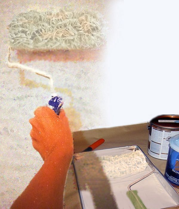
the roller in the pan seems squished, and the handle looks blurred, but fantastic use of this source!
thanks...i will go back and fixed those!
thanks...i will go back and fixed those!
For me the roller in the pan is ok, it's immersed in paint... Nice idea and GL!
thank you very much for your feedback!!
Hey clever use of the source works really well together. The paint buckets look a little real and not painted in with how the other effects.
Everything looks painted, except the paint cans, which even in this resolution, I can see some edges that need to be fixed. The textures of all the images should match.
Now is to jadged...shame author...this could be great work...try to work on it...i will hold my vote
Yeah the hand seems a bit unrealistic, though it's a very good idea ! Good luck !!
haha well at least we could use it for something...
Howdie stranger!
If you want to rate this picture or participate in this contest, just:
LOGIN HERE or REGISTER FOR FREE