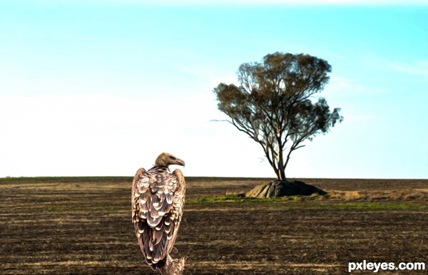
Stacked both one upon other.
applied oil filter.
did hdr toning.
(5 years and 2564 days ago)
- 1: source1
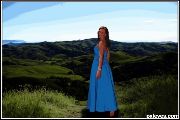
Im new at photo manipulation, so be kind^^ Any constructive criticism is gladly accepted.
Its "grainy" because of a filter i used, i think it looks more like a painting with this effect :P (5 years and 2708 days ago)
Nice choice of images. Composition is OK.
Some suggestions:
The effect of the filter is not equal in the different parts of the image. Try to make the contrast and sharpness of alle parts in the image roughly equal. If some of the backgroundparts are sharper, or contain a lot more detail than the foreground objects, than you can blur these parts.
I should also have made a color correction on the background to a warmer color.
Instead of applying a filter to the whole image i would have added a layer with noise or grain (with multiply of screen mode).
Thank you for your comment and suggestions! Its too late for me to change it for the competition, but it should be good practice anyway 
Howdie stranger!
If you want to rate this picture or participate in this contest, just:
LOGIN HERE or REGISTER FOR FREE
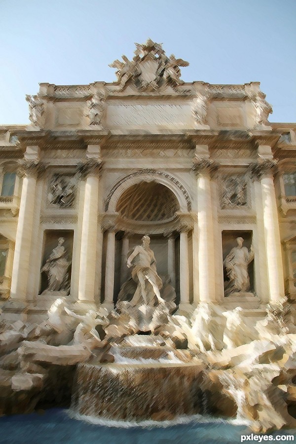
made it look like a painting using photoshop cs5 extended. (5 years and 2836 days ago)
your interesting work, not make the beauty of the fountain, just my opinion
again?
Makes my head hurt.
 hurts my feelings
Really nice original image! Although the edits have ruined it for me.
this way I can use the original for other contests :p
Howdie stranger!
If you want to rate this picture or participate in this contest, just:
LOGIN HERE or REGISTER FOR FREE
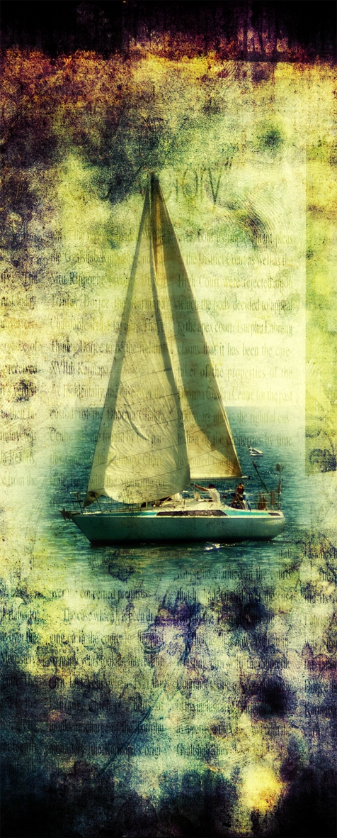
Painting (5 years and 2863 days ago)
Howdie stranger!
If you want to rate this picture or participate in this contest, just:
LOGIN HERE or REGISTER FOR FREE
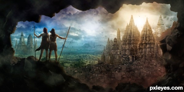
I created this epic view from several pictures of temples and ruins! Lots of digital painting, shading, and coloring to get it all to blend together.
Thanks to Tasastock and RaeyenIrael-Stock for the image of the girls. (permission is in the SBS) (5 years and 2918 days ago)
Nice mood ! This is an eye catching image !!
GL
Yes, very nicely done, like to see a tutorial for this one
Great image 
The perspective on two of the bigger temples on the right are off though, might be able to fix that by rotating and or skewing it. Otherwise: good mood, great color combinations, I like the framing in the rocks... a classic epic game scene 
Wonderful!
Howdie stranger!
If you want to rate this picture or participate in this contest, just:
LOGIN HERE or REGISTER FOR FREE
I understand the bird's grumpy face, cause there's not much to eat there in that field . The oil filter doesnt work very well for me, or at least I dont see much added compared to without the filter. Also, the bird looks a bit pasted. That's imo mainly because of a conflict between light. Looking at the tree, there's a strong light coming from left three quarter behind. Therefore you'd expect the bird getting the light from the same direction. Is it possible to adjust that? Good luck!
that's an amazing suggestion. thank you. i'll see that if i can correct it.. Have a great day...
Howdie stranger!
If you want to rate this picture or participate in this contest, just:
LOGIN HERE or REGISTER FOR FREE