(5 years and 3316 days ago)

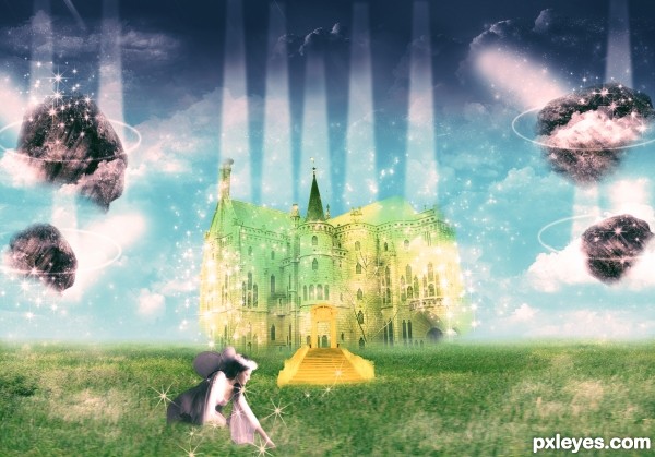
Here is an image which describes the atmosphere of heaven. Thanks to Neonescence for those fairy dust brushes used in my image. Thanks to mjranum-stock for giving us a beautiful fairy's image which is sitting below on those beautiful grass field. Thanks to JavierZhX for those beautiful clouds brushes. Extremely thanks to krallear-stock for that lovely rock image which I used it in my image. Thanks to Alkemya for that beautiful palace, thanks to SimplyBackgrounds for that beautiful grass-field. Thanks to FantasyStock for lovely stairway (5 years and 3320 days ago)
Beautiful work!
Thank you rbs........
Howdie stranger!
If you want to rate this picture or participate in this contest, just:
LOGIN HERE or REGISTER FOR FREE

(5 years and 3826 days ago)
Beautifully done.
Extraordinary Image! Awesome!
beautiful!! GL !
Nice work!
very nice 
great image,gl
congrats matteo! 
Congrats for your second place, Matteo!
Congrats
congrats
Thank you all very much!
Congratulations for 2nd
Howdie stranger!
If you want to rate this picture or participate in this contest, just:
LOGIN HERE or REGISTER FOR FREE

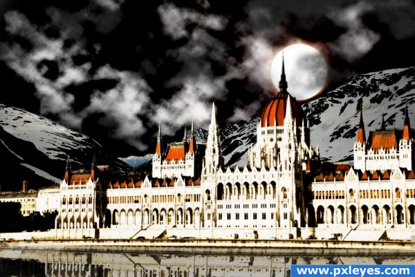
1 source image used................night effect achieved with the help of levels and curves............clouds made with "render clouds" filter..............a lens flare applied behind the moon which is a simple cirlce........glow effect of the palace achieved by duplicating the layer twice, applying a gaussian blur of 4-5 to the underneath layer and then setting the blend mode of the above layer to color dodge..........reflection achieved with the gold old ripples filter.....hope u guys like it....:) (5 years and 3887 days ago)
Interesting image, the building is a little too bright, but good luck!
looking good, building is definitely too bright though.
thnx ponti and speel.....i purposely kept it bright as it was looking dull.........bt i'll keep it in mind the next time........
The moon is behind the palace but it illuminates the front of the palace?
as i said that has been purposely done to prevent the palace from fading......a dull palace wuldn't have looked good.....thnx nyways for pointing it out
Looks like you didn't edit the point where the two mountains intersect, well at least it looks like its still a blue sky.
thts not the sky..................those are the farthermost mountains.........watch it in HR
this would be so awesome if there wasn't so much light on the buildings. your step 6 looked better IMO
Howdie stranger!
If you want to rate this picture or participate in this contest, just:
LOGIN HERE or REGISTER FOR FREE
Looks like something from The Golden Compass. Great detailed work!
very nice work...gl
Howdie stranger!
If you want to rate this picture or participate in this contest, just:
LOGIN HERE or REGISTER FOR FREE