
(5 years and 2461 days ago)
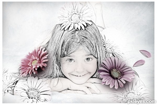
Try to be simple... (5 years and 2838 days ago)
Yes it is simple - but you have done it very well, and I think your picture is very pretty. Well done 
thanks for the comment... This is my first contest. You are my first comment giver.. 
Good job on this, author, I like the 3D effect of the color flowers on what looks to be an illustration. 
Thanks for comment... 
Congrats on 3rd place - you should be proud of that 
Thank you... 
Congrats!!
Thank you... 
Howdie stranger!
If you want to rate this picture or participate in this contest, just:
LOGIN HERE or REGISTER FOR FREE
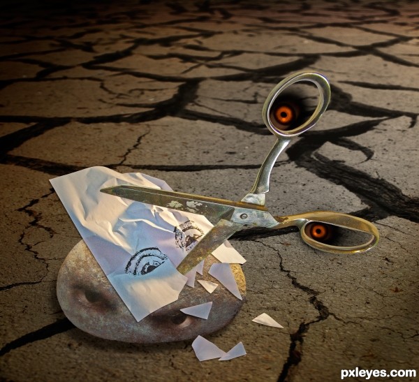
Photoshop montage with some photos of my own and some extra stuff borrowed. Scissors and rock are my photos, I printed a drawing of fearful eyes on a piece of copy paper, crumpled it and cut it up a bit before photographing it for this composition. Put it all together in photoshop and added the background and the rock's eyes. The scissor's eyes are added with the airbrush tool, lighting effects added, drop shadows, etc. (5 years and 3081 days ago)
SUPER JOB, but author you must place your RAW PHOTOS in the SBS.. go to MY STUFF, MY CONTEST ENTRIES and enter the uncut source photos there... GOOD LUCK!!
Very imaginative, and technically well done!
Howdie stranger!
If you want to rate this picture or participate in this contest, just:
LOGIN HERE or REGISTER FOR FREE
(5 years and 3166 days ago)
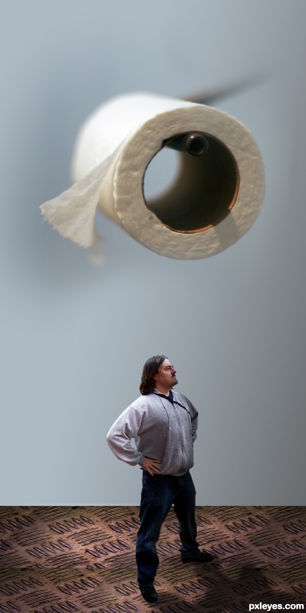
The focus of the various elements is not consistent, and the floor is at a different perspective angle to the man standing on it. This just looks hurried and thrown together.

Light source on paper is from top left, on the man from upper right.
While the concept is very funny, for a higher score you may want to run a very soft blur brush over the edges of the man, his will make him blend better (he's very roughed edge and the top of his head has the white edging (IMHO)
Select the FLOOR LAYER and use PERSPECTIVE on it, and you will find that it will blend better as well.. (took me some time to learn how to do that and I still have trouble) but you have enough pattern in the floor so it should be quite easy...
Gray Gaussian disks placed beneath his feet (at the floor perspective) will help ground him as well.. Good luck author (The humorous concept of this piece is very adorable)
EDIT: 100% Improvement author.. good luck


thanks everybody for the tips
Howdie stranger!
If you want to rate this picture or participate in this contest, just:
LOGIN HERE or REGISTER FOR FREE
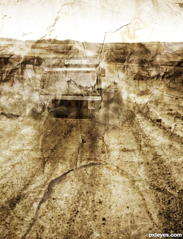
A bus traveling down a lonely desert road featured on crumpled paper (5 years and 3356 days ago)
good effect
Howdie stranger!
If you want to rate this picture or participate in this contest, just:
LOGIN HERE or REGISTER FOR FREE
Very good. Clean, simple and to the point. The integration of the paperclip design is a great touch.
Thanks, appreciate it!
Good idea & execution.
Good job! I like the change.
Thanks!
Good job ...keep It up..
Thanks!
Your design is elegant and easily recognizable, both important qualities of a good logo!!
Appreciate it!
Congratulations......
Thank you!
Congrats Randy!!
Thanks Rein!
Howdie stranger!
If you want to rate this picture or participate in this contest, just:
LOGIN HERE or REGISTER FOR FREE