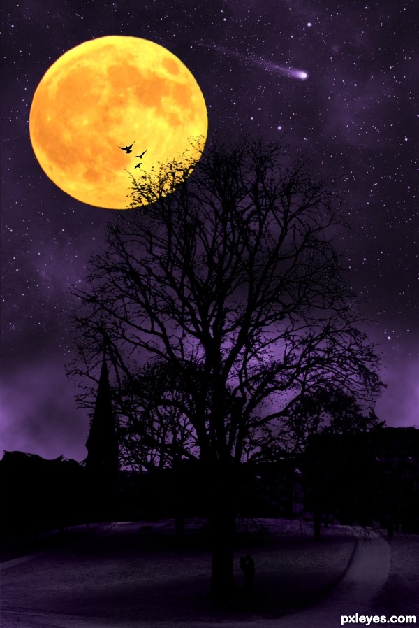
I love to take a walk in the park and look this tree and observe how it changes during the four seasons. Old trees still grow new leafes.
The photo of the tree is my own. (5 years and 3305 days ago)
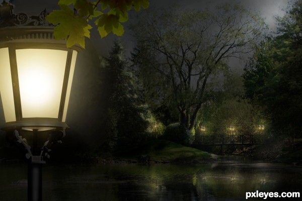
Primary source is my own photo (step 1)
Update: Front lantern was brightened. (Thanks, Androla!) (5 years and 3307 days ago)
what a peaceful nite.......!
wonderful picture! the only suggestion is that you should make the front lantern brighter! much brighter! good luck!
Thank you both. I was afraid that would over-dominate the entire scene, Androla. But I will give it a try. Thank you so much!
Beautiful work ... lovely source image and wonderful conversion to night. Your lighting is perfect!
looks really much better!!!!!! awesome entry!!!
Lovely up through about Step 15, but the introduction of the foreground lamp with a vanishing point much lower than that of the background makes it look simply like a lamp in front of a painted backdrop.
OK, Dan, light lifted. Better? Thank you!
Yes, it is better (although I would eliminate the foreground lamp's underside glow and raise the underside's far edge).
The foreground lamp and leaves are a good way to add depth to the image. The brightness of the foreground lamp makes it the focus, however. I would move it to the left so only half of it at best is visible in the frame.
Thank you, Dan, I appreciate your advice. I moved the lamp off some, but think its lines and curves make it quite a beautiful piece by itself, worthy of discovery.
beautiful scene author...very well done
Great job, GL!
Beautiful work...best of luck!!
Congratulations on a lovely entry!
Howdie stranger!
If you want to rate this picture or participate in this contest, just:
LOGIN HERE or REGISTER FOR FREE
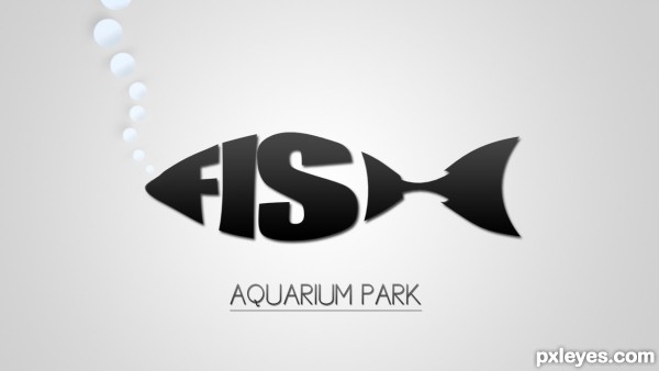
So, When i first saw this comp, i thought right on to the logos where the text forms a animal or a object. And i thought, which animal would fit for that? And a FISH was a perfect animal to do it with, so i did. (5 years and 3314 days ago)
Very cool! 
Wow 
this is cool man ... i mean this logo worth a lot
Simple and Clean
I like the simplicity. The lack of color is kind of blah, however, which doesn't really entice me to visit the park. I also think "AQUARIUM PARK" should be a bit more prominent and I might consider adjusting its kerning to make that text as wide as the fish above it.
http://www.bananadesign.co.uk/work/branding/little-black-fish-films-logo
it's right???................sorry!
Wow, I've never seen that before?! I never used any picture as inspiration, and i also did ALL by myself. I'm surprised that someone else did it too, but i promise, i never seen that one before.
I realize the link does look similar to the authors entry. In Art School we had a class in lettering design (hand lettering). Using words and letters to create shapes which we called cartouches and one assignment was to create shapes to match the words. Fish was one of the easiest to do and at least a third of the class did virtually the same design (the word Love in the shape of a heart was done six times).
I think the one you have done author looks better than the example presented above. looking good.
I agree there with Chapp. Although there are similarities, No comparison imo. This is a good presentation. Good luck Author.
good luck!
simple, and very well done!!
Howdie stranger!
If you want to rate this picture or participate in this contest, just:
LOGIN HERE or REGISTER FOR FREE
(5 years and 3339 days ago)
wonderful and funny!!!! good luck!!!!
Thank You Androla 
very funny like your entry
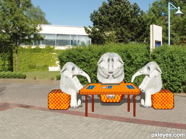
nice idea the manipulation of the elephants is good -- you need to adjust your shadows as the light in the source is form the lower left (See the shadow of the tree on the left for reference). Also the shadows are too far away form the elephants giving them a floating appearance. The shadow of the table is not attached at both legs
Thanks kushpatel and Alan2641 ....Alan I adjusted shadows I seem to have trouble sometimes with prospective on them I redid any better?
Your entries and artistry are unique... this one is great... best of luck author!
p.s. actual cards or chess pieces would be really awesome here... keep up the great work...
woodztockr First of all Thanks. I redid before because of shadows and I forgot to put cards back on table So Thanks when I saw your comment I said opps..lol so heres the cards back on the table
Cute fun entry author,look good GL
Thanks mishti
Howdie stranger!
If you want to rate this picture or participate in this contest, just:
LOGIN HERE or REGISTER FOR FREE
(5 years and 3349 days ago)
Interesting work author...gl
Thank you 
Howdie stranger!
If you want to rate this picture or participate in this contest, just:
LOGIN HERE or REGISTER FOR FREE
Very arresting but this does strike me more as using a daytime pic to create a dramatic, fantastic night scene rather than transforming the day scene to a night version.
Hmm. I guess you got a point there. I forgot to view the tutorial after i opened Photoshop. I got stuck in my chair with my eyes focusing only at my conest entry the following hours.

Thank you for commenting Dan
You should blur the moon's edges a little so it doesn't look so sharp.
very cool image author, but with the moon this big and placed there, tree would be covered with the moonlight...GL
Howdie stranger!
If you want to rate this picture or participate in this contest, just:
LOGIN HERE or REGISTER FOR FREE