(5 years and 3620 days ago)
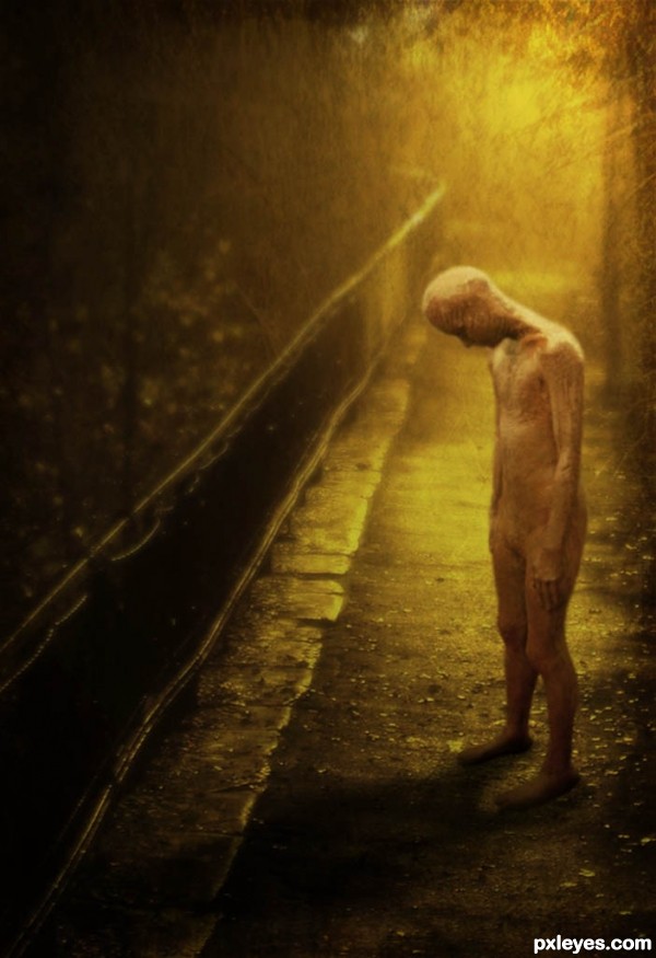
The images I used were not big files to begin with so my only option was to to blur them a bit.
This actually worked out, creating the kind of lonely mood I was going for. I also added some textures and a shadow. (5 years and 3643 days ago)
I really liked this.. this got something in it.. love the mood.. 
in my opinion
the shadow is wrong and the guy seems kind of floating..but its very nice overall...good luck author
edit:
I see what you mean with the guy floating, gonna go try to fix it, thanks, and iquraishi thank you as well.
I fixed the shadow a bit, connecting it more to the feet, hope that's better.
Very nice composition from such a simple elements. Seems to be rooted now and looks good.
Ty guys.
that person looks creepy... awesome!
author you can try giving a little bit of burn to ground where the mans feet touches it.. it'll make it look as if the man is standing on the ground.. a kind of pressure from his weight on the ground.. generally the shadow will be a bit dark where two things touch.. I hope you got my point..
Really sad. It seems an alien, a lost alien - or maybe he fell in love with a terrestrian girl and knows that this love is impossible!
This is such a compelling piece. The color, light, figure, texture. Even though there is a creepiness (to me) to it, the atmosphere you created is strong and truly speaks of loneliness. Very strong work.
Enchanting image less is defiantly more with this image, speak volumes good work author!!
Like the overall old-image effect. Btw, is that an alien? :P gl
Thanks a lot everyone. I really do appreciate all the tips, and comments. This lonely man was not meant to look like an alien. Check out the sources to see what it is =) But you may think of him in anyway you like. I'm sure there is an alien out there that's lonely too.
Very nice work author . Looks great 

Amazing work author,its very sad and hits 110% theme of the contest.To me he look like a man who survived the holocaust...Colors fits perfectly,mood is fabulous...well done
this is the 1 image so far that makes me think lonely well done author.
This IS lonliness.
Excellent!!!
I like this, great mood
Nice mood! The source looks like chocolate The man's shadow looks a wrong. The light is coming from the back, the shadow should be almost vertical under the man. At least that's how it feels to me. Good luck!
Thank you for all the nice comments. As for the shadow, I know it's a little bit off, but if you look at the original source image the light is coming from his right. Although it does look like it's coming from the top after I cropped it. I will have to keep that in mind next time =)
Very nice portrayal. GL!
hi, congrats for the 1st....
Congrats no surprise here, superb image!!
Congrats for 1st
congrats for the 1st
Congrats, very moody
Thank you guys so much.
Congratulations!
Congratulations!
Viva! Congratulations, Emi!
Congratulations amazing 1st place entry!
Congrats! for your winning
Congrats
Congrats
Thank you again for all the congrats. You guys are way nice = )
Congrats !
congrats! great mood!
congrats!
CONGRATS..
WOW!!!!! This is amazing!!!!
Howdie stranger!
If you want to rate this picture or participate in this contest, just:
LOGIN HERE or REGISTER FOR FREE
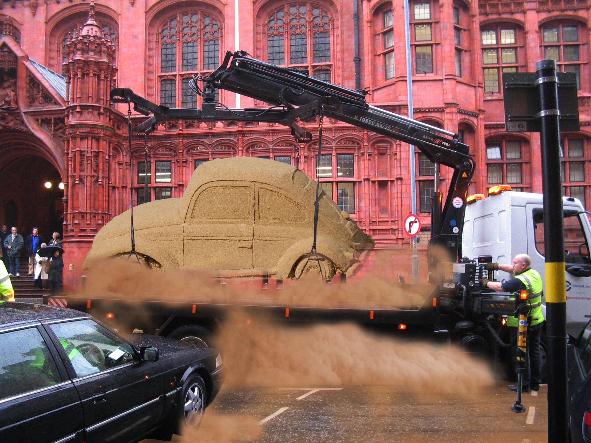
Thanks for voting. Source files are updated. Lots of work here :) (5 years and 3780 days ago)
Cough, cough!... xD
really nice, looks like a wet day so the owner prolly would have lost it anyway,
Seems to me to be a bit to dusty, The dry sand in the air would be a lighter colour because it's dry, but as stated, it's a wet day :S. Very good idea tho...
very nice work...good luck author
Howdie stranger!
If you want to rate this picture or participate in this contest, just:
LOGIN HERE or REGISTER FOR FREE
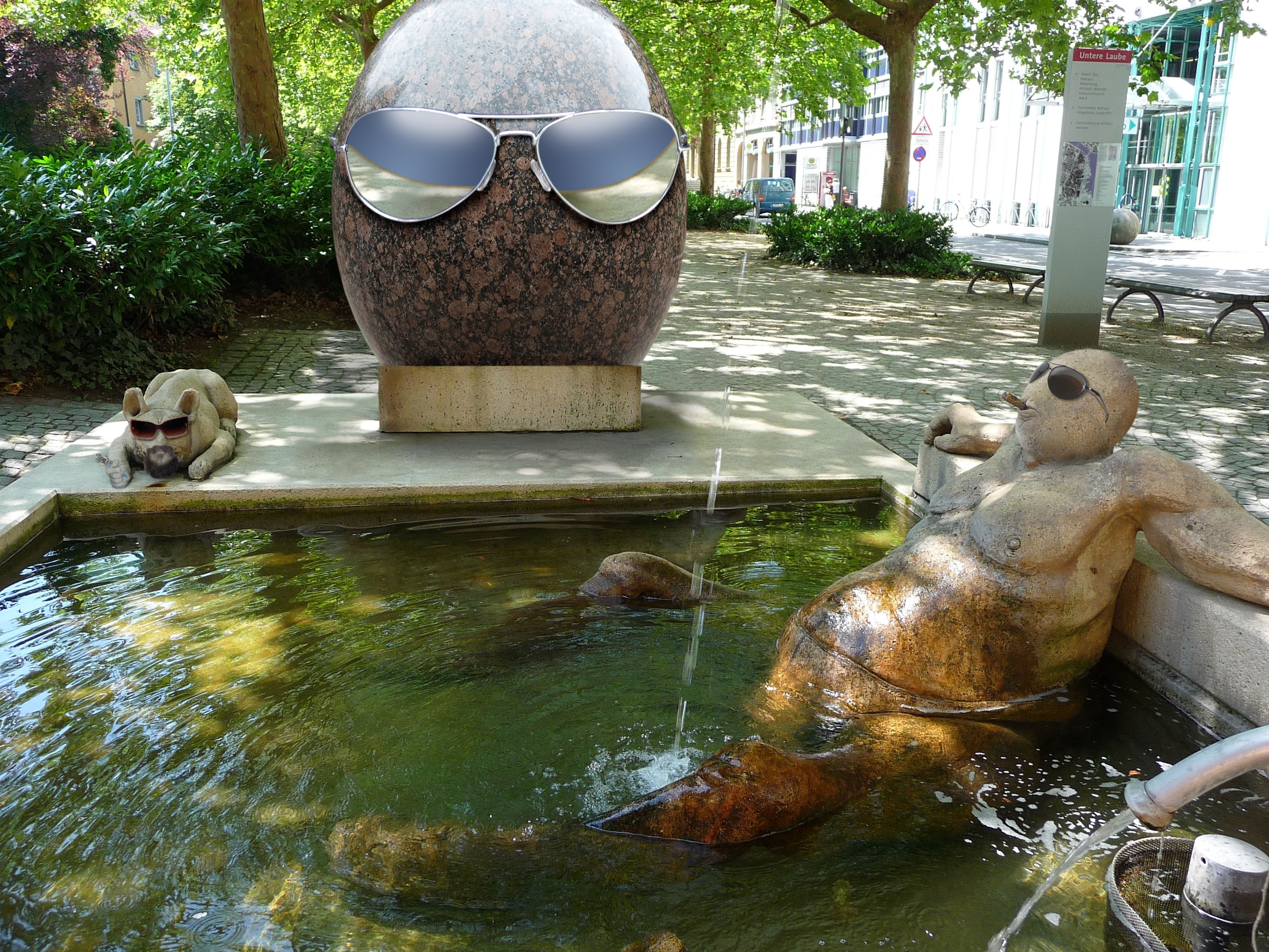
Where else would you find these people? (Please see high res!).
(5 years and 3852 days ago)
Nice clean chop, just how i like 'em!
High time I was wondering when something like that would come up 
Well, something differente.... I like the shades....lol(h)
A better use of the source for a comical vote IMO. Nice entry author.
Not sure about the reflections on the giant head's glasses but the rest looks clean to me. Good job!
We see our popular Mr. Bob (CMYK46) from time to time in many different form. Nice work
looks like CMYK's avatar 
Some funny details in HiRes . The pedestal from the big egg is maybe a bit too much made from the front, I'd expect to see a bit more from the top of it. Rest is well done. Good luck!
Henk, depends on how you see it. I imagined that the base is hollowed out to fit the bottom of the big egg. That's my story, and I'm stickin' to it!
Cool idea! but the man needs beard and a tattoo
ok
I don't even have to vote to find out who you are Nice chop BTW.
LOL Great.
nice entry, it looks very real
Clean chop but sorry....this CMYK egg theme is getting a bit repetetive and boring.
Sorry Freejay...send me your pic and I'll chop you next time.
If you put my pic in there you would instantly get high votes from all the women, but the men would be jealous and vote low!!....but seriously, the egg theme is getting a bit old.
Congrats! for 3rd. CMYK chopping CMYK
Congrats!
Congrats,
Congrats, funny image
Howdie stranger!
If you want to rate this picture or participate in this contest, just:
LOGIN HERE or REGISTER FOR FREE
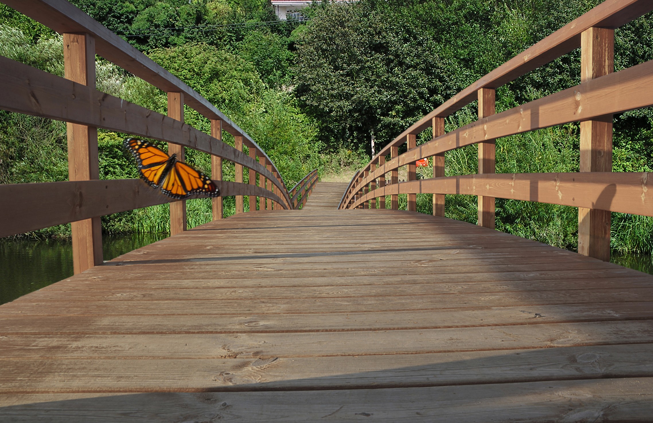
I've used transform tools (floor, railings) for the end of bridge . The butterfly with Gaussian blur and motion blur at low opacity. The rest is obvious.
Edit2: Butterfly shadow.
As I see it now.Light source is from the left and low, 4 o'clock direction.
Adjustments of position, size, tone, saturation and opacity.It is not easy. (5 years and 3865 days ago)
interesting idea, but the butterfly doesn't fit in with the rest of the image in my opinion, but good job finishing the bridge - good luck!!
Agree with Ponti, and shadow of butterfly is wrong...look at the other shadows...
Edit: correction butterfly shadow. I'm not sure...if this is better.
Light source is from left.
CMYK Thanks, now I understand. The projection of the shadow of the railing on the right me confused. As can I correct it.
very nice indeed. but the first 3 openings on the fence on the right still have some of the sky showing .. can't see it on the normal res but the hi res shows . g/l
pretty image.
Howdie stranger!
If you want to rate this picture or participate in this contest, just:
LOGIN HERE or REGISTER FOR FREE
Photography and photoshop contests
We are a community of people with
a passion for photography, graphics and art in general.
Every day new photoshop
and photography contests are posted to compete in. We also have one weekly drawing contest
and one weekly 3D contest!
Participation is 100% free!
Just
register and get
started!
Good luck!
© 2015 Pxleyes.com. All rights reserved.


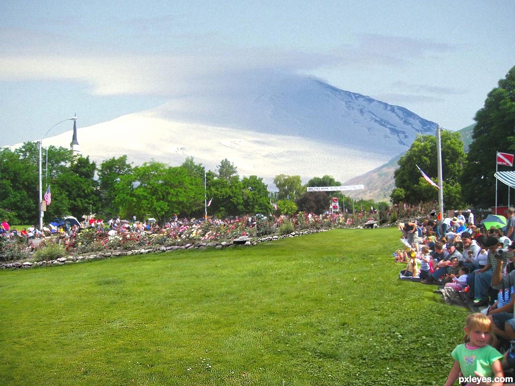
Nice image. If you flip the mountain in background it will match the light in the source pic, which is from our right.
thanks for advice ! cmyk46
I agree with CMYK. Make the changes and GL!...
i like it!
Might be more convincing as a park if you put some other source image people in the middle, IMO.
very nice idea,looks like mountain Fuji in the background...good luck
well done author.....more than a park this luks like a golf course
Howdie stranger!
If you want to rate this picture or participate in this contest, just:
LOGIN HERE or REGISTER FOR FREE