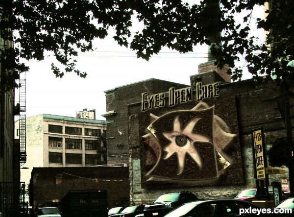
Scanned image of a baggie of coffee grounds (fresh) Chock full of Nuts...My Picture of a back alley in Seattle, basic PS WORK, My picture of an eyeball (5 years and 3428 days ago)

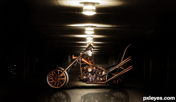
Used the engine of my source bike and used the rest of it as reference to construct the bike out of the source image. (5 years and 3562 days ago)
very nice job GL
sweet
This is fantastic author.. just a suggestion.. the back wheel needs a little shading (the spokes have no shadow cast for the tail pipes and they are very bright compared to the darkness of the surroundings) and the tail pipes would be parallel and it would be nice to see the end of the upper tail pipe attached to something...
It's only noticeable in HIGH RES, and this is a nitpick.. but I really do think you'd get even a higher score with some TLC... overall image is AWESOME!!!! (all imho)
GOOD LUCK AND GOOD JOB!!!
very good ,and good luck
Updated entry .... wheels and pipework have shadows, pipes are parallel and are joined to the frame (didn't think of that!). Thanks Drivenslush for the advice!
Nice job ........ 
Good one but maybe a little bit to small or too far to see all the details of the bike. good luck author
Superb!
It seems your background could be in better focus with the bike but it's only noticeable in high res. However, it's a really unique of source and I got to give you props for not CBRing the source. Well done! GL! 
Wow....I wish i could ride that bike
GL author
wow...superbly done!
I agree with all the commentators above! Very beautiful and impressive work. 
I am not much for mechanical images but this one rocks! Lovely lighting (I did not get a chance to see it before the change) so no complaints (critiques) here on that. Just a wonderful piece of art! Bravo!
Well put together author, GL.
Very very cool construction author...good luck
congrats
Howdie stranger!
If you want to rate this picture or participate in this contest, just:
LOGIN HERE or REGISTER FOR FREE

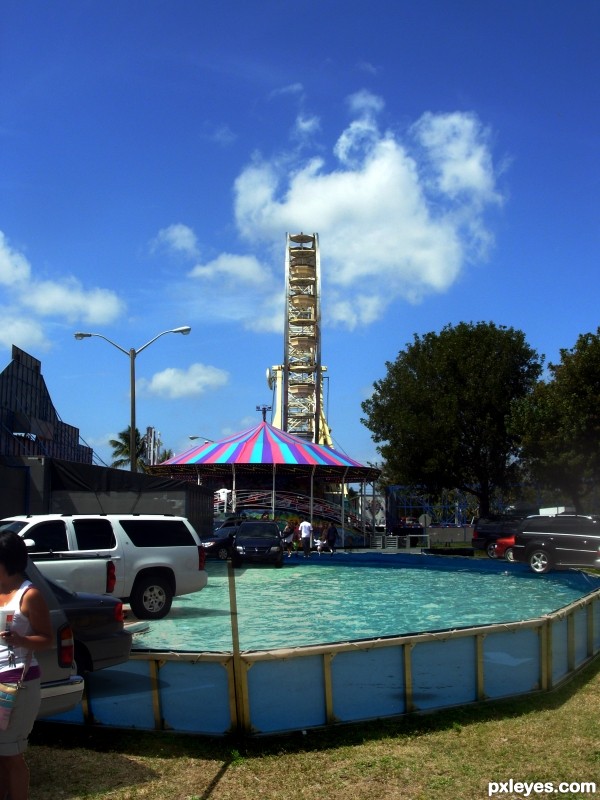
Photos taken at Local Church Carnival (5 years and 3736 days ago)
very strange choice,totally different approach to the theme...good luck author

quite an illusion
great job!
Cars will sink! Oops... It's just an illusion! 
Nice, except I don't think one would paint an above-ground pool on a sidewalk/roadway/parking lot unless one knew photographers would crop their pics as you did here (no bottom borders visible) -- but if this instead were the uncropped view so we could see where illusion meets reality, then this would be a more compelling illustration of the theme IMO.
Hey...... am i dreaming.............. 
I'm not quite sure what Danlundberg means. I have an idea. But all of those street illusions only work from one perspective. And then they are photographed from that optimal perspective. So if it only works from the way this is photographed, it still makes sense.
Howdie stranger!
If you want to rate this picture or participate in this contest, just:
LOGIN HERE or REGISTER FOR FREE

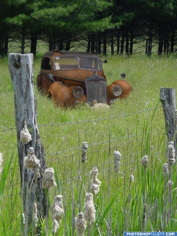
I knew I wanted to rust this car, just couldn't decide what setting to use. I think this one worked out o.k. (5 years and 4039 days ago)
ummm, where is the car?
edit: much better =)
whoops did you forget something?
ok lol I was wondering
good job author
This is very good  the first post was minus the car...
Good work on the rust --peeling roof is a nice touch
Hey, great idea  and the integration of the car is done excellently!
The title made me laugh, so I had to come in for a closer look. Good job on rusting that poor car. The peeling roof is a nice touch. Maybe you could beat up the chrome on the grill a little more, like this: http://www.sxc.hu/photo/1156437 Or not. I still like it.
this looks really good! i love it!
very nice work
Maybe, you could removed the brightness in the chromed parts. In any way, very good work.
I rarely ammend a submission, but I decided to remove more chrome highlights as suggested. As for the original with no car, it was a hectic night and I got just a little ahead of myself. Thanks for the comments 
car fits perfectly with the environment
good idea 

worked ouyt pretty well..good luck and nice job
very good job here.. I can actually feel the rust on my fingers 
very nice
Sweet job...I'm glad you dulled the chrome. Definitely high vote...

Looks convincing to me! Maybe you could add a liiiitle bit of feather for the edges from the roof, but that's just a tiny nitpick. Well done with the background that you see through the backwindow of the car. Good luck!
very convincing! man supawork!!!!
could have done with a bit of bird poop on it  nice idea ..
very nice ))) Farmer John's grandpa's car )
congrats
Congratulations for 1st
Congrats!
Congratulations.
Congrats!
congrats on the win
Howdie stranger!
If you want to rate this picture or participate in this contest, just:
LOGIN HERE or REGISTER FOR FREE
hahahahahaha...unique idea author...gl
That is interesting, well done! I have one suggestion though, for the bevel highlights on your overlapped shapes on the wall, try using a different blend mode or colour so that the highlights don't look so whitish. At the moment they look like they're kind of floating on the wall. Same goes for the main cafe text. Good luck !
Awesome SBS, but the coffee grounds are so dark, they are very hard to make out, and the tree leaves look black.
That was the idea MAD, I wanted it to look like it's a 3D floating sculpture (letters and all).. and MossyB, if your monitor is on the wrong tilt it's very dark.. but the High Res you can see the coffee quite clearly, (the original back alley picture is very dark as well and the leaves were very black to begin with.. )

thanks for the help, I'm glad you like it
Very nice signage. I wish it was a little easier to see. Graphically very well done. Good luck!
Clever concept and great scan idea.
Eye can relate!
Howdie stranger!
If you want to rate this picture or participate in this contest, just:
LOGIN HERE or REGISTER FOR FREE