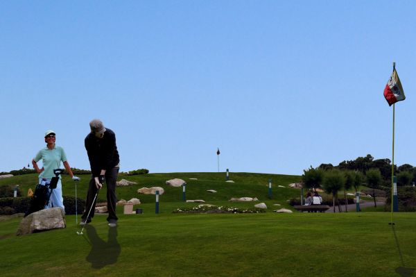
Created in Photoshop 7.0. All sources are mentioned. (5 years and 3819 days ago)
5 Sources:
- 1: New Sky
- 2: Golf flag and hole
- 3: Golfer 1
- 4: Golfer 2
- 5: Female Golfer

Created in Photoshop 7.0. All sources are mentioned. (5 years and 3819 days ago)
this is a good idea, I think you would benefit by checking the scale of your golfer in the background though. Good Luck with this, it's a nice looking image. Edit: removing the golfer in B/G is an improvement. As for the shadows well my opinion is that they do not need to be as long possibly...
Good work, just try fixing the shdow a but, by locating the direction which the light hits, 2nd, get rid of the man walking in the distance... or rescale him.. GL.
I removed the golfer but I am not sure why you see the shadow as wrong.
hmmm idea is great,work too just few minor observations...woman is to bright for this lighting,shadow is to define,with this lighting u cannot have that define shadow...if u fix that u could have fantastic work...very realistic image
I made some changes.
Howdie stranger!
If you want to rate this picture or participate in this contest, just:
LOGIN HERE or REGISTER FOR FREE