Photoshop Pictures: Past (page 2)


results 6 - 10 of 19

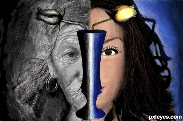
The Change:-Present To Past - created by vysakhk


The Change:-Present To Past
Favs: 1SBS: n/aHi-resRank: 16/28Score: 53.4% (0)12920 views

Two images were clubed part by part.Both of them were a bit posterized.Image on the right side was photo filtered with a variety of orange colour.Mainly brush tool was used to paint.Pen tool was used to select the vase.A little blur effect was given.

Sorry guyz nothing from source 2 was used. (5 years and 3414 days ago)

1 Source:

no avatar

the idea is quite nice...
good work...

author says:

Please post your valuable comments.

avatar Disco
Disco says:

I think the blending of the two images needs attention where they meet in the middle. Lovely idea thought!

avatar erikuri
erikuri says:

It's a nice idea, but I suppose source 2 is not valid (from blogs).

avatar CMYK46
CMYK46 says:

Source 2 is from blog. Please read http://www.pxleyes.com/blog/2009/06/how-and-where-to-find-legal-source-images/

avatar RayTedwell

I think you need to pay more attention to the size of the faces, it would be more effective if they line up well and look like the same person aged and un-aged.

author says:

thanq for ol da comments...

@raytedwell:-I thot tht when one gets old their face shrinks

Howdie stranger!
If you want to rate this picture or participate in this contest, just:

LOGIN HERE or REGISTER FOR FREE


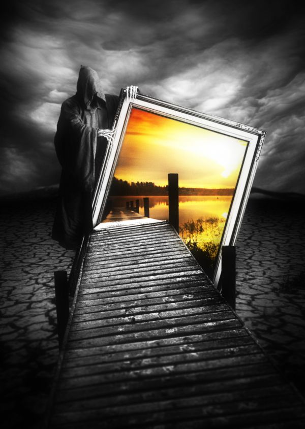
Welcome to the Past - created by langstrum


Welcome to the Past
Favs: 7SBS: 8Hi-resRank: 1/28Score: 62.3% (35)18354 views

Sorry if the resolution is not that high, it depends on the sources. Also, to avoid misunderstanding that this work can be off theme, I explain the center image is just the photo, so actually this is the world without water. (5 years and 3552 days ago)

4 Sources:

avatar Jellopudding

ohhh wow.. well done gl

avatar erikuri
erikuri says:

I don't know if you didn't put the stakes of the bridge of this side on purpose, but it's only a detail. Very, very impressive work! GL!

avatar jawshoewhah
jawshoewhah [banned] says:

Why doesn't the reaper have a right hand?

avatar erathion
erathion says:

great work...good luck author

author says:

Thank you for commenting. @erikuri: hmm, it'll be better with some stakes, right? So I'm doing on that ^^. @jawshoewhah: he doesn't have foot and face, too :p. However, because of your question, I will make some changes , thank you very much

avatar wrockx
wrockx says:

oh.. scary......good job!

avatar pearlie
pearlie says:

love it, very clever.

avatar erikuri
erikuri says:

Wonderful!

no avatar
kathyw says:

love this

avatar jawshoewhah
jawshoewhah [banned] says:

Well I'm glad you could see where I'm coming from. Looks better now. GL! I think you got another winner

no avatar
wjtje40 says:

dammn thats nice

avatar mariosilva

very nice good luck

avatar Lamantine
Lamantine says:

wonderful !

no avatar
RAW says:

light come from behind as yo see by the reaper so i miss some shadows, just my mind, but a really great job gl.

avatar dreamboy
dreamboy says:

realy scary, gr8 work!

avatar Govindrathod

Stunning work....Amazing creativity and imagination.....Great vision.....

avatar madamemonty

Congrats, nice work and really creepy

avatar RichieMB
RichieMB says:

Congrats for 1st

avatar vertigo
vertigo says:

Congrats, very creative!

author says:

Thank you for your congratulations, I love you all

avatar sophia
sophia says:

gratz

avatar loopyluv
loopyluv says:

Congrats! Nicely done!

avatar chakra1985

Congrats!

avatar Lelaina
Lelaina says:

Congrats for your first place, Langstrum!

avatar basem11361

Congrats

avatar Suky04
Suky04 says:

Great work,Congrats !

author says:

Thank you my friends ^^

avatar 510SAM
510SAM says:

I can see how this got first place. Simply amazing work.

Howdie stranger!
If you want to rate this picture or participate in this contest, just:

LOGIN HERE or REGISTER FOR FREE


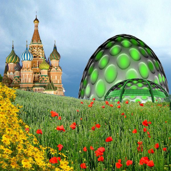
Past and Future Domes - created by DigitalPro


Past and Future Domes
Favs: 0SBS: 3Hi-resRank: 20/28Score: 53.4% (0)7934 views

Future domes can be prefabbed
and manufactured where labor & material are cheap and transported easily to any point on the globe in short period of time. (5 years and 3585 days ago)

4 Sources:

avatar gayongmaarifat

what is that green object.. aliens has landed?

avatar gayongmaarifat

what is that green object.. aliens has landed?

avatar CMYK46
CMYK46 says:

Interesting take author, but you need a SBS to show how you made this...it's a minimal use of the source.

avatar loopyluv
loopyluv says:

cool, but I have to agree with CMYK there ...

avatar Govindrathod

I would agree that the source usage is minimum. You could have done better. Your idea though is nice...

Howdie stranger!
If you want to rate this picture or participate in this contest, just:

LOGIN HERE or REGISTER FOR FREE


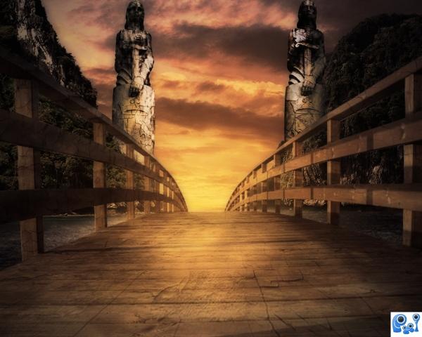
Bridge to the past - created by ponti55


Bridge to the past
Favs: 6SBS: 14Hi-resRank: 1/28Score: 62.4% (35)12014 views

Thanks to Falln-Stock for her wonderful statues (5 years and 3640 days ago)

5 Sources:

avatar divair
divair says:

Nice idea and good colours, but the bridge is blurrer than the statues and I think you should place the mountains and statues lower and reduce them since the bridge is curve and its end probable is lower than the horizon...

avatar CMYK46
CMYK46 says:

I'd flip one of the statues & pay more attention to light & shadow, but nice image...

avatar jawshoewhah
jawshoewhah [banned] says:

Definitely flip one statue. They'd look much better facing the opposite way.

author says:

Thank you very much all of you, i used dodging and burning to apply light to the figure on the right. Thanks

avatar ReapRevenge
ReapRevenge [banned] says:

nice sbs author !! G/L

avatar Mairissa
Mairissa says:

reminds "The Neverending Story" - one of the films most affected me in my youth.. i love step 13 in SBS - it's greener and more interesting than final result

no avatar

I love the feel about your image author. good use of source.

avatar Lelaina
Lelaina says:

Congrats for your first place, Matteo!

avatar oana
oana says:

congrats Matteo!

avatar nasirkhan
nasirkhan says:

congrats! for 1st place.. Very nice color

avatar nishagandhi

congrats

avatar demi
demi says:

congrats! for 1st place.

avatar spaceranger

Congrats!!

no avatar
numbsock says:

congrats

Howdie stranger!
If you want to rate this picture or participate in this contest, just:

LOGIN HERE or REGISTER FOR FREE


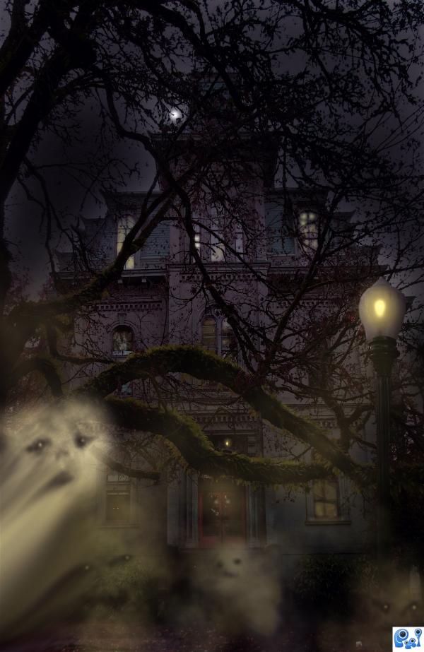
Past Residence - created by donh


Past Residence
Favs: 0SBS: 3Hi-resRank: 10/28Score: 56.5% (0)6159 views

Only my own personal source,
along with brush credit.

Image taken at a University (5 years and 3652 days ago)

1 Source:

avatar dustfinger

Nice work. I like the ghosts. For some reason, the lamp looks a little odd (my best guess is that the edges of the lamp are too sharp). But apart from that it's a nice job.

no avatar

nice

avatar mistic
mistic says:

luks creepy

author says:

Thanks for the tip dustfinger> fixed it, and thanks for the compliments people.

avatar erathion
erathion says:

Lamp looks like a sea shell and its not simetric,light from here is to weak and u cannot have that big ligting spot on the trees...but whole composition is very nice...gl author

avatar jawshoewhah
jawshoewhah [banned] says:

lamp looks fine to me.GL ghosts were a nice touch.

no avatar

nice colour choice. dont know that it would be my dream house well constructed image.

Howdie stranger!
If you want to rate this picture or participate in this contest, just:

LOGIN HERE or REGISTER FOR FREE