Photoshop Pictures: Past (page 3)


results 11 - 15 of 19

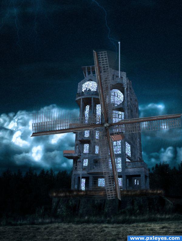
Windmill of Futures Past - created by willis


Windmill of Futures Past
Favs: 0SBS: 13Hi-resRank: 9/19Score: 55.2% (0)6924 views

I wanted to try and combine this challenge with the one next to it.
I thought the juxtaposition of modern architecture with the old world windmill would be cool.
I added the lightning rod to further the concept of past meets future
No other photos used (5 years and 3688 days ago)

avatar pingenvy
pingenvy says:

Cool idea & mood. You might want to shadow the tops of some of the windows if the light is external. If the light is internal, then never mind.

avatar pixelkid
pixelkid says:

I like the mood of this...try and put some variation of tone in the windows. I don't think all the windows would have the same brightness...just a suggestion.

author says:

TY both for the advice. I did intend the light to seem internal but perphaps should have used some glow and some burn to emphasize that. My biggest personal complaint after looking at it again is that I would have transformed the propeller to the appropriate angle! oh well hindsight is 20/20

avatar Chuck
Chuck says:

Wow! Different...Good idea

Howdie stranger!
If you want to rate this picture or participate in this contest, just:

LOGIN HERE or REGISTER FOR FREE


Druid's Past - created by donh


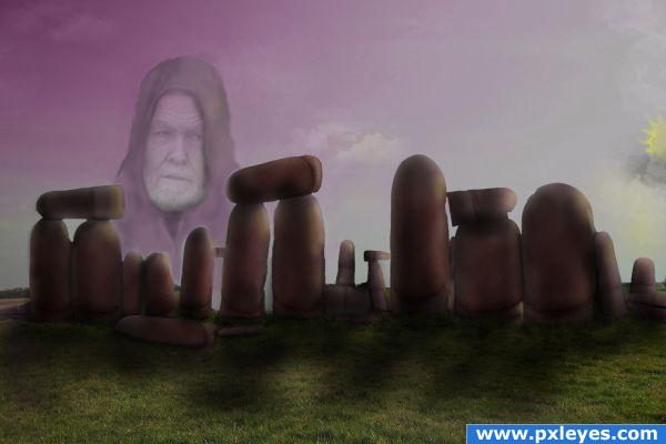
Druids Past
Favs: 1SBS: 7Hi-resRank: 4/19Score: 57.6% (20)8460 views

Just a speculation.. not fact that
druids built Stonehenge. (5 years and 3702 days ago)

2 Sources:

avatar woodztockr

Very well done! Nice job putting everything together.. g/l

no avatar

great use of source.. well constructed. druid in sky is a lovely touch it pulls the image together. GL

avatar ponti55
ponti55 says:

I love the image.. everything except for the man in the sky. You created stonehenge beautifully, and i think that that alone is good enough to earn you very high marks. I'll hold my vote for the moment.

avatar Lelaina
Lelaina says:

Great composition and idea! I really like the peaceful feeling and how you drew the cape of the man I'm usually not a big fan of placing people anywhere in pictures, where they normally don't belong, but in this case it fits so good! Just two small things, that I noticed. Maybe you could work a bit on his cape, where the cape meets the "stones". There is a white outline and maybe it could look better, if you'd fill these white outlines, so it looks more like he is completely behind the stones and not so cut off. (If that was your intend, just ignore that )

avatar Lelaina
Lelaina says:

The second thing: maybe you could darken the grass a bit, cause the front looks like a very bright and sunny day. And considering the mood of the whole picture and how the sun is positioned I'd expect the grass to be a bit darker. Not much, just a little. These are the two things Maybe that can help a little. But like I said: other than that it's really good! Good luck

author says:

Thanks everyone for the great compliments, and thanks Lelaina for the tips, I did fix those little things. appreciate your tip also ponti55.

avatar CMYK46
CMYK46 says:

ROFL...FingerHenge

avatar Lelaina
Lelaina says:

You're welcome It looks much better now Good luck again!

avatar pixelkid
pixelkid says:

Yeah...uh...right...like what Lelaina said....ditto that. All of that! Good job, author!!

avatar loopyluv
loopyluv says:

Great image : get rid of the dude in the sky....

avatar chakra1985

Congrats

Howdie stranger!
If you want to rate this picture or participate in this contest, just:

LOGIN HERE or REGISTER FOR FREE


Beauty from Past - created by Nellista


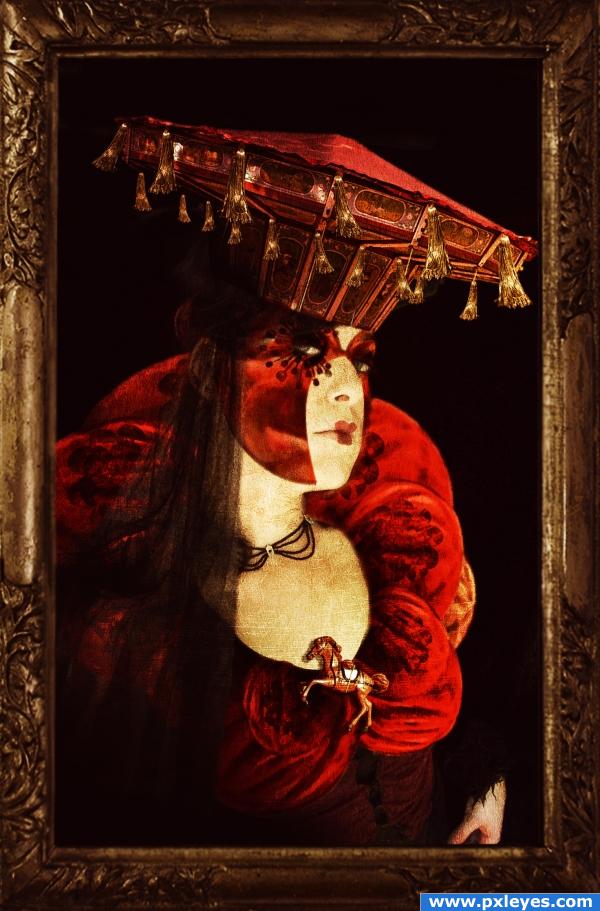
Beauty from Past
Favs: 3SBS: 19Hi-resRank: 5/19Score: 61.7% (24)25339 views

For this entry I thought of something different. The top part of the merry-go-round made me think of a hat....so that was my starting point.
I found a great portrait photo taken by "Fetishfaerie " on deviantart. I selected all merry-go-round and after that only the top side. I resized it slightly and added it on top of girl's head.
I added tassels and gause.
I selected only the tail from the most visible red horse on the merry-go-round.
I used warping, resizing and distorting to get the shape of the high collar and the top of the dress. I didn't want to recreate the entire dress as I planned to put shadows on the left side of the image.
I added jewelries on top of dress and face (blending mode multiply).
I colored the dress, added mask, blended. I also added a small horse from the source image in the middle of the corset and dropped shadow.
In the end, I added old frame, added a texture to make it look like a painting, also added a slight dry brush filter, colored more and added brightness/contrast using adjustment layers.

SBS upcoming!

Credits to:
1. "Fetishfaerie"on deviant art for some really amazing shots. Main account at: http://fetishfaerie-stock.deviantart.com/.
2. "Bluesse" on deviantart for a really infinite useful stock. Main acount at: http://bluesse.deviantart.com/.
3. "Night-fate" also on deviantart for a great texture. Main account at: http://night-fate-stock.deviantart.com/.

Hope you like it! (5 years and 3750 days ago)

6 Sources:

avatar GolemAura
GolemAura says:

Rembrandt Meets the Munsters (the brooch throws it over the top)

I FOUND HER HUSBAND... hehehehe.. couldn't get it out of my mind

http://k53.pbase.com/g6/69/456169/2/83739060.z5NJzicN.jpg

avatar ponti55
ponti55 says:

Wow.. incredible use of source, a very nice image. Good luck!

avatar Akassa
Akassa says:

Wow this is amazing! Looks truely like an old paint. Alot of imagination here!

avatar Lelaina
Lelaina says:

Beautiful work and idea! And you just found the perfect model for this. Aaaah... Great! Good luck!

author says:

Thank you so much for the excellent comments! But Golem Aura....I had higher expectations from her....! Lol....! From all the people in the world....she had to choose him.....!!!!!!! Oh well....everybody's got a better half, I guess!

avatar Nelee
Nelee says:

amazing idea! and pulled off the final image very well indeed! awesome stuff here!!!

avatar GolemAura
GolemAura says:

(Just the Hat.. not the guy.. LOL) hehehe

avatar Tuckinator

this entry would make me run away screaming f i was in this contest.

avatar hymerion
hymerion says:

great one!

no avatar

great thinking out of the box when using the source author.

avatar sparklen
sparklen says:

Holy Merry-Go-Round Batman! She needs to be in the next movie!

avatar TheWinningStar

amazing! really great work and very good use of the source image

Howdie stranger!
If you want to rate this picture or participate in this contest, just:

LOGIN HERE or REGISTER FOR FREE


Witness of the past - created by George55


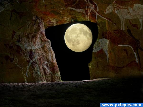
Witness of the past
Favs: 1SBS: 4Hi-resRank: 8/19Score: 56.6% (0)6531 views

Image of the moon thanks to Mymy

Image of the cave thanks to mqtrf (5 years and 3771 days ago)

2 Sources:

avatar GolemAura
GolemAura says:

just excellent and beautiful.. really struck a mood (kinda looks like some of the scenes in castaway, when he's in the cave.. really wonderful mood and great use of source

(AUTHOR fix your link to the cave image.. it's PXL.. not PIXEL)

all fixed

author says:

Thank you GolemAura...had same problem before... Fixed already!

avatar cabldawg71

Nice work Author

avatar Tuckinator

awesome image

avatar ponti55
ponti55 says:

Looks.. GREAT! Good job!

avatar sparklen
sparklen says:

Love this image! Beautiful feel and great source work! High marks Author.

avatar chakra1985

very nice

Howdie stranger!
If you want to rate this picture or participate in this contest, just:

LOGIN HERE or REGISTER FOR FREE


5 Miles Past Atlantis - created by BG2


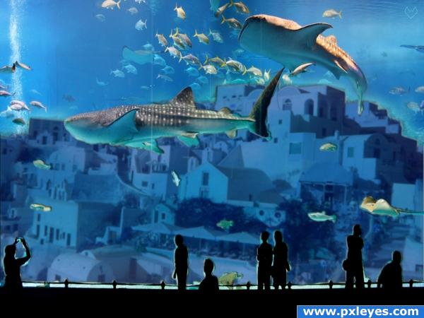
5 Miles Past Atlantis
Favs: 1SBS: n/aHi-resRank: 8/19Score: 54.6% (0)11625 views

(5 years and 3772 days ago)

1 Source:

avatar OliviasArts

love the flicker photo, nice find looks good author

avatar ponti55
ponti55 says:

Great idea, looks really nice, but in my opinion the actual buildings need a little bit of sharpening. Good work and good luck!

avatar sparklen
sparklen says:

Very inventive.........good luck

no avatar
weredog says:

wicked awesome

avatar Tuckinator

wonderful work author

avatar ReapRevenge
ReapRevenge [banned] says:

Interesting image.

avatar invasorsl
invasorsl says:

good job!! good idea!

avatar chakra1985

very nice

avatar solkee
solkee says:

The masking around the people could have done with a lot more work.

avatar fille
fille says:

someone lives in this city yet, everything looks trimmed... cheers!

avatar vinshine
vinshine says:

love the lights on the viewers. but there are two lines on the glass don know if they are meant to be there or was any scrap. good idea.,

avatar Steve1972
Steve1972 says:

cool underwater worl...high res?

Howdie stranger!
If you want to rate this picture or participate in this contest, just:

LOGIN HERE or REGISTER FOR FREE