
(5 years and 2923 days ago)
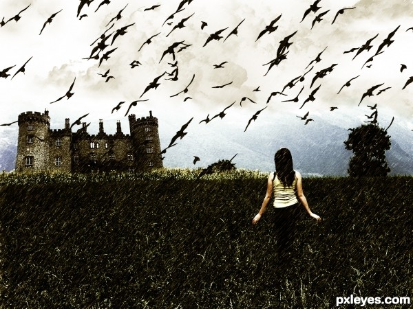
I have provide all source links.. The girl was my own photo (5 years and 2971 days ago)
Not a bad image. Might be better if there was a path somewhere.
hmm good idea

if you're making changes... a little bit of rain splatter off her right side (since rain is falling that direction), and the top of her head... keep it light, but clear and visible in the high res. Nice image over all.
Howdie stranger!
If you want to rate this picture or participate in this contest, just:
LOGIN HERE or REGISTER FOR FREE

(5 years and 3041 days ago)
Congrats, nice work 
Thank Nator & madamemonty.
Howdie stranger!
If you want to rate this picture or participate in this contest, just:
LOGIN HERE or REGISTER FOR FREE

Exiting your persona can lead to better or worse things. Made adjustments from the suggestions given. Thanks! See high resolution. (5 years and 3059 days ago)
Very nice. I might do some more soft erasing on the left side of the foreground sand, but it's a well made and intriguing image. GL author. 
Try to work a little bit more on the feet on the sand it's make not realistic ! otherwise good work !
good collection of sources put together well
CMYK and lolu: Thanks so much for your help. I have blended the left side foreground sand more...and also fixed the shoe in the sand to make it more realistic. Looks better! Thanks so much you two! 
This image proves what i have always said, Men would also misplace their heads if they were not attached. 
JUST LOVE< LOVE < LOVE, the choice of images, the mood and construct of your image. BIG THUMBS UP
very nice, makes me kinda think of rene margritte and salvador dali mixed up
Wonderful, amazing work.
On the scale of 10 I would rate 9 on your idea and 8 on execution. Actually you made this kind of image before and it inspired me to make one of my work. However, I have some critiques that might help you to improve that image if you're willing to (1) The perspective or the angle of the sand is different from the gray ground, so viewers can feel the inner image (inside the frame) is actually closer and higher than the outer image; (2) the pattern of the sand and the gray ground are very different, so even though you used a high feather radius, they are not blended well
@ All: Thanks all for your comments. @langstrum...thank you so much for your observations, they are much appreciated. You make some great pointers...unfortunately I can't commit any more time to this as of now. Glad I could inspire you to do a similar approach on an entry. Thanks again for commenting and offering ways to improve. I'm always looking for that kind of critique. I guess I must rely on the 'so strange' mantra to answer any inconsistent elements. 
That's what I planned to mention, the "so strange" elements, but didn't have enough space for that. From that aspect, everything is fine lol. I understand that it's close to the voting period so normally we don't have enough time do make any change. Best of luck to you, author
So glad to see you....I really like this image, I can totally relate  Best of Luck

Congrats Rob,  wonderful work
Howdie stranger!
If you want to rate this picture or participate in this contest, just:
LOGIN HERE or REGISTER FOR FREE
(5 years and 3092 days ago)
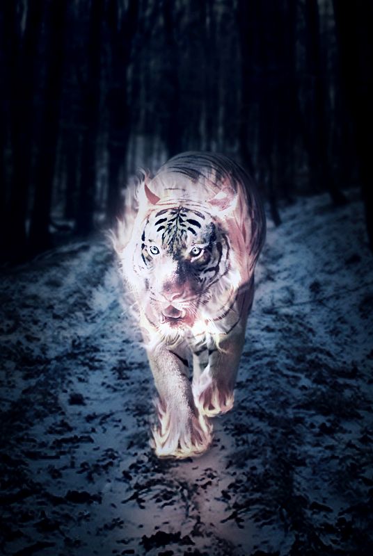
great concept.. love yoru choice of animal.
ilike the image, nice source, nice work. The text below it is ok i guess it just the reflection of the text that bothers me...
Get rid of the text , my opinion.....  nice work
Great work, but I agree on getting rid of the text, it's distracting. Let your work speak for itself. Nicely done!
I agree text is a bit distracting, image will be better without it. Great job.
edit: Text are Removed. Thanks for the suggestion & liking it.
Howdie stranger!
If you want to rate this picture or participate in this contest, just:
LOGIN HERE or REGISTER FOR FREE
This is dreamy and cool...I know this is surreal...so all bets are off...but those are some huge escalators.
Good idea, but hardly any of the source is visible here. This image could have been made without using the contest source.
Yeah, I thought about that cmyk and thought it would be more fitting in a mixed media contest, but I just threw it into this contest to see what would happen. Although minimally, the source was used. Your comment is a fair argument though. Thanks pixelkid!
ack.. transport back to stairway to heaven and every prom anyone over 40 LOL.. good luck author
very nice.., congrats on second
Congrats!!
Howdie stranger!
If you want to rate this picture or participate in this contest, just:
LOGIN HERE or REGISTER FOR FREE