Credits to
nexus35-Stock
liam-stock (5 years and 3208 days ago)
Credits:
http://muttstock.deviantart.com
http://resurgere.deviantart.com
http://dawnallynnstock.deviantart.com
Caro Lander
bas3ssen
night_fate
lousyrats (5 years and 3210 days ago)
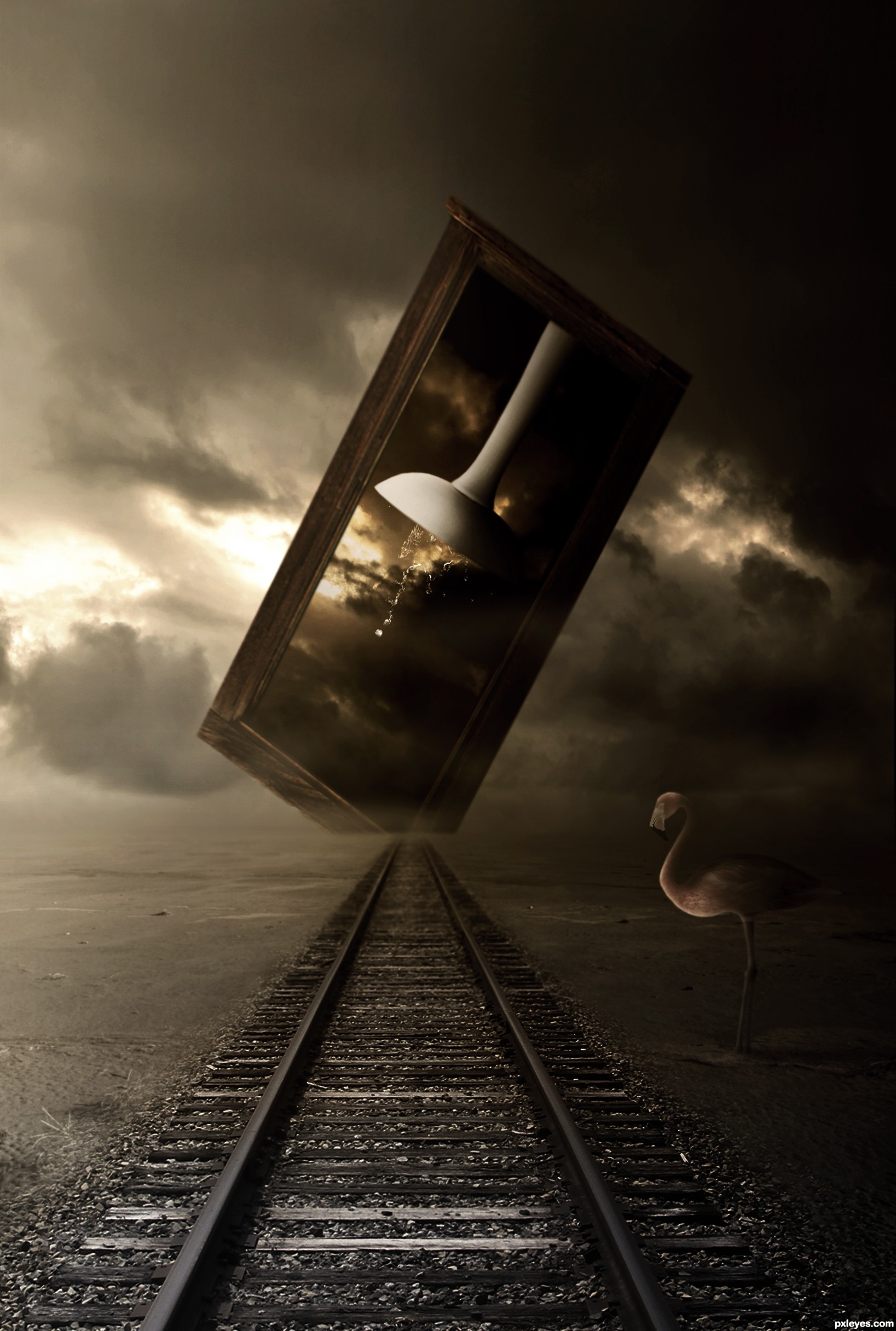
Intriguing with the odd elements, very constrained color palette, and dramatic brightness difference between the left and right sides, but in the end I just don't get it. While I see a 'path' (the railroad tracks, I assume), the 'sink(ing)' element seems disconnected from those tracks. The window thing encompassing the sink seems nearer than the far end of the tracks so I would expect some shadow from that window onto the tracks. The cut off corner on the window is weird.
Maybe shortening the title to just "Sinking" and making the window/sink element vertical and complete plus positioning it a bit more towards the left side of the image with a ground shadow would be a dramatic contrast against the left-side background and have a surrealistic appeal overall.
Makes me sit on the edge of my seat to see what Lundy comes up with... giggle snort.. great job author.. on a very difficult subject
this is amazing author
good luck
high vote and fav

Congrats for 3rd, nice one
Howdie stranger!
If you want to rate this picture or participate in this contest, just:
LOGIN HERE or REGISTER FOR FREE
(5 years and 3242 days ago)
Howdie stranger!
If you want to rate this picture or participate in this contest, just:
LOGIN HERE or REGISTER FOR FREE
(5 years and 3309 days ago)
great job author!
impressive!!!
Awesome! Fav!
very cool effective work...best of luck author
this gives me chill... GL author...
Good one... my friend 
Congrats
Congrats!!
Congrats...
congrats
Nice Congrats
Howdie stranger!
If you want to rate this picture or participate in this contest, just:
LOGIN HERE or REGISTER FOR FREE
(5 years and 3356 days ago)
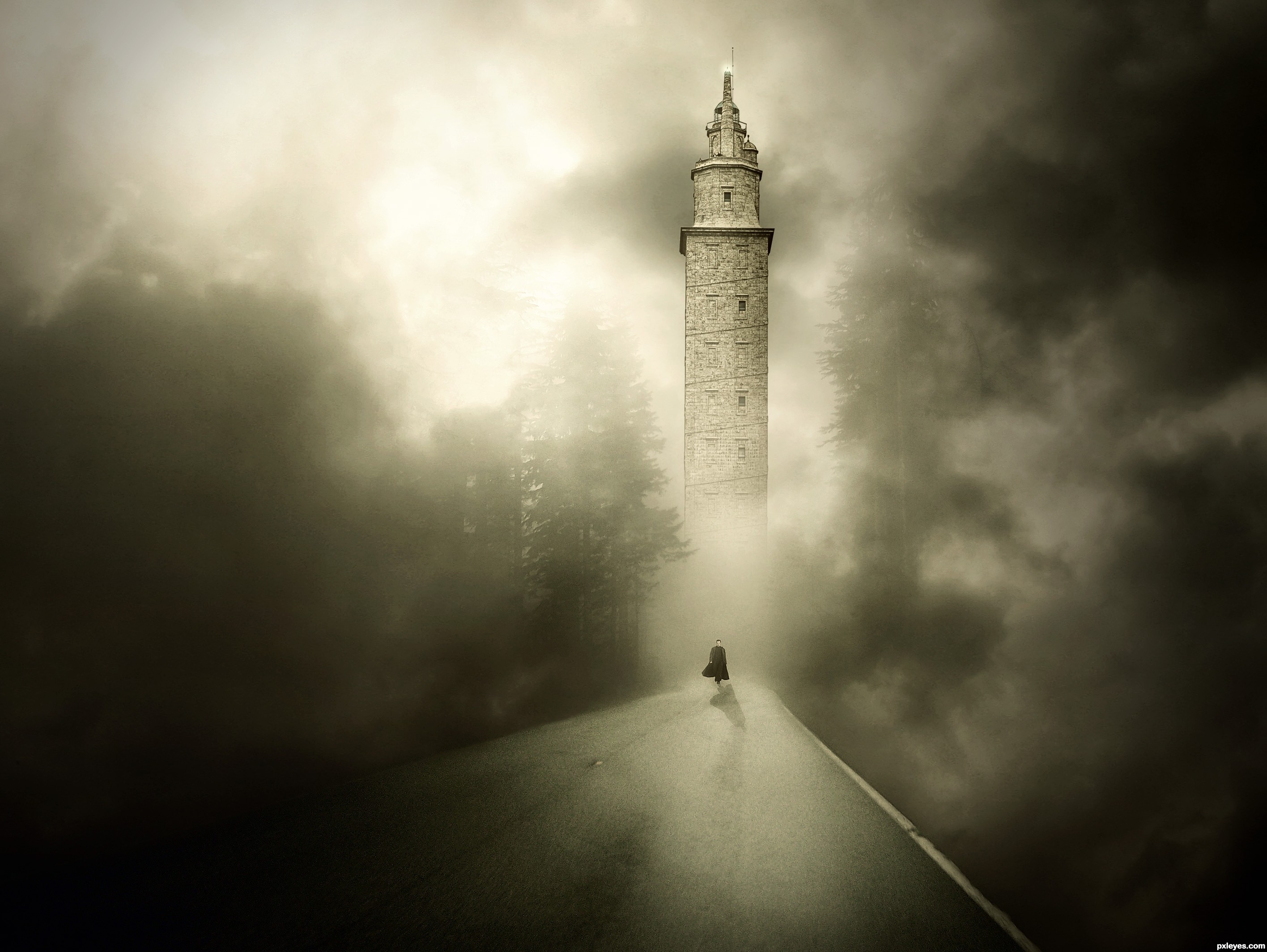
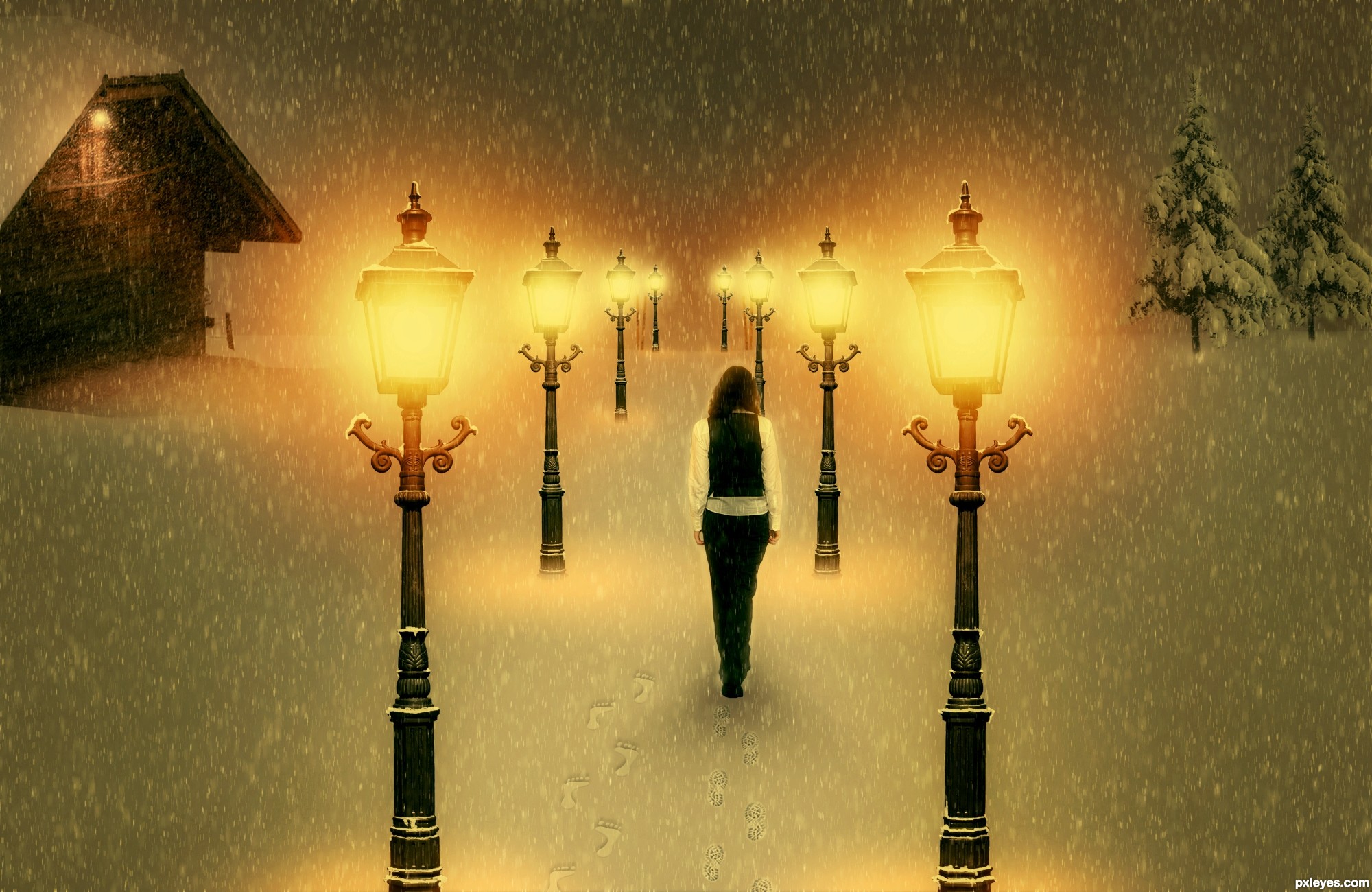
Very cool work author...IMHO she is a bit big compared with the rest of the image...also perspective of the laps is for few degrees wrong...try to fix that and this will be great...by the way great touch with adding foot steps in the snow...best of luck
She's way too big, and the perspective on the tops of the lamps is wrong. Good idea & mood, though.
Also, symmetry doesn't help this image, two identical buildings is a bit weird. Find one or some tries for one of the sides.
edit: I made changes. Thanks erathion, CMYK46 and greymnal for your useful suggestions. But I don't understand how can I make my lamps perspective better...tell me
well done!
From the angle at which the lamps are shot, I don't see what you can do about the perspective issue.
You could transform the lamps just a bit , so that those in the foreground appear bigger, but Make Sure you Don't split the image with them. Splitting image = failed composition.
Also make the far distance foggy, so that you can't perceive horizon, but just image it. Check works of ponti & arca if you don't understand what i mean. I usually do it with some scatter common brush on a layer which I gaussian blur. But internet has many tutorials, try them.
Last tip: since all your elements are vertical, image might be plain - try to tilt the snowfall, a few degrees.
You're doing good, and you're also the only guy with warm mood!
Howdie stranger!
If you want to rate this picture or participate in this contest, just:
LOGIN HERE or REGISTER FOR FREE
Photography and photoshop contests
We are a community of people with
a passion for photography, graphics and art in general.
Every day new photoshop
and photography contests are posted to compete in. We also have one weekly drawing contest
and one weekly 3D contest!
Participation is 100% free!
Just
register and get
started!
Good luck!
© 2015 Pxleyes.com. All rights reserved.


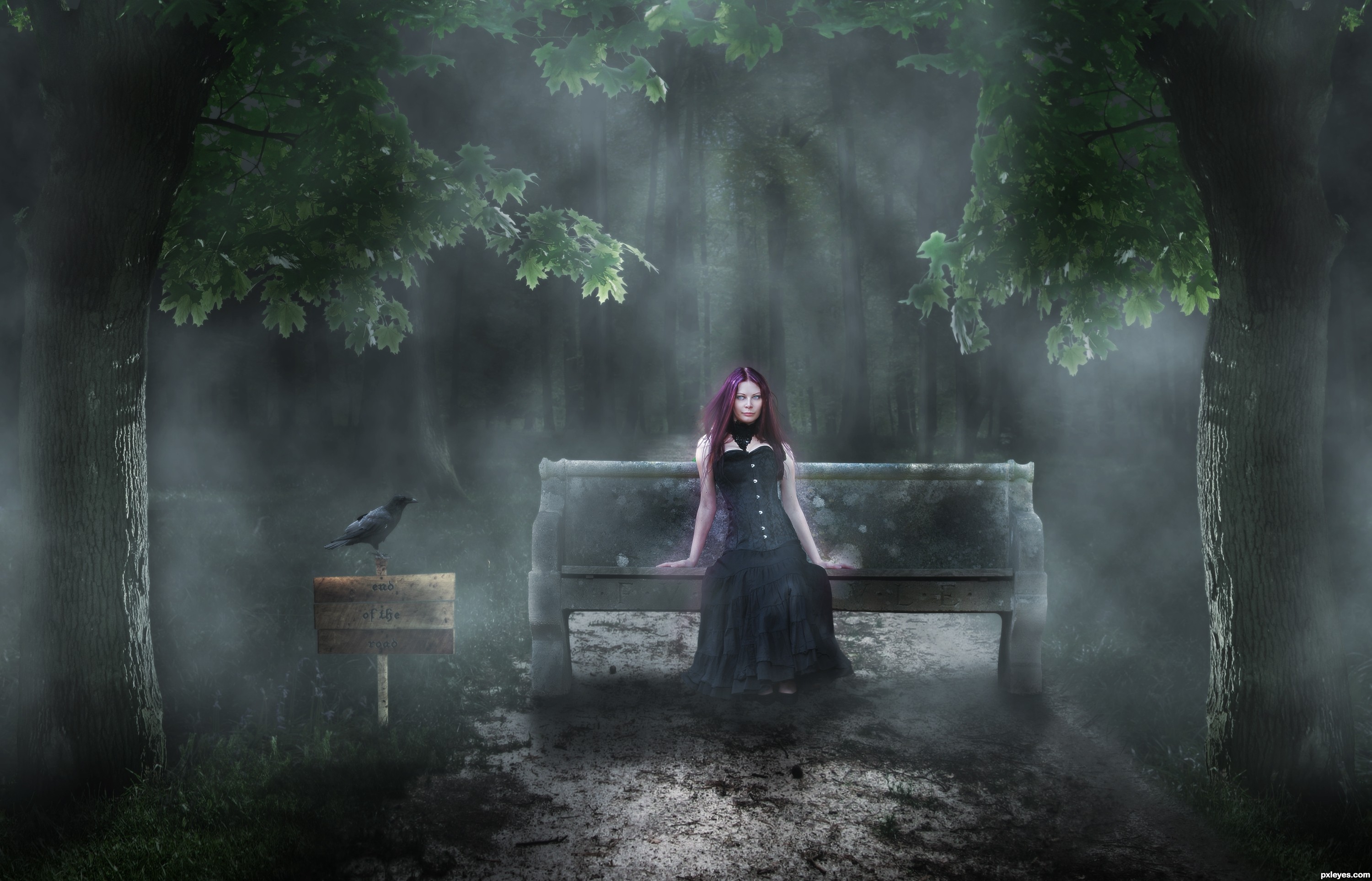
Nice eerie feel, love that purple hair!
wow love it
nice mood good luck
Howdie stranger!
If you want to rate this picture or participate in this contest, just:
LOGIN HERE or REGISTER FOR FREE