(5 years and 3566 days ago)
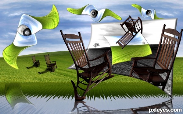
source and my picture of rocking chair (5 years and 3592 days ago)
pretty nice reflections
its beautiful  ............... all the best
Wow! I am really diggin' this one! Reminds me of a Dali. Good luck to you author! 
Surprise, Surprise, lookie who it is 
superb...
@jaw: what's the surprise? If you thought of surrealism, you thought of him... 
Author, fantastic work as always! 
This is fantastic...few effects are just WOW...well done author

I could see this on a wall in a museum!
Beautiful surreal image and the sbs is so detailed and nicely done 
Howdie stranger!
If you want to rate this picture or participate in this contest, just:
LOGIN HERE or REGISTER FOR FREE
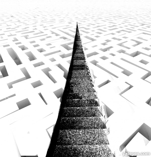
Thanks to gerard79 for maze picture
(5 years and 3606 days ago)
I think the stairs should extend all the way through the maze, but also gradually fade like the maze. Good luck!
all the best ........... 
gl to you!
Howdie stranger!
If you want to rate this picture or participate in this contest, just:
LOGIN HERE or REGISTER FOR FREE
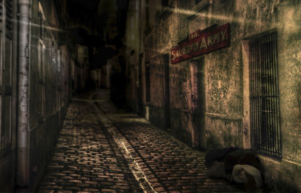
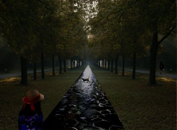
No one saves us but ourselves. No one can and no one may. We ourselves must walk the path.
Buddha
http://www.brainyquote.com/quotes/keywords/path.html first quote.
I kept this image simple on purpose and focussed more on the idea behind it and the mood.
>> PLEASE CHECK THE HIGH RES (5 years and 3724 days ago)
What a thought provoking image... well done 
Might be better to use a path instead of an alley...
Good job, I like it!
That's just the reason why I put the Salvation Army sign in Nator; the quote is about helping / saving yourself not to let others help you.
Nice....
WOw!!!!Well done
Congrats for your fourth place, Honey!
Howdie stranger!
If you want to rate this picture or participate in this contest, just:
LOGIN HERE or REGISTER FOR FREE
Thanks to Ameotoko!
*as I look at this from a different computer, it looks so dark. (5 years and 3749 days ago)
The man in the right is too clear. He should be blurry like the rest of the background. Also "cousin It" or whatever that is in front looks like they have no arms. I think they're a little dark and the edges are a little fuzzy.
Please fix source link...perspective on path is a bit off.
i can tell that you have flipped the source image. to make the trees look more realistic try to blend them together so it does not look reflected. gl
we are not sure why the source link is not working so here it is http://www.flickr.com/photos/ameotoko/3946537224/sizes/o
Howdie stranger!
If you want to rate this picture or participate in this contest, just:
LOGIN HERE or REGISTER FOR FREE
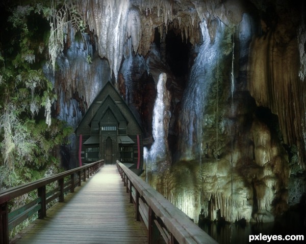
If you expand the house without a vertical mirror it would look a lot better in my opinion. Also if you can fix the right, missing part of the bridge, would be good. Maybe use that railing on the original picture or something. Very beautiful picture otherwise, nice colours and mood.
Thanks Widiar , I have clone and repair missing right railing and also resize house.
Creative idea and pretty nicely done the scale is a little off tho most obvious on the left hand side the large formation of rocks, looks (massive) possible scale this down and clone It in for a more realistic feel….
Beautiful!
Thanks Warlock, I have replace left rock from other source
Very nice work author,great colors and fantastic mood...gl
Nice image, well done author
Your welcome author! looks much more convincing now..... top job!
definately neat
Nice cavelike feel to this.
Howdie stranger!
If you want to rate this picture or participate in this contest, just:
LOGIN HERE or REGISTER FOR FREE