no time for SBS, maybe latter! (5 years and 3560 days ago)

(5 years and 3666 days ago)
I think your blending still needs a lot of work 
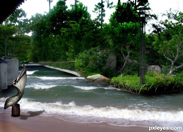
Yes, agreed. For starters, sharpen (not with the sharpen tool, but as in make flat) the edge of the drawing--not so feathered, or it looks too unreal. Also, the pelican is crosses out of the logical boundary for the chalk art so it would have to be real, not part of the drawing. If this is the case, then the pelican looks a bit cartoonish. Also, author, don't forget to list your sources.
I don't use sources, accept if a source is offered, the original photos are in the sbs (never did anything like this before so I really don't know what "Blending needs a lot of work" means, I blended til my fingers fell off LOL.. I really thought the drawing should like a drawing.. but I really liked the way the Pelican sculpture is floating on the image... but I could be wrong..  .. but this is my first attempt at something like this.. so it really was a learning experience
Okay, I see, then. Pardon my complain re the sources. 
I don't think that was a complaint Games, I think that so many entries have sources that you just assumed this one was the same  (and I've NEVER been the same.. though I do have to admit this was a bit weird for me to do.. I'm so used trying to make the two pictures match that having them look like a realistic chalk drawing on a urban environment is very confusing... I even added a paint filter on top of the water and in PS7 it looks fine, but the result after upload looks totally different.. hehehe. but it's good to learn new things (I had to try something
Good effort 
blending needs a lot of work means.... here the edges are too much feathered, that it looks unreal... u can have a reference of the same from clicking the link of edgar mueller's works given in the theme.... Gl 
well I tried moving the bird around.. didn't look right... I made the edges harder by doubling .. then it looked too much like a photo laid into the picture.. sigh, I'm just going to leave it as is, I can't work on it any more, but thanks for all the help (this will go done as a stumper)
EDIT (I succumb to try harder.. see below  )
)
What? How does one achieve level 8+ without knowing how to blend the edges better?
Instead of trying to blend the edges better, I would use the pen tool to draw a border around the inside of the natural edge of the drawing to make it appear to be inside of the street rather than on top of it. Look at this image and see if you can see what I mean: http://eviluncle.files.wordpress.com/2009/04/edgar-mueller-1.jpg
@downoffthedragon, ouch!
okay, I STRENGTHENED the edge
Author i like your work very much,but to be better demands a bit more work.Its better to cover the edges with water and other things,with that u will get better blending and whole image will get more realistic look.And would be better if u create couple blending layers.For example with this colors it would be cool to add one dark blue overlay layer,then one dark brown color layer and dark green soft light layer,and maybe,just maybe one golden color layer.With that u will get better blending effect and image will be more realistic...Good luck
thanks erathion, I abandoned the waterfall and changed it into the ocean.. figured everyone wanted the image to go to the edge.. (I didn't use a paint filter (it was hard to resist)... I wish I could source images, but I've done so well without them I don't want the temptation hehehe..
THE ORIGINAL ENTRY IS IN THE SBS (That's what all the comments are about before the ocean change)
This has been a wonderful as well as confusing learning experience... making something look real and fake at the same time was very weird to me.. 
I also have to admit I gave up on this entry but after all the help and all the new things I learned I'm very happy I tried again.. thanks so much for all the constructive criticisms.. (I even got help from other choppers in PM and that's a really nice way to learn 
Now looks fantastic...pelican shadow is great...good luck author
thanks erathion.. and everyone.. you were all a big help
Good Luck with this entry
Author, when I say you always surprise me, I'm not kidding! Incredible... Nice, I wouldn't do better! 
Howdie stranger!
If you want to rate this picture or participate in this contest, just:
LOGIN HERE or REGISTER FOR FREE
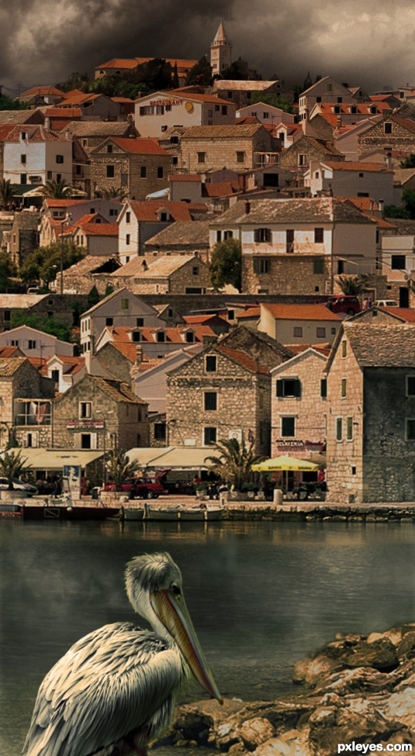
Good job on the background, but what's that all over the pelican???
Yep the background is nicely done, but having the B.G superimposed over the pelican is not working for me, maybe having it in its original form.
It's houses! My image is a fantasy and in it the pelican is blending into its surroundings.
Back to realistic image! I hope it is better!
wow! this image is awesome!~
It’s a much more appealing image with a realistic pelican!!
So different from the rest. Love it. I love how you went vertical, and the colors are great! Good job, author.
Nice...
Vertical is great. IMO more pelican conrtast (given the title) is needed , however, to make it truly the focus
Good image.
Congrats on the first place! Great image.
Congrats!!
Congrats, lovely work
Congrats for 1st
congrats for the first
Thanks everyone!
Congrats!
Congrats on great work...
Congrats for your first place, Vertigo!
Howdie stranger!
If you want to rate this picture or participate in this contest, just:
LOGIN HERE or REGISTER FOR FREE