THANKS A LOT TO:
http://fantasystock.deviantart.com/journal/7569297/ (5 years and 3382 days ago)
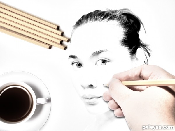
A drawing of a asian girl. (5 years and 3432 days ago)
AMAZING!!!!!
Sweet!
Great idea, love it!
the perspectives of the pencils and the cup are a bit odd, other than that, Nice image 
GL
Great Idea. The hand is a little too bright for me, but i like it.
I agree about the brightness of the hand, and the coffee cup it's a bit distorted, but it's a nice idea. 
Howdie stranger!
If you want to rate this picture or participate in this contest, just:
LOGIN HERE or REGISTER FOR FREE
Only one external source used (5 years and 3540 days ago)
Clever idea. Well done!
nice
Very good entry!
Very creative and curious idea. 
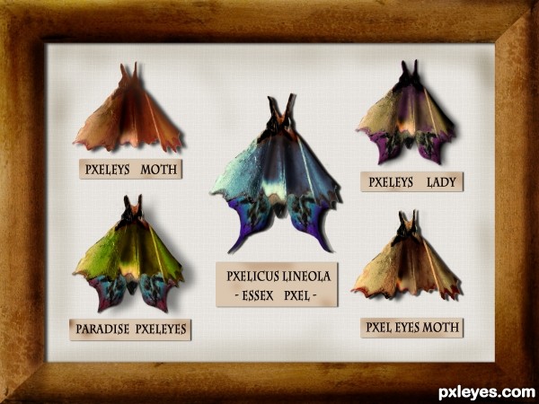
Very creative, but the butterflies/moths look flat, not three-dimensional. Some Burn Tool on the bodies and refinement of the shadows falling on the background (different parts of the moth would be different distances from the background and thus would cast a slightly different shadow) would help. A stick pin through each moth might add to the realism.
Hi, everyone!¨Thanks for the comments!
@ DanLundberg
I didn't want to touch the original texture much but, you're right, some things should be improved. I uploaded it and decided to see what the others would have to say . I appreciate your suggestions and, yes, burn tool just might be the best solution for the "fake" inner shadows. i will try to improve that part!
And as for the pins- sorry, i just couldn't!  ))) I made the pins and in the end decided not to use them, I couldn't stab the poor creatures!
Great idea author,i like your different approach to this contest...well done
thanks, erathion!
I made some changes! DanLundberg, thanks again for the suggestions- burn tool really did do the trick (I don't think I use it nearly as often as I should  ). I did my best to achieve a more 3D effect and I think it looks better. I also used both burn and dodge tool to add the same effect to the frame. Then i added some smudges to the background and to the tags- i thought it should be older!
Anyway, I appreciate your inputs! Thanks!
i like it !!!!
I think there's some more depth now. BTW if you create a selection beforehand, that constrains where your burning occurs so you can easily get hard lines between burned and unburned areas..
Congrats...this is really really cool work...
Howdie stranger!
If you want to rate this picture or participate in this contest, just:
LOGIN HERE or REGISTER FOR FREE
Only Source
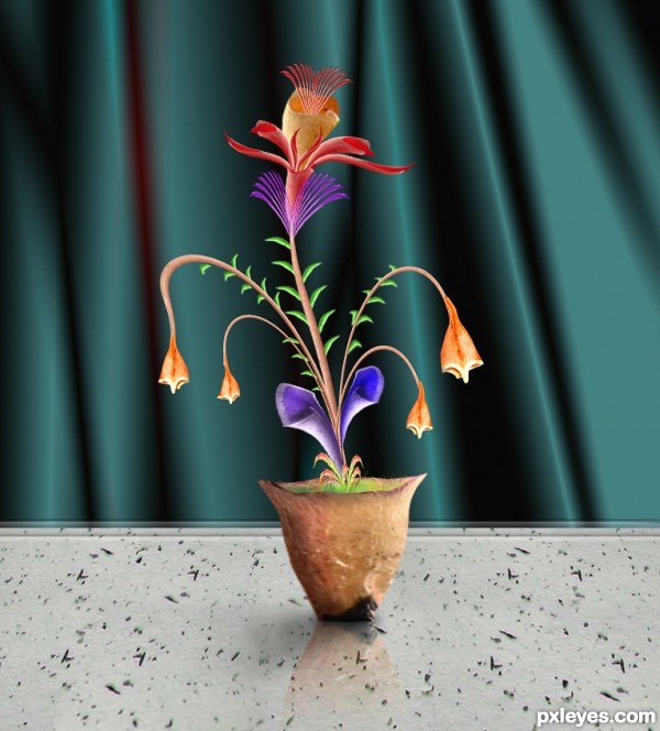
Background created using George55's tutorial http://www.pxleyes.com/tutorial/photoshop/1732/How-To-Create-A-Still-Life-With-Realistic-Fruit.html
Thanks George (5 years and 3540 days ago)
yoohooo......this is very nice.......well, how about doing more work on the BG lil bit? that is just IMO....

it's very creative . i like it !! good luck
Really nice! Good luck!
Thanks dekwid, I have made changes to background. 
i love it! one suggestion though, i think the pot needs a slight shadow...just IMO
i thought pencil shavings is useless but u made it flower...i like this
Fine job making the flower in the pot. Your background is top shelf work. I am curious as to where the table top came from though. One suggestion is that the perspective of the plant on the table seems slightly off to me.
I suppose author used a white part of the source with graffitti splinters to make the table. And now it seems a granite table! Very well done, the curtain is also nice, and the flowers, very neat. GL... 
lchappell, I have updated sbs, Erikuri is right, taken white part with particles from source to create granite table.
author,very nice creation...reflection is ok but with light source like this,u made highlight's for the branches,u need some slight shadow...any how,i like this one and i wish u best of luck
Considering that the source was not the easiest to use, you really did an amazing job creating these beautiful flowers. Maybe a little excess background, but I really like your work. GL
Howdie stranger!
If you want to rate this picture or participate in this contest, just:
LOGIN HERE or REGISTER FOR FREE
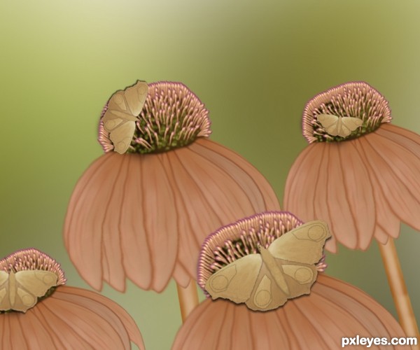
Hi to all
In this image i used only source image
and
i used wrap, brush tool, smudge tool and Hue & saturation.
I hope u all like this image (5 years and 3541 days ago)
Very nice job. Well done author.
Very nice work author,but IMHO maybe would better with some colors...best of luck
i like this
I like this a whole bunch of shavings = )
I like the nudy colors, very beautiful. But I'd like just one butterfly on the flowers, and maybe one flying around. GL... 
Good idea, but kinda flat. Try to create a more dimensional look.
Thanx to all who comment to dis image
Howdie stranger!
If you want to rate this picture or participate in this contest, just:
LOGIN HERE or REGISTER FOR FREE
nice idea author...gl
Howdie stranger!
If you want to rate this picture or participate in this contest, just:
LOGIN HERE or REGISTER FOR FREE